GRAPHIC DESIGN


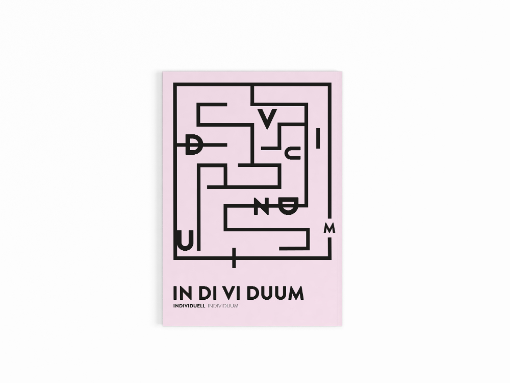
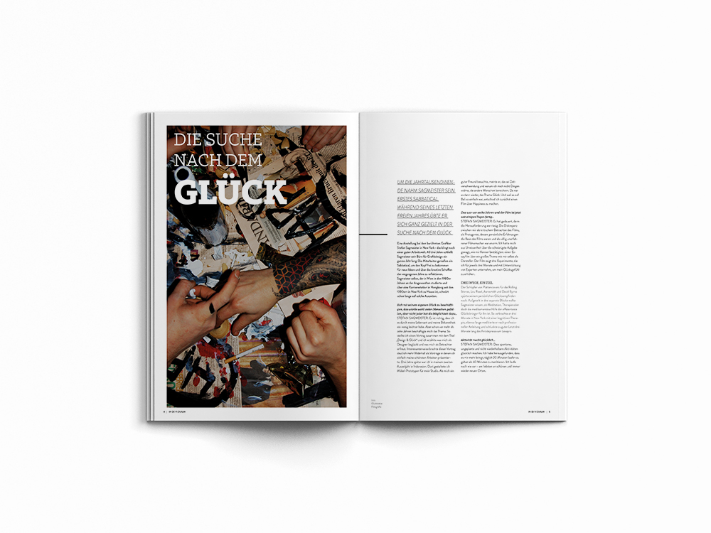
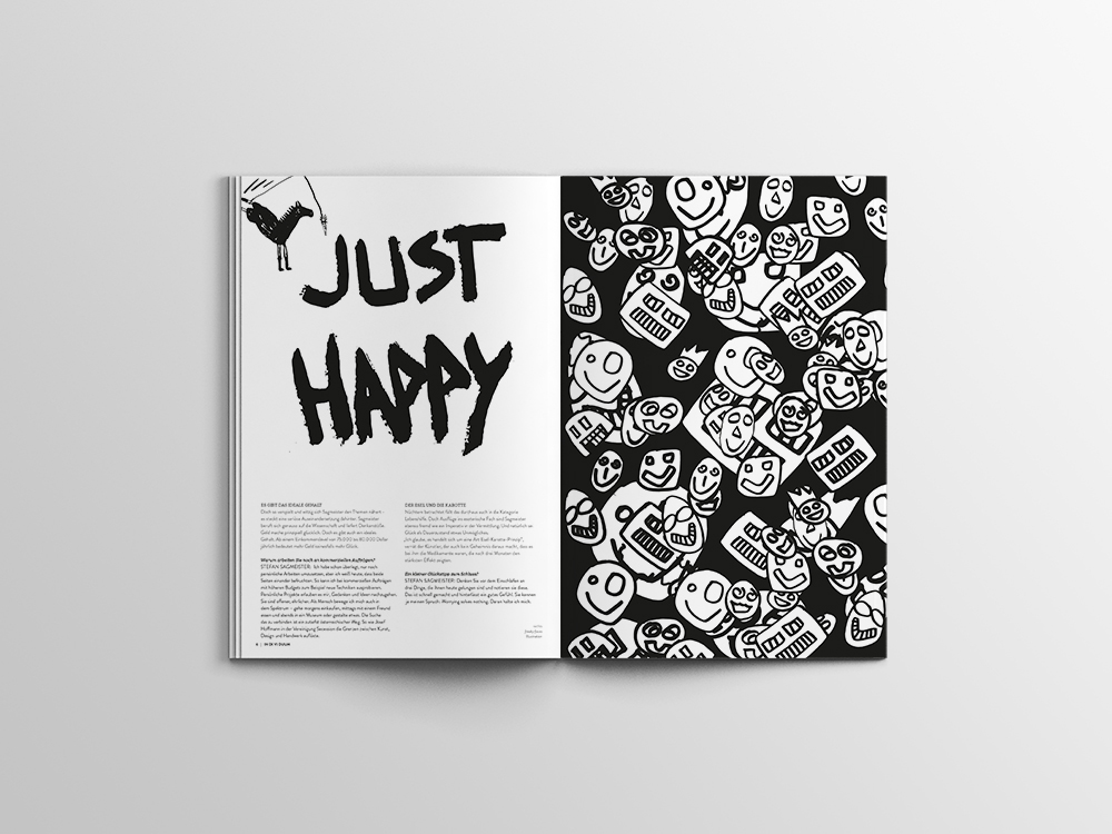
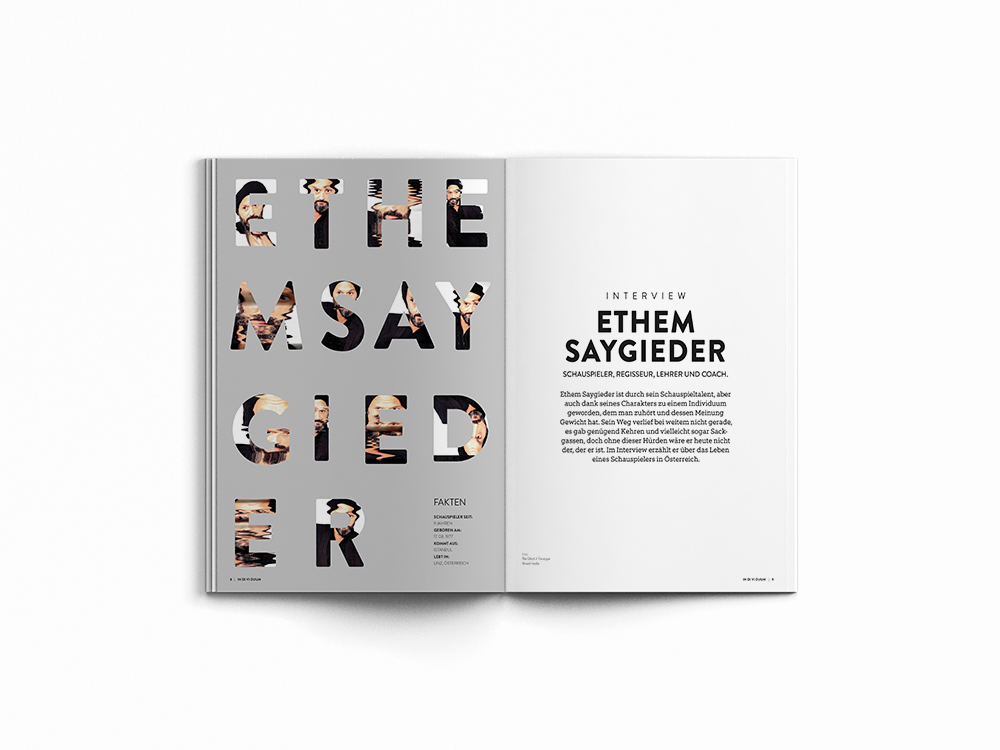
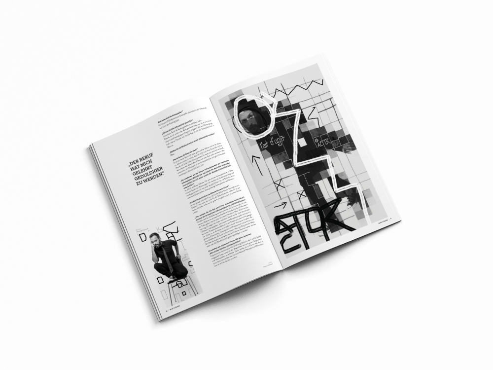
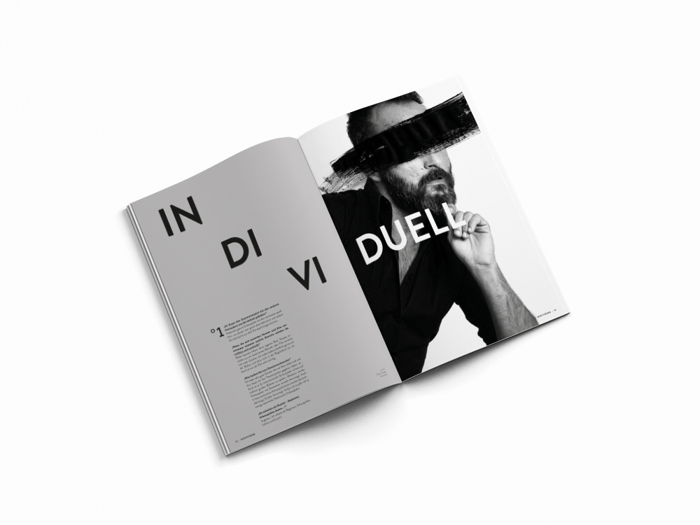
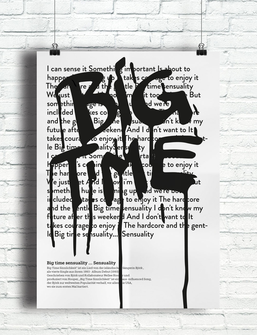
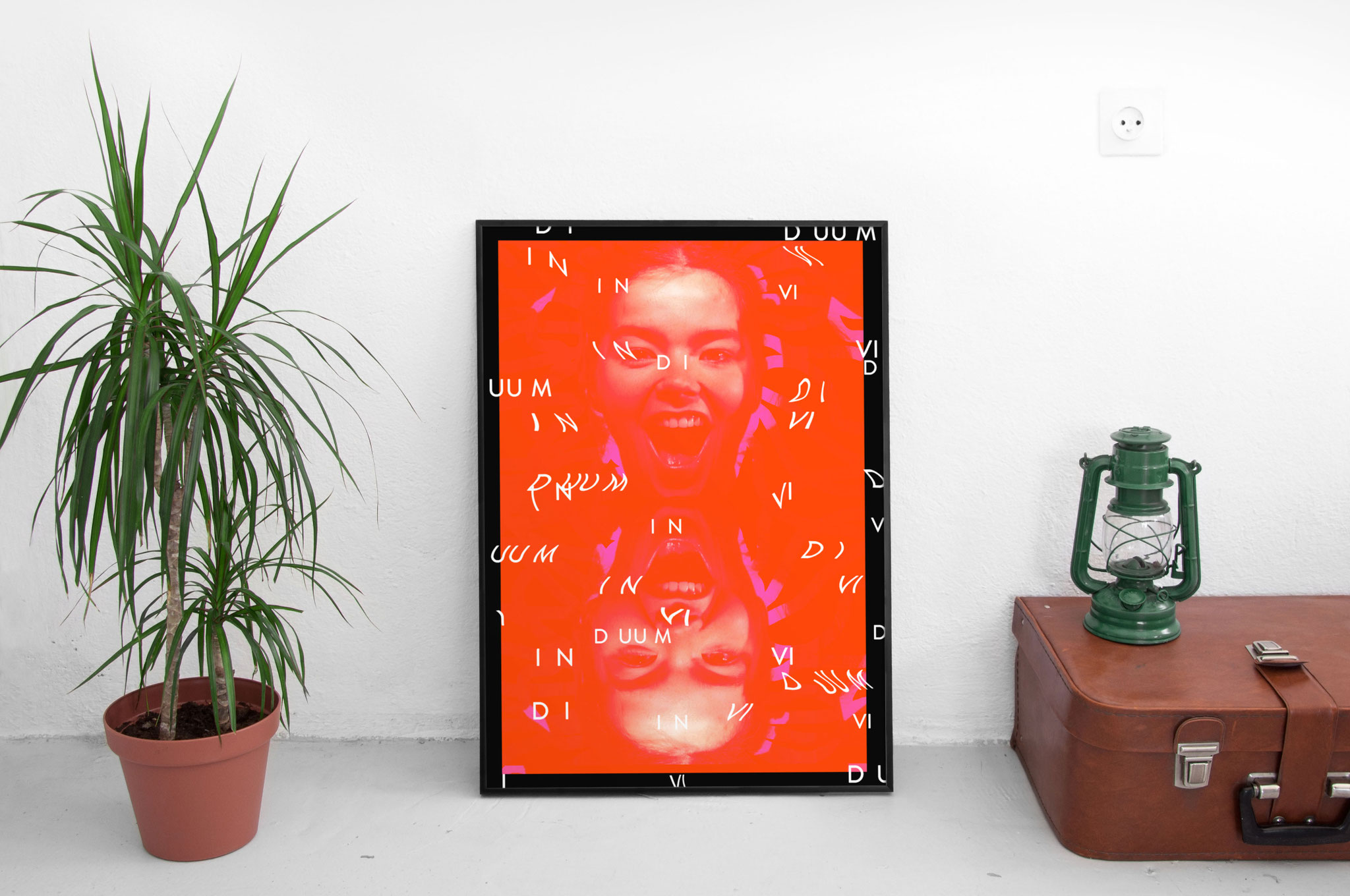
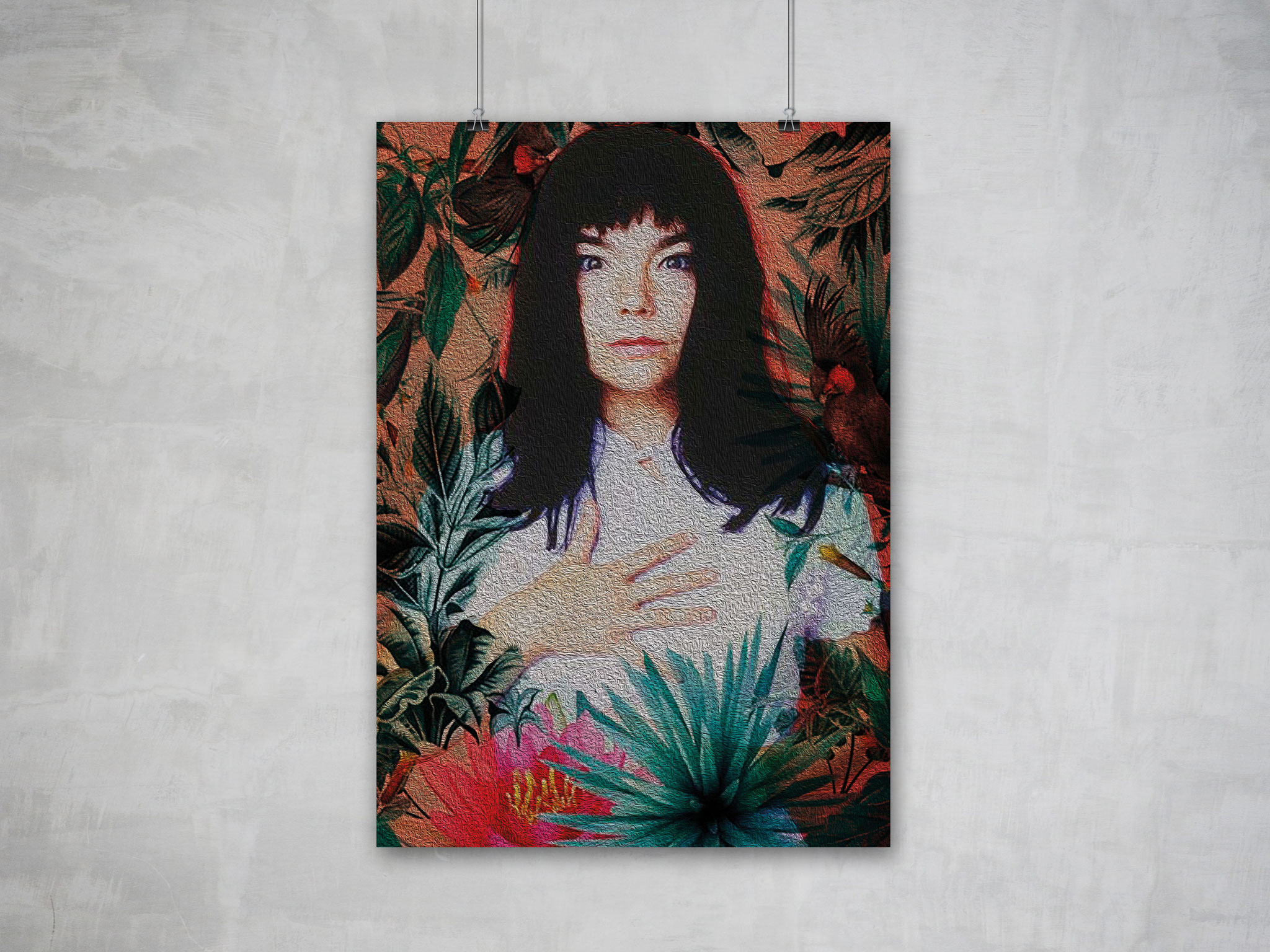
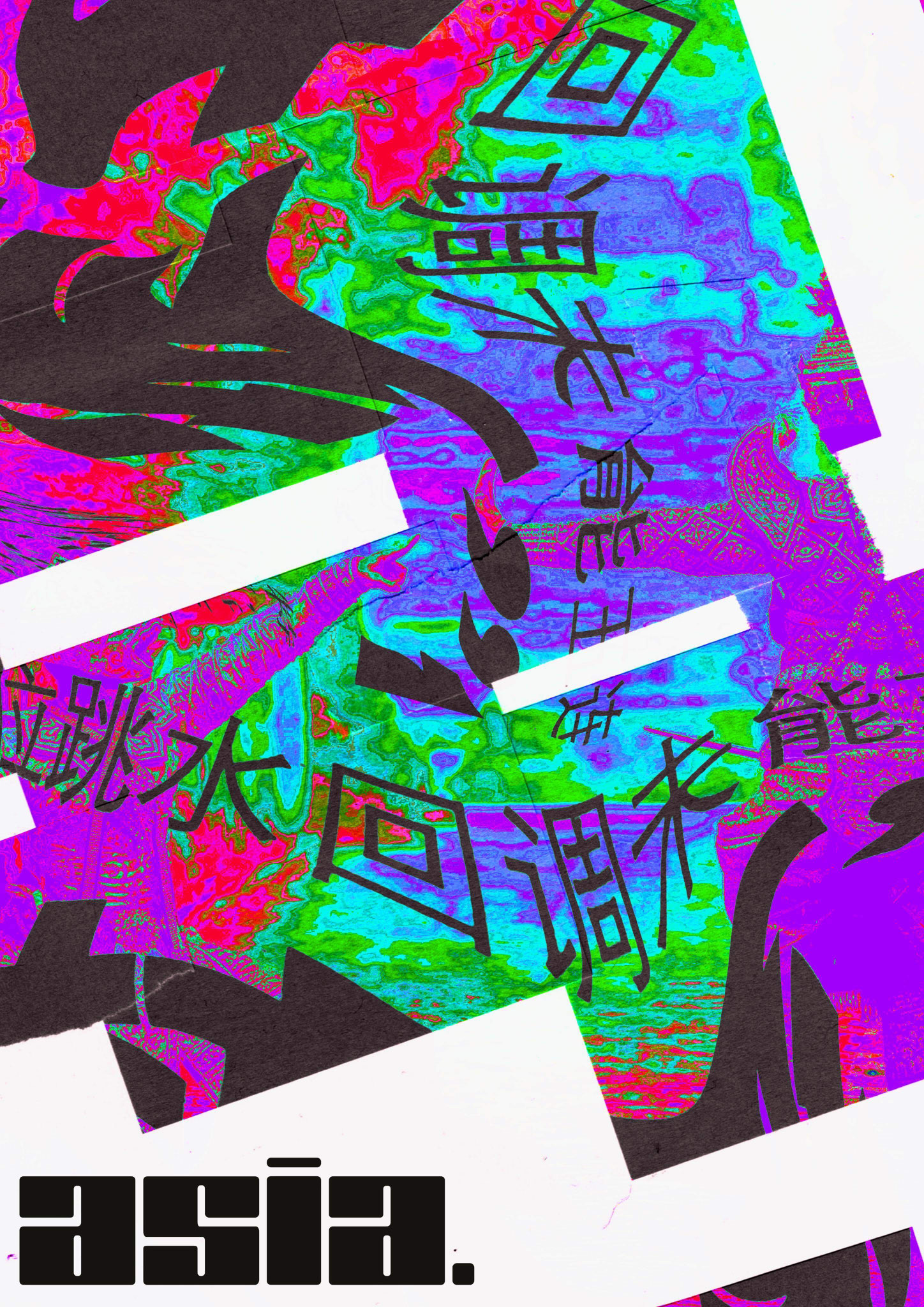
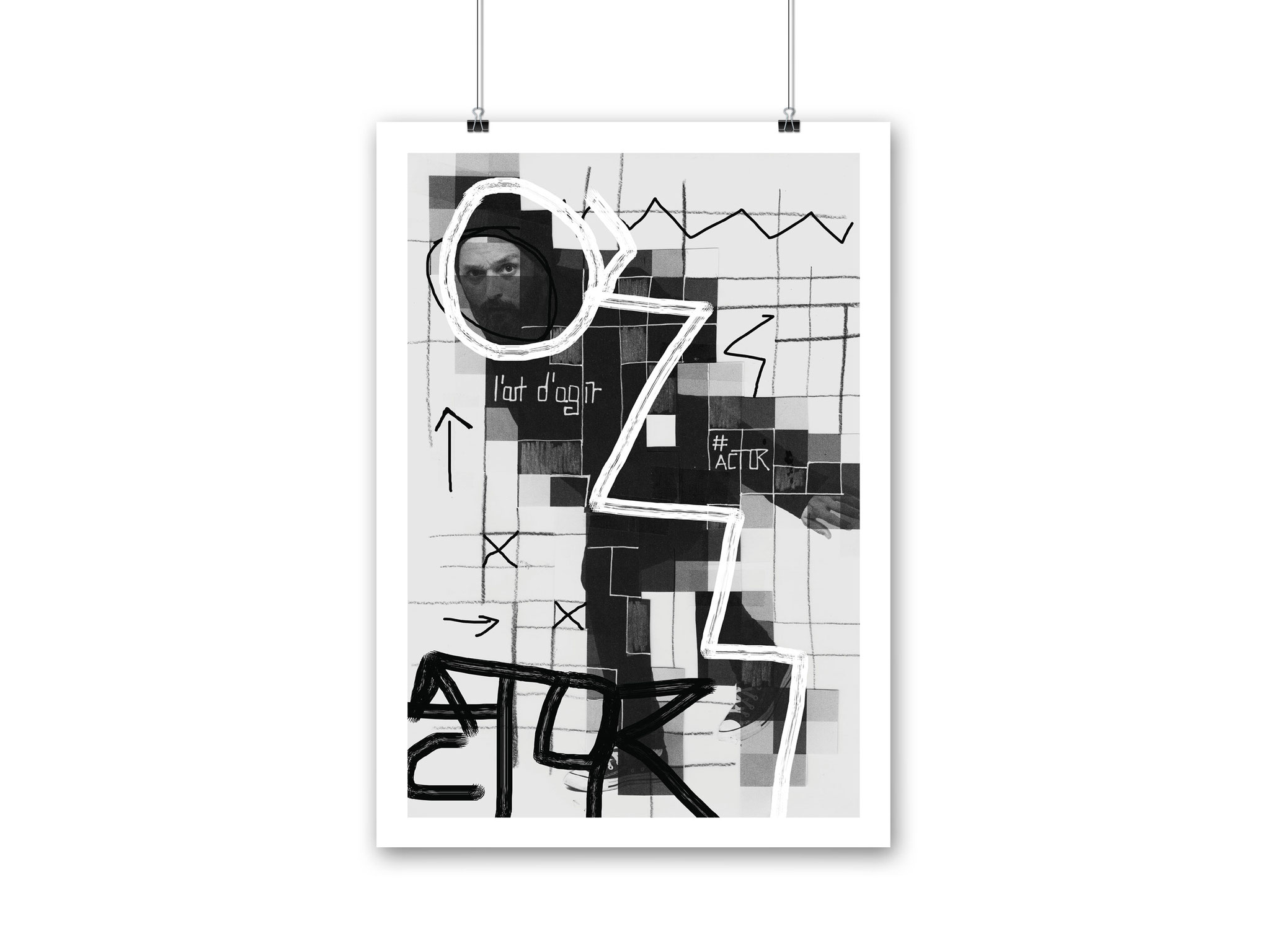
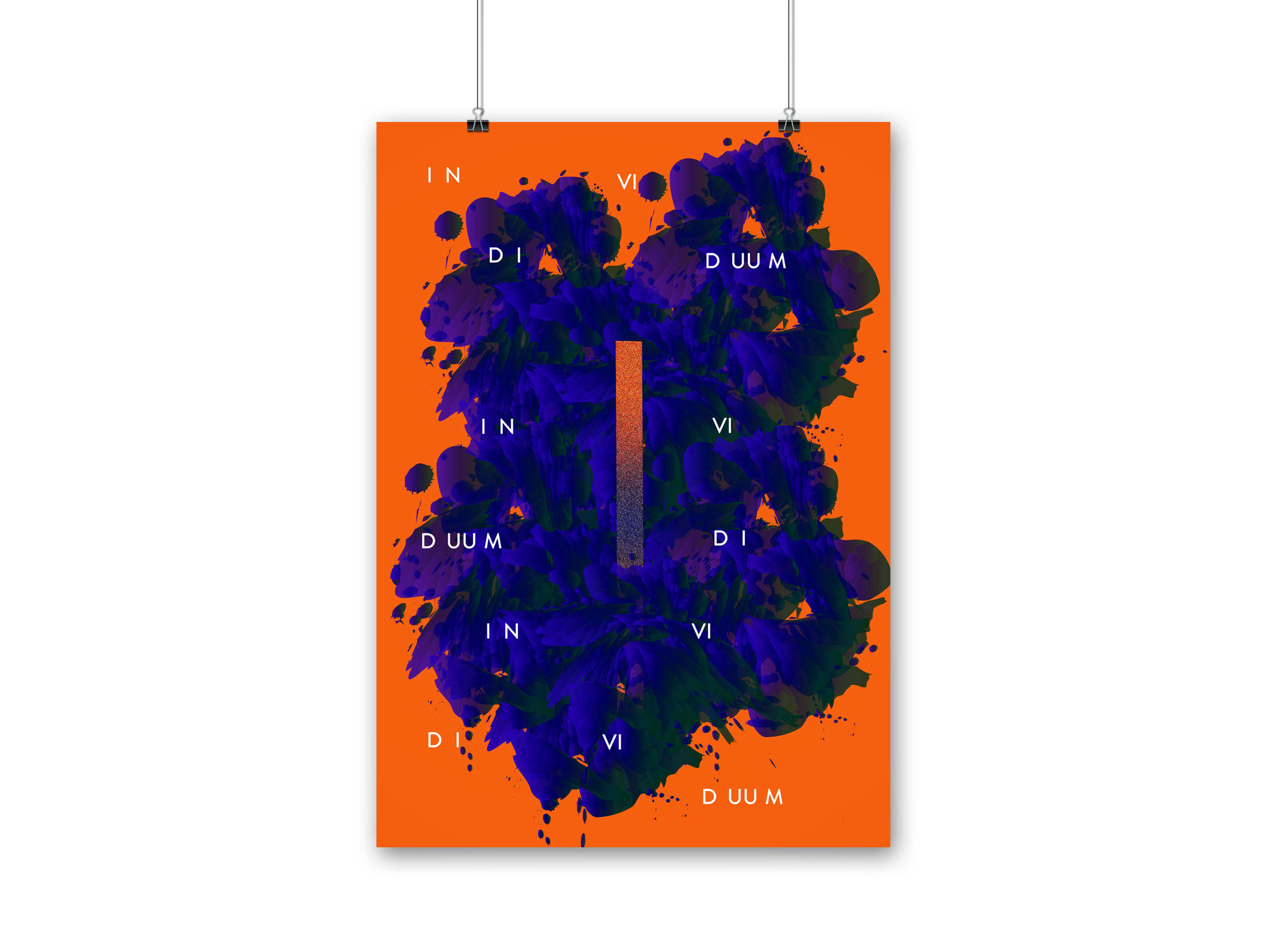
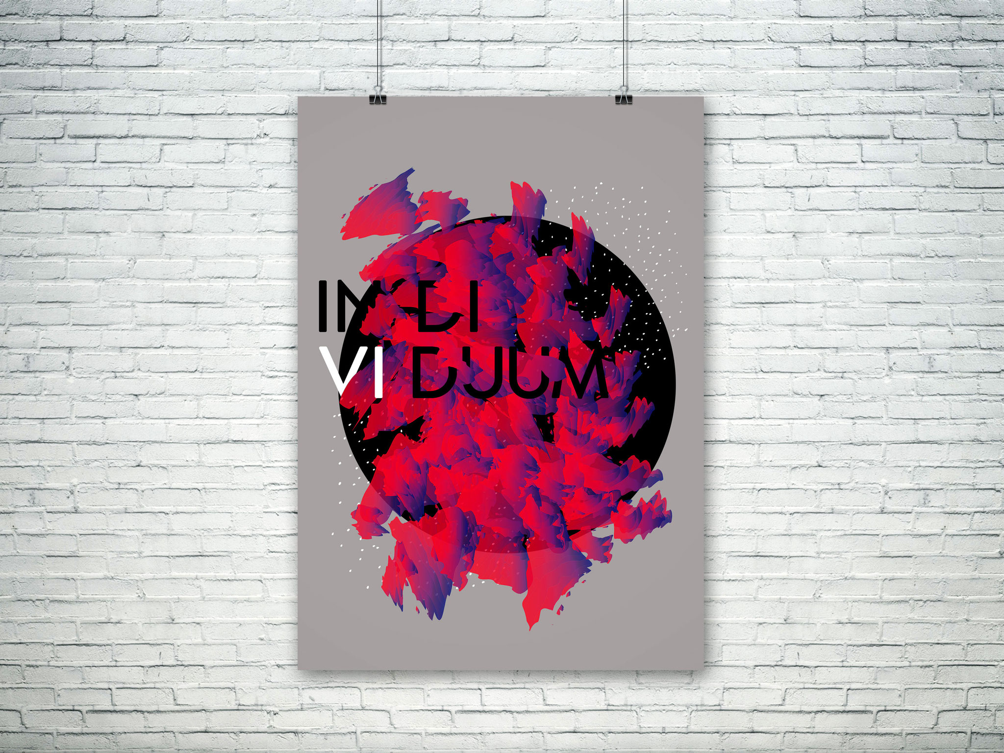
EDITORIAL DESIGN - IN DI VI DUUM
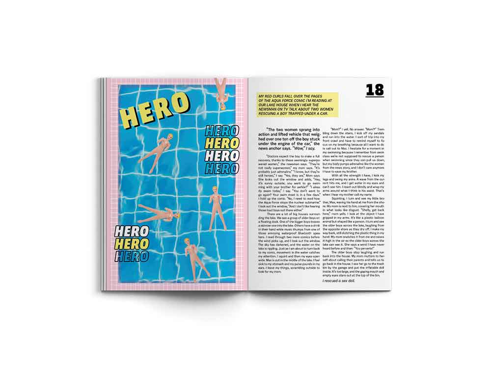
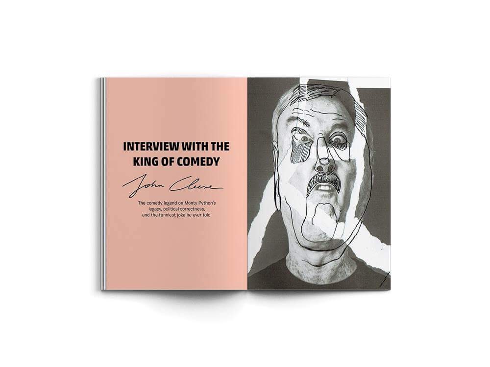
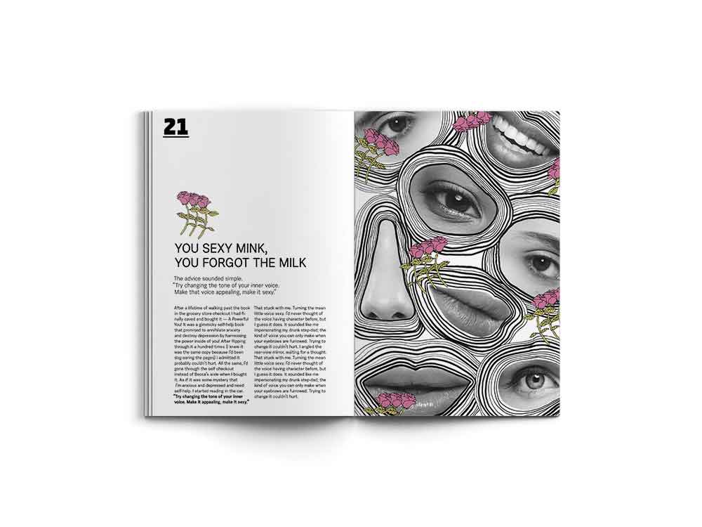
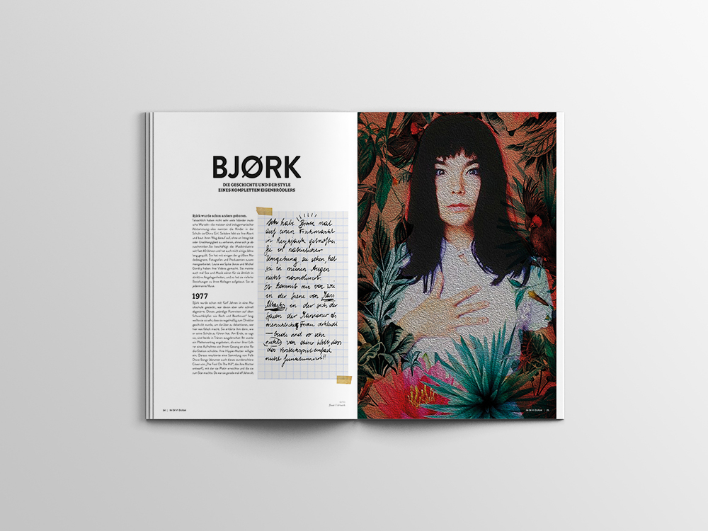
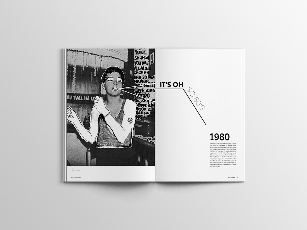
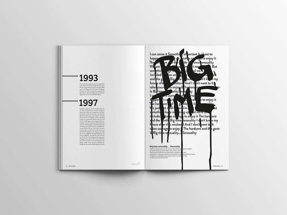
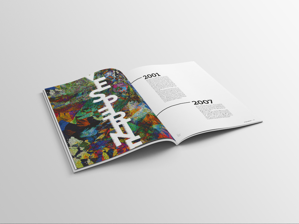
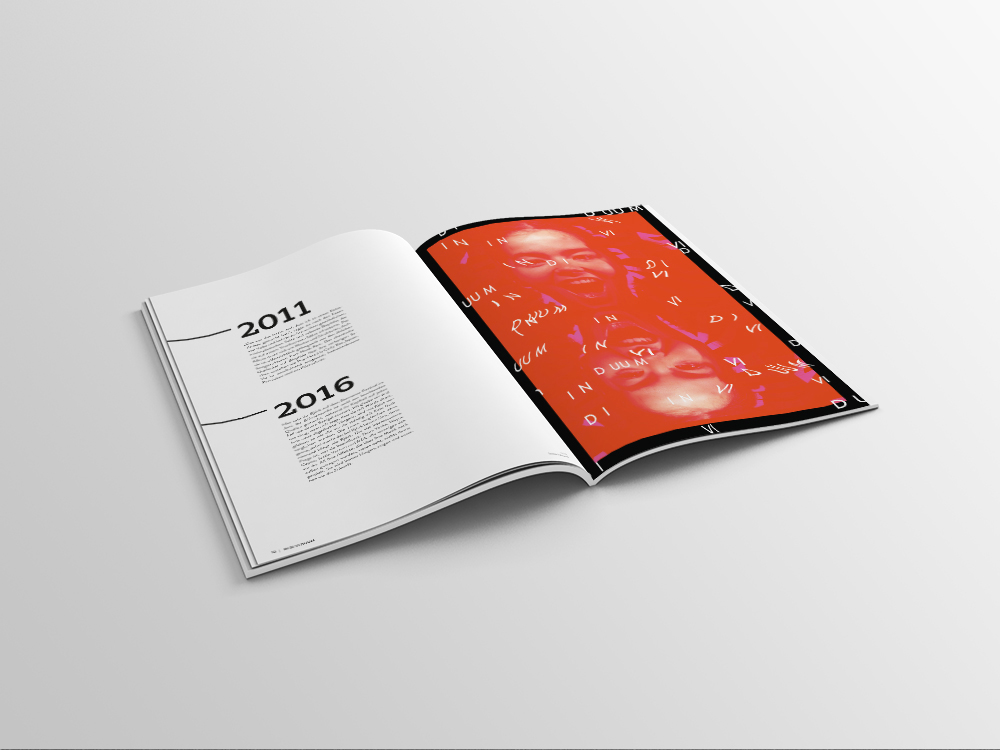
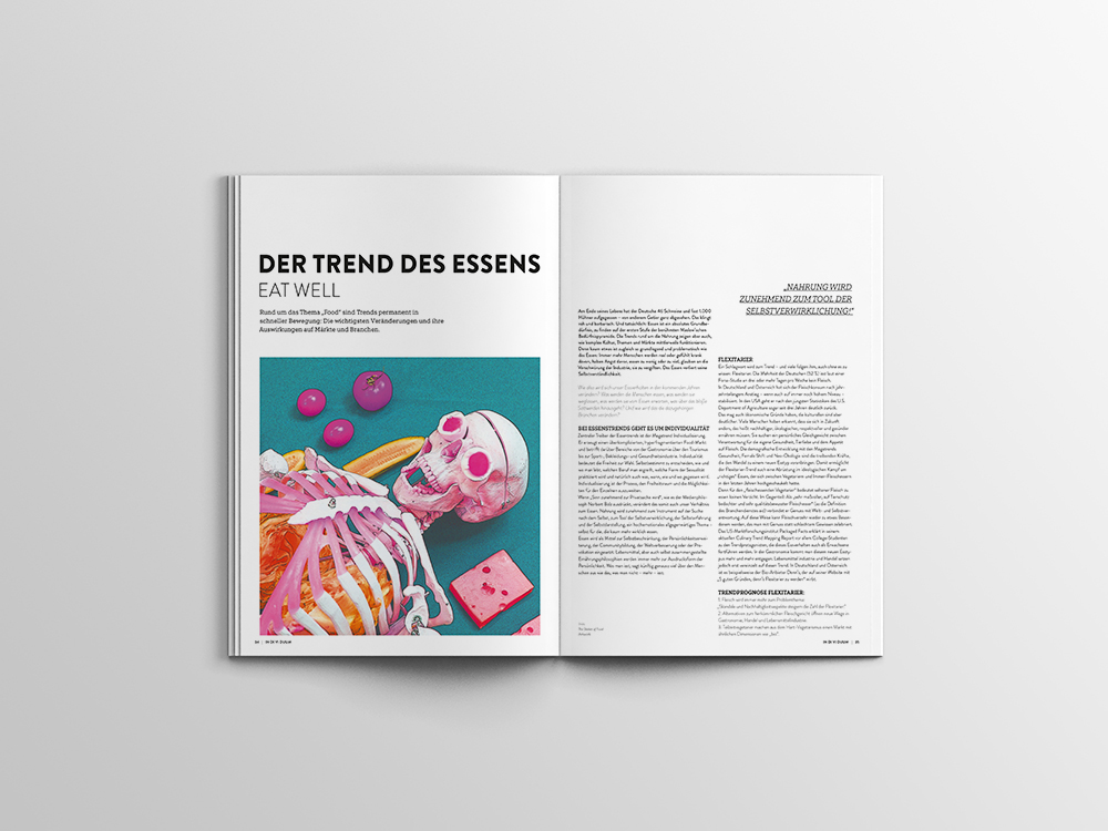
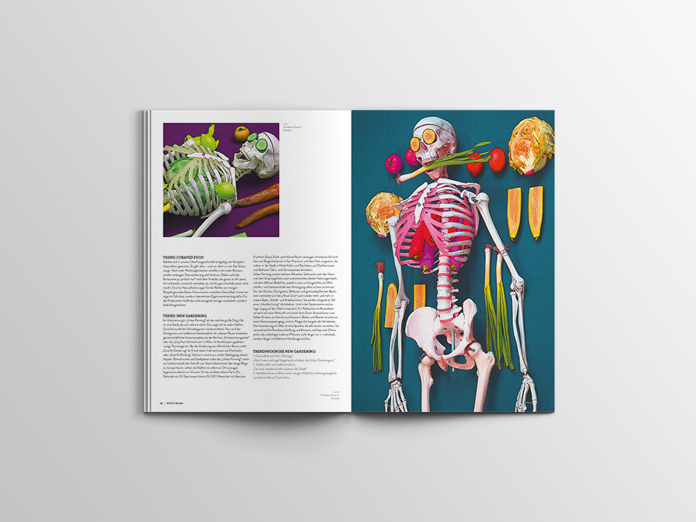
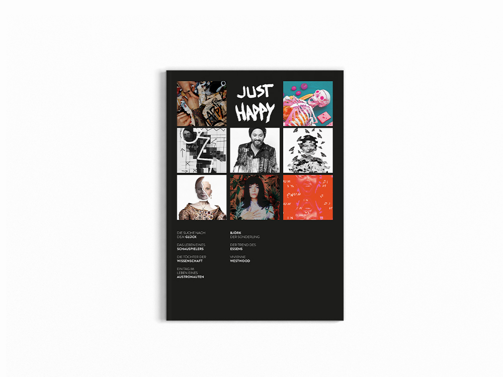
IN DI VI DUUM is a magazine about individual, interesting people, stories and topics. It includes for example an interview with an Austrian actor, describes Björks unbelievable journey as an artist & musician and so much more. I created the hole magazine including all the pictures and artworks.


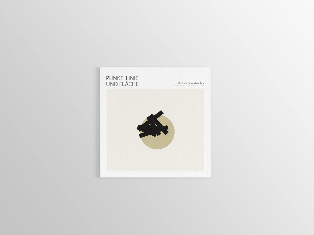
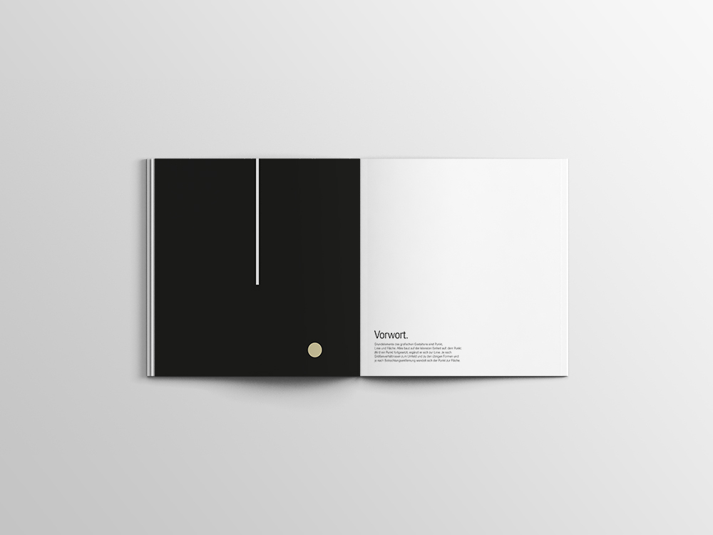
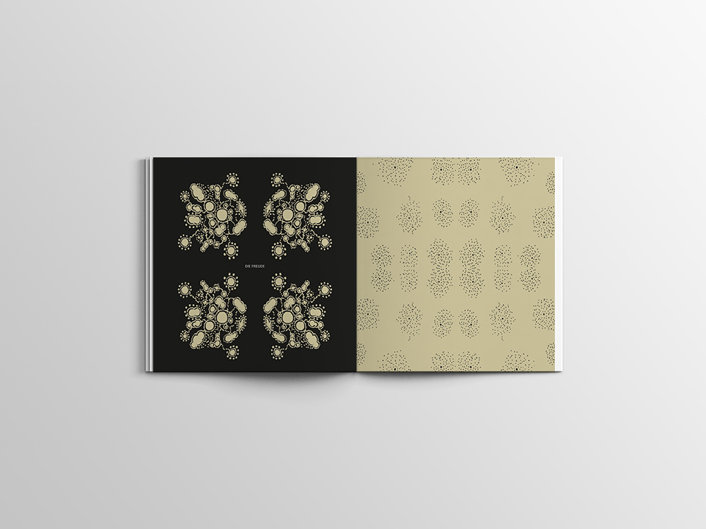
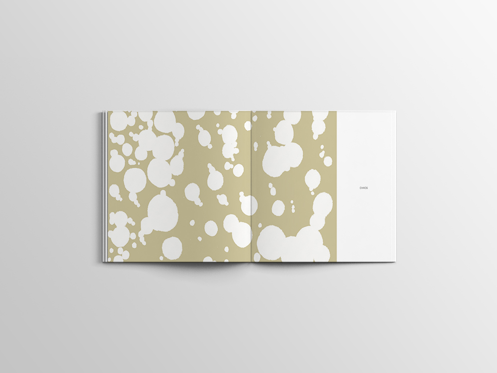
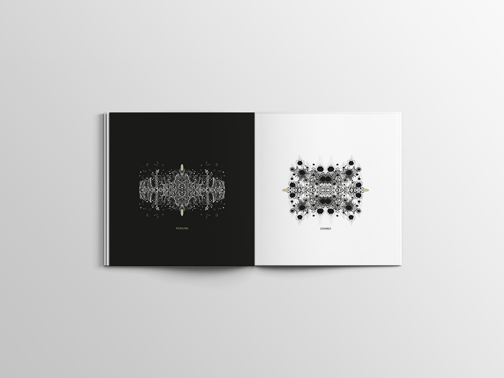
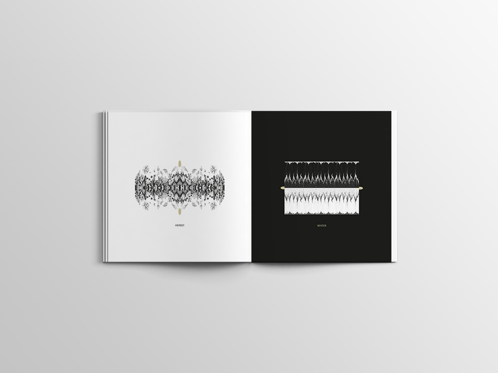
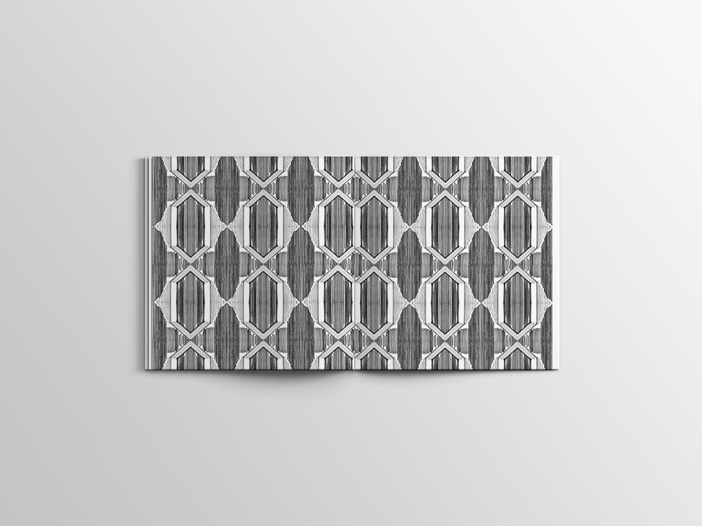
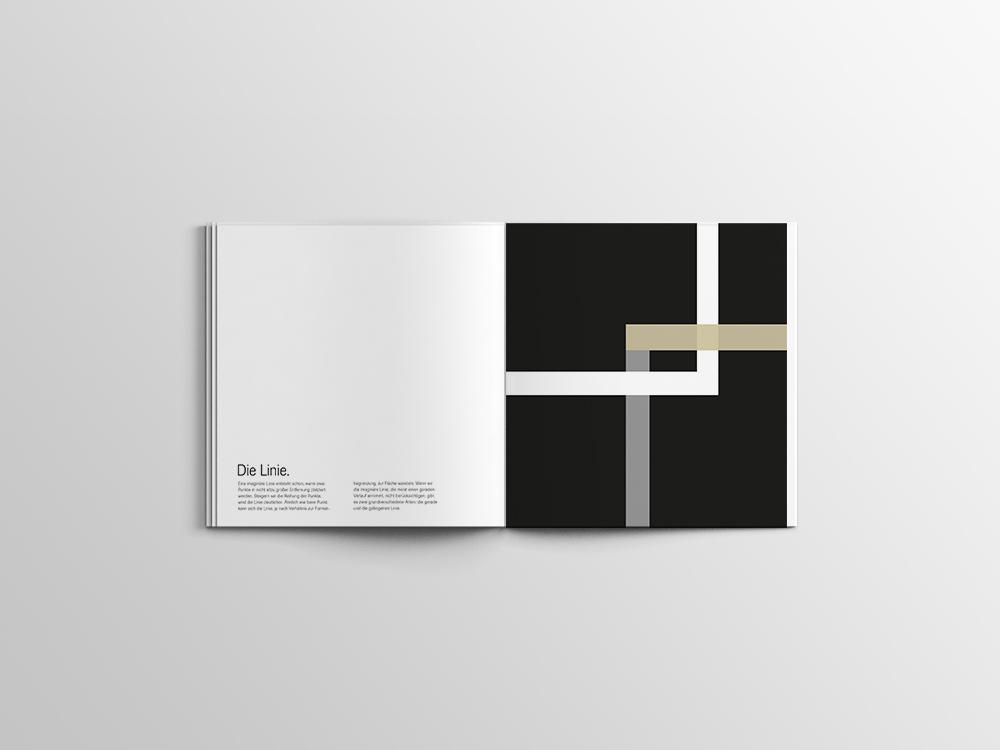
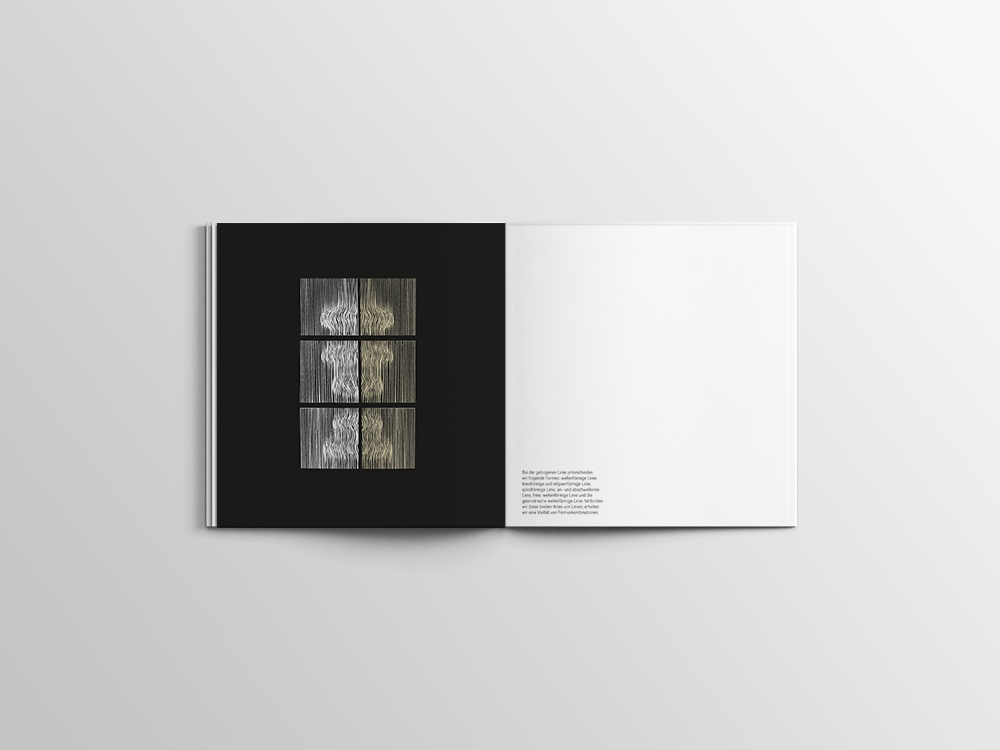
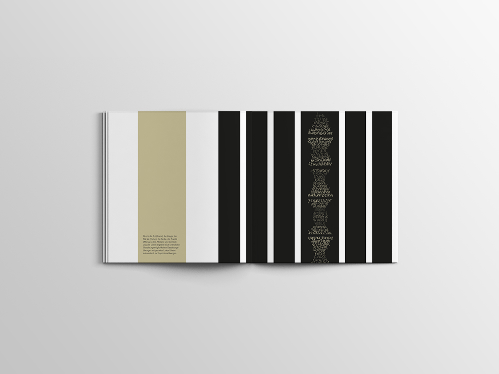
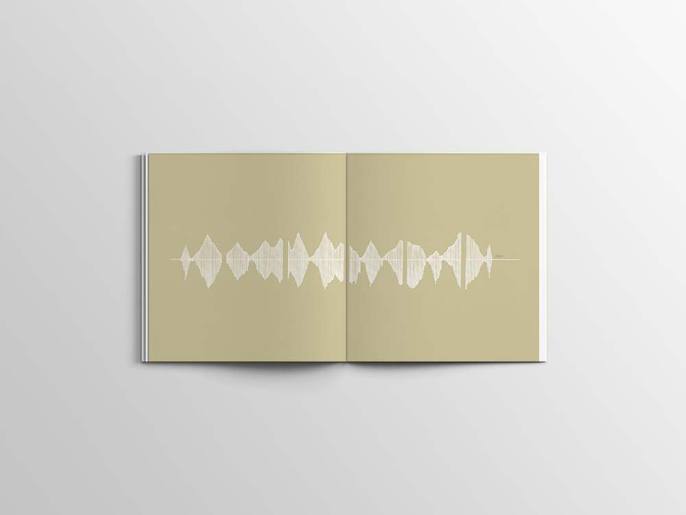
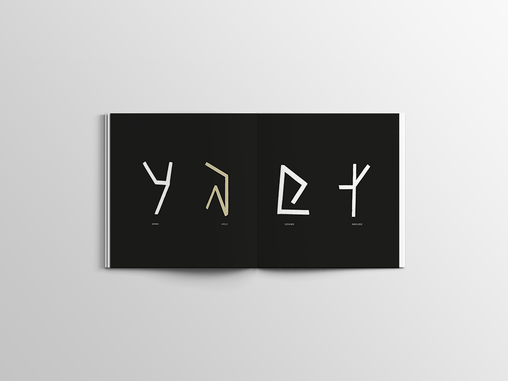
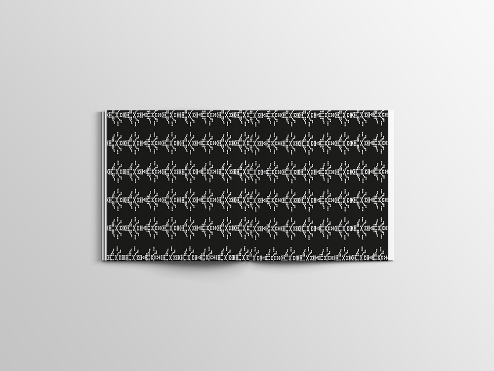
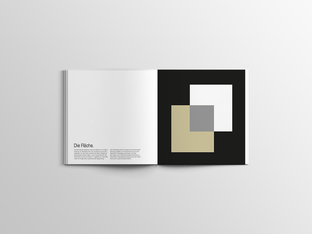
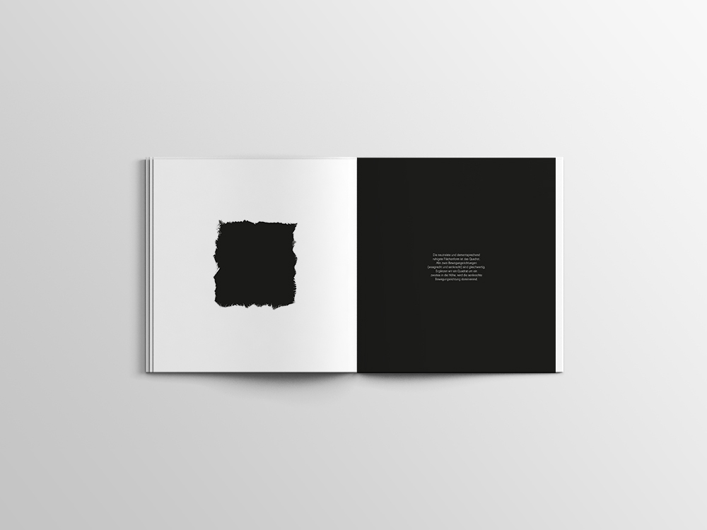
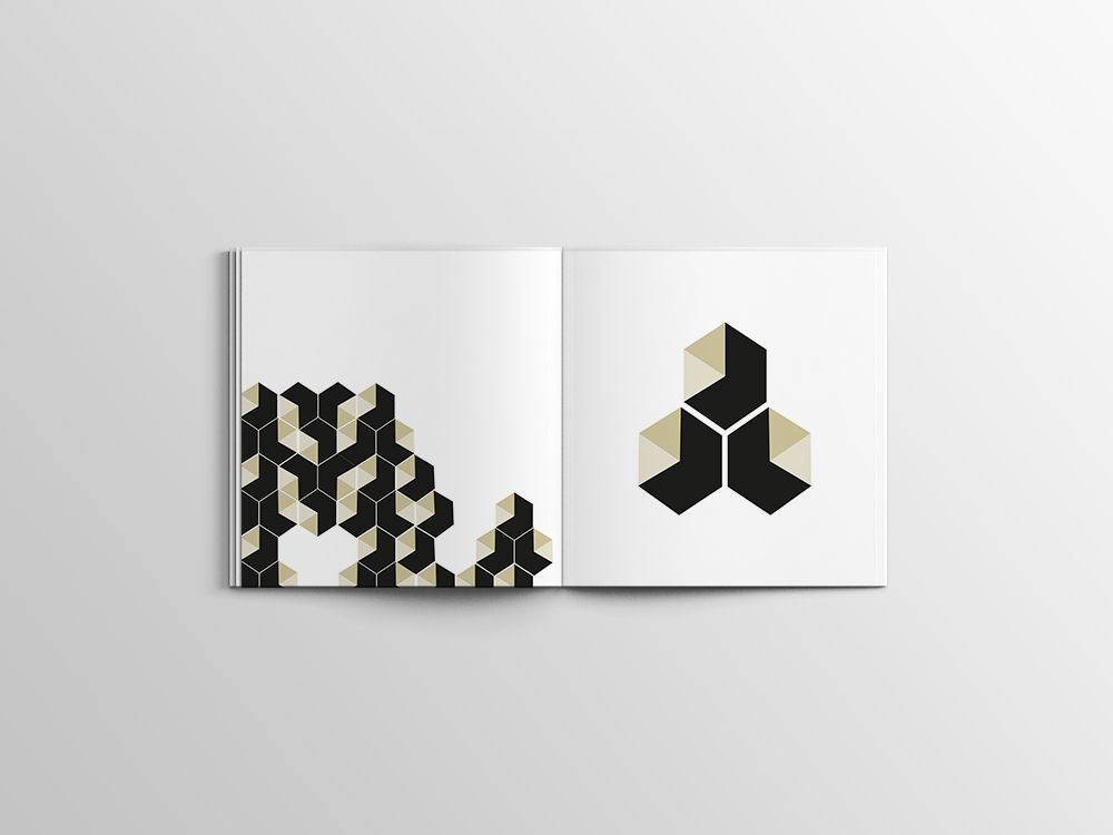
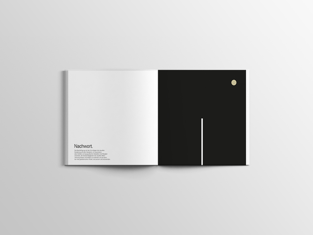
EDITORIAL DESIGN - POINT, LINE & SURFACE
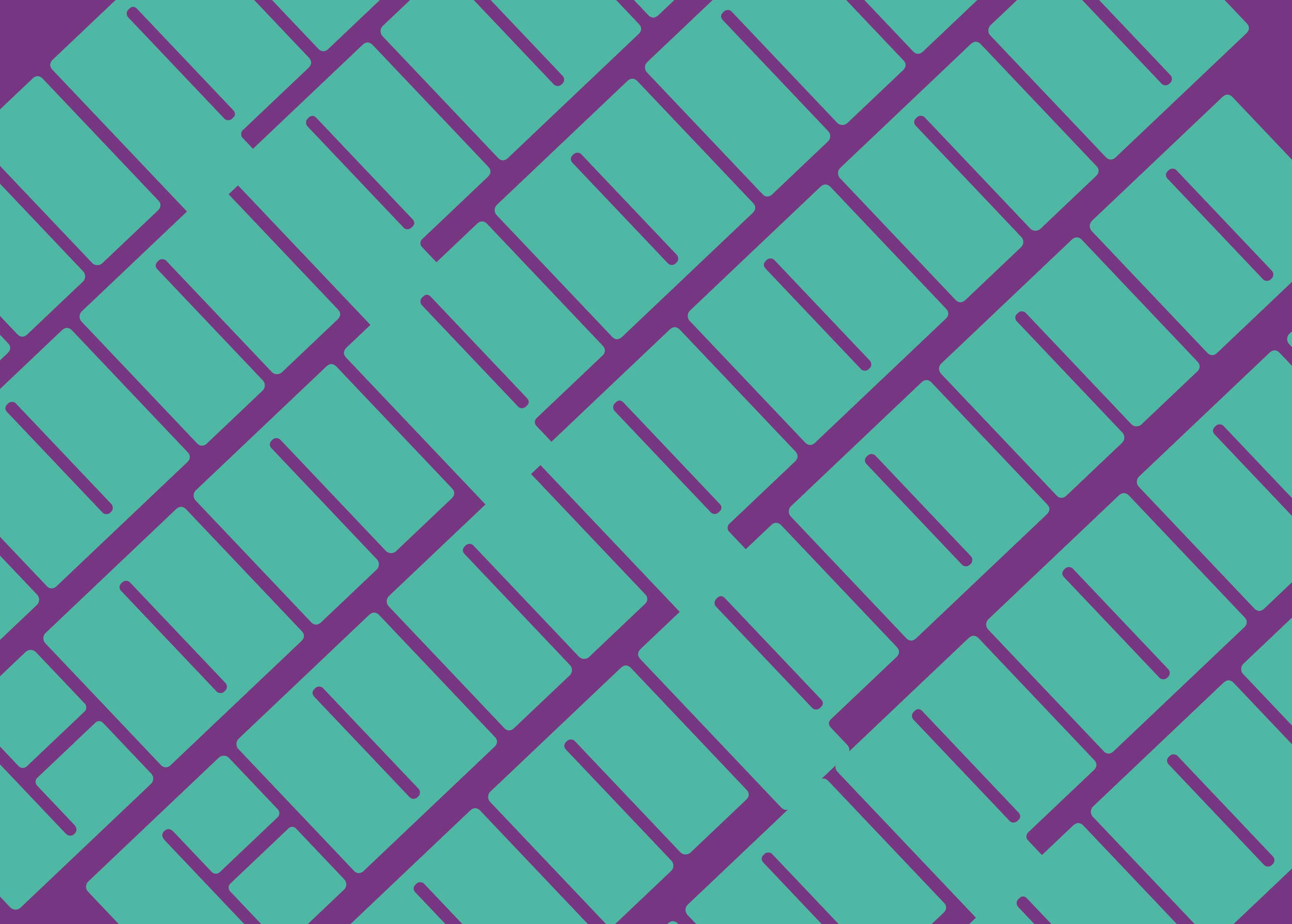
This is a book about points, lines and planes. Those three shapes are very important in the graphic world. the illustrations shows the magic of dots, lines and surface. Text by Dario Zuffo


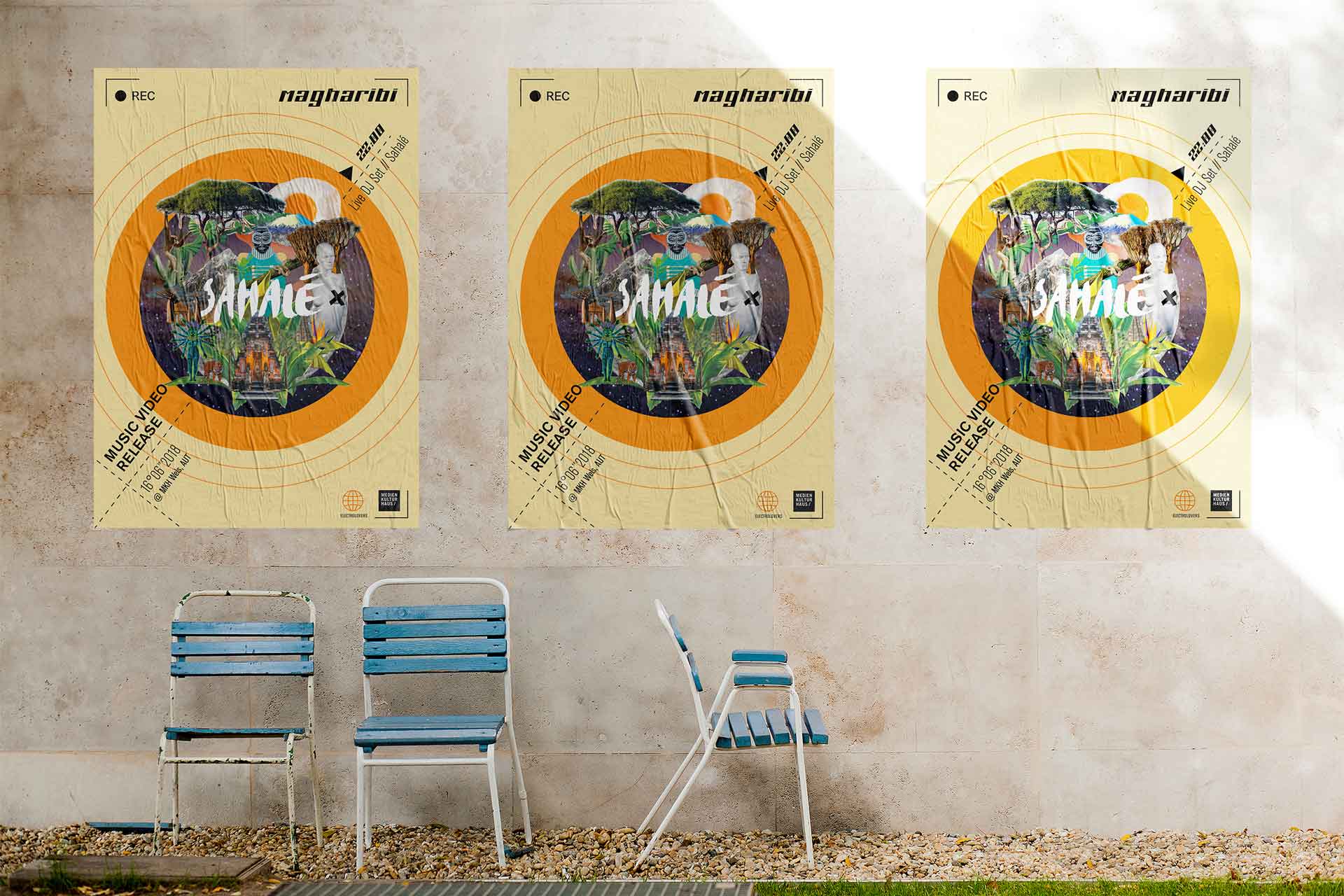
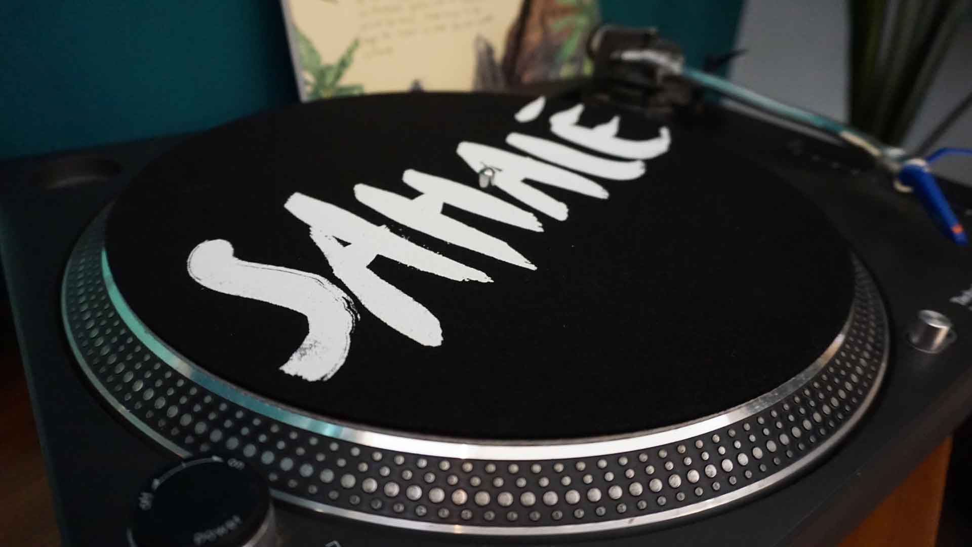
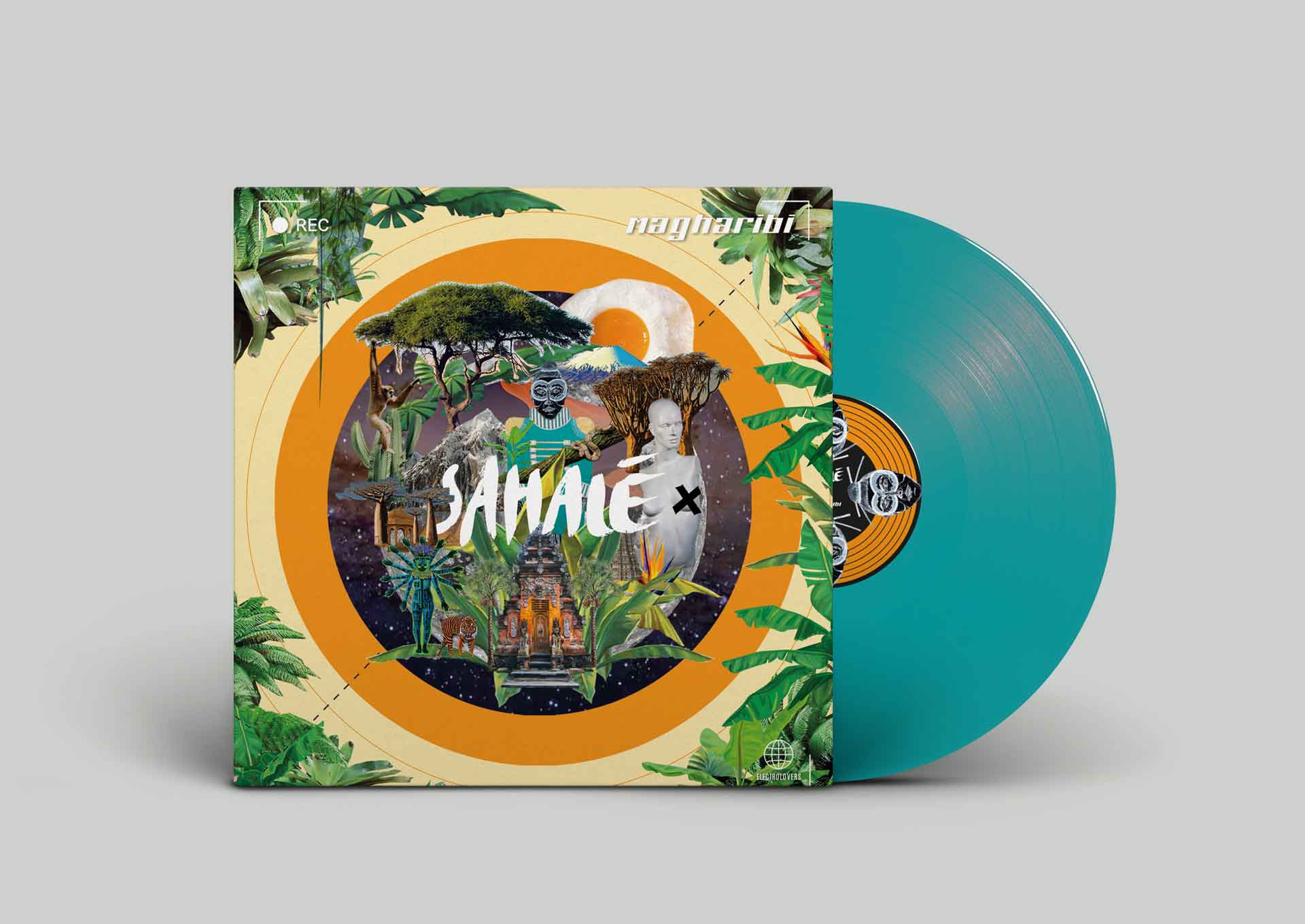
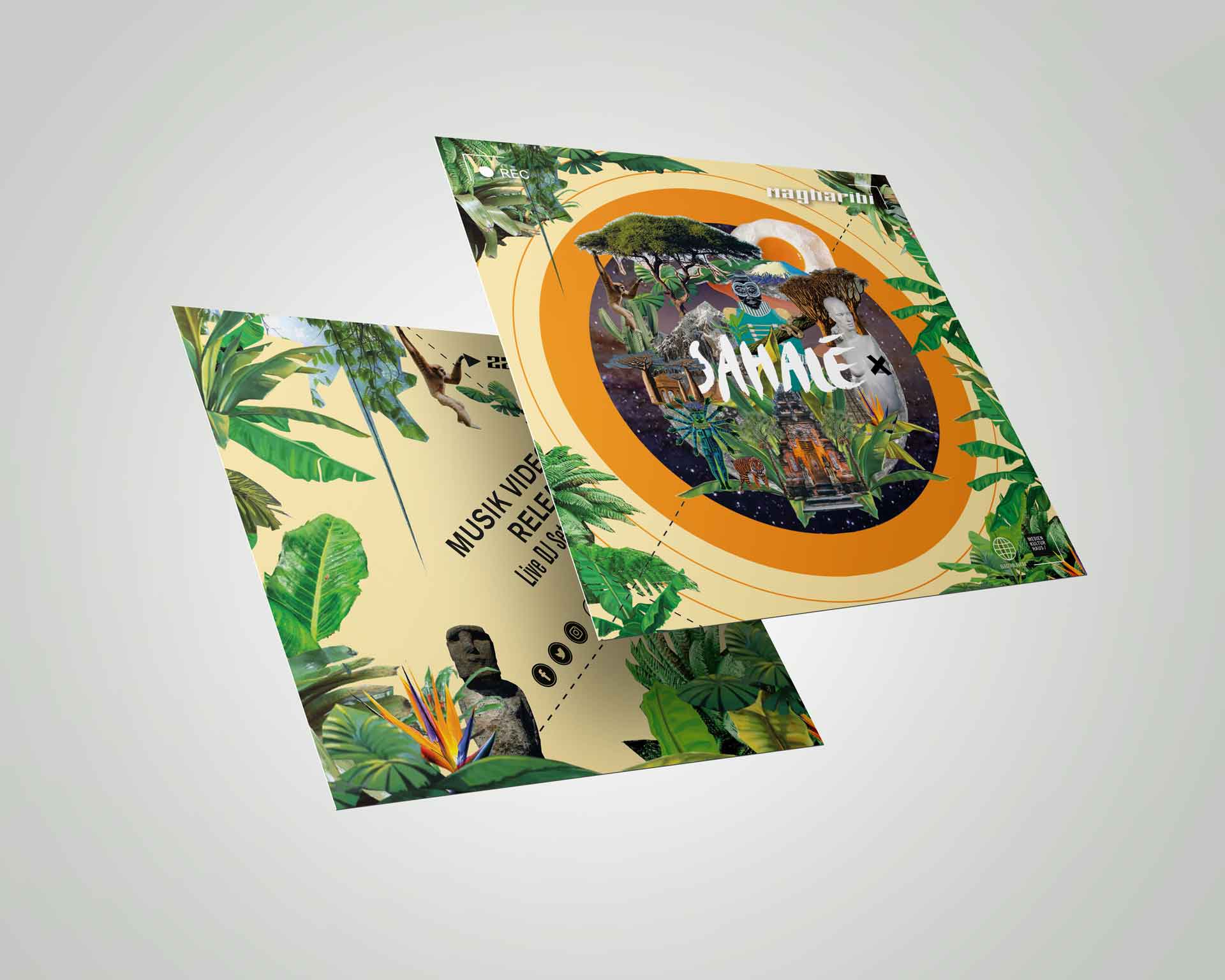
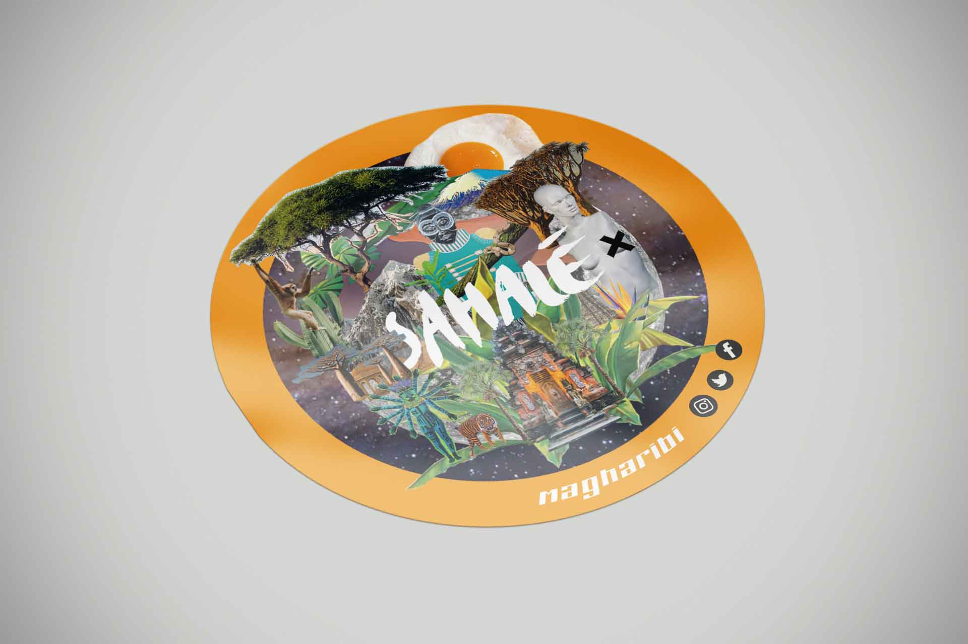
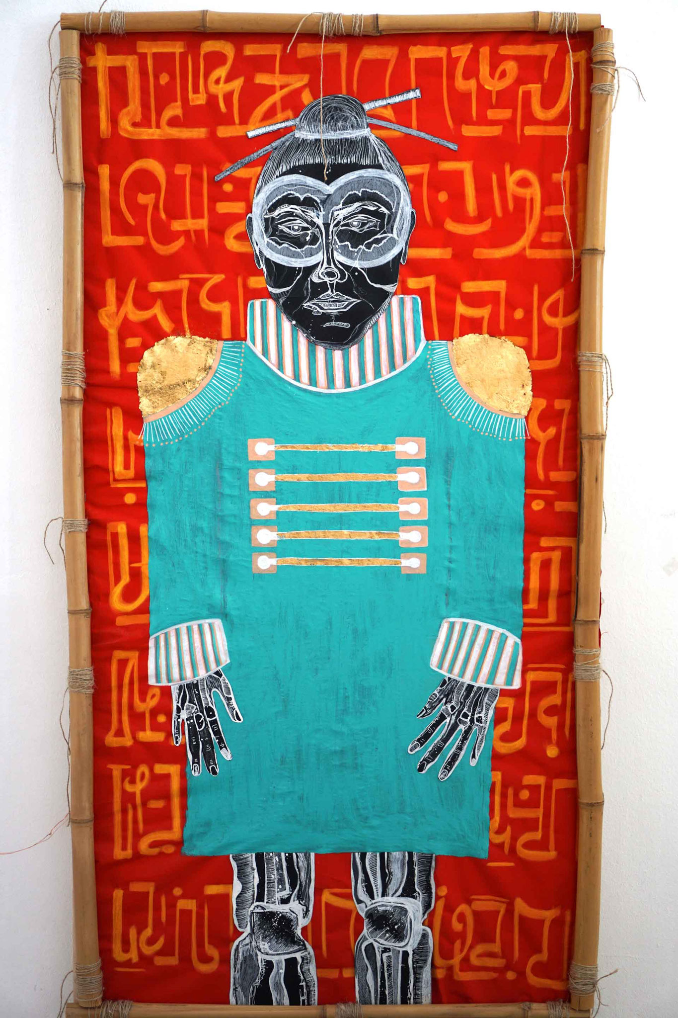
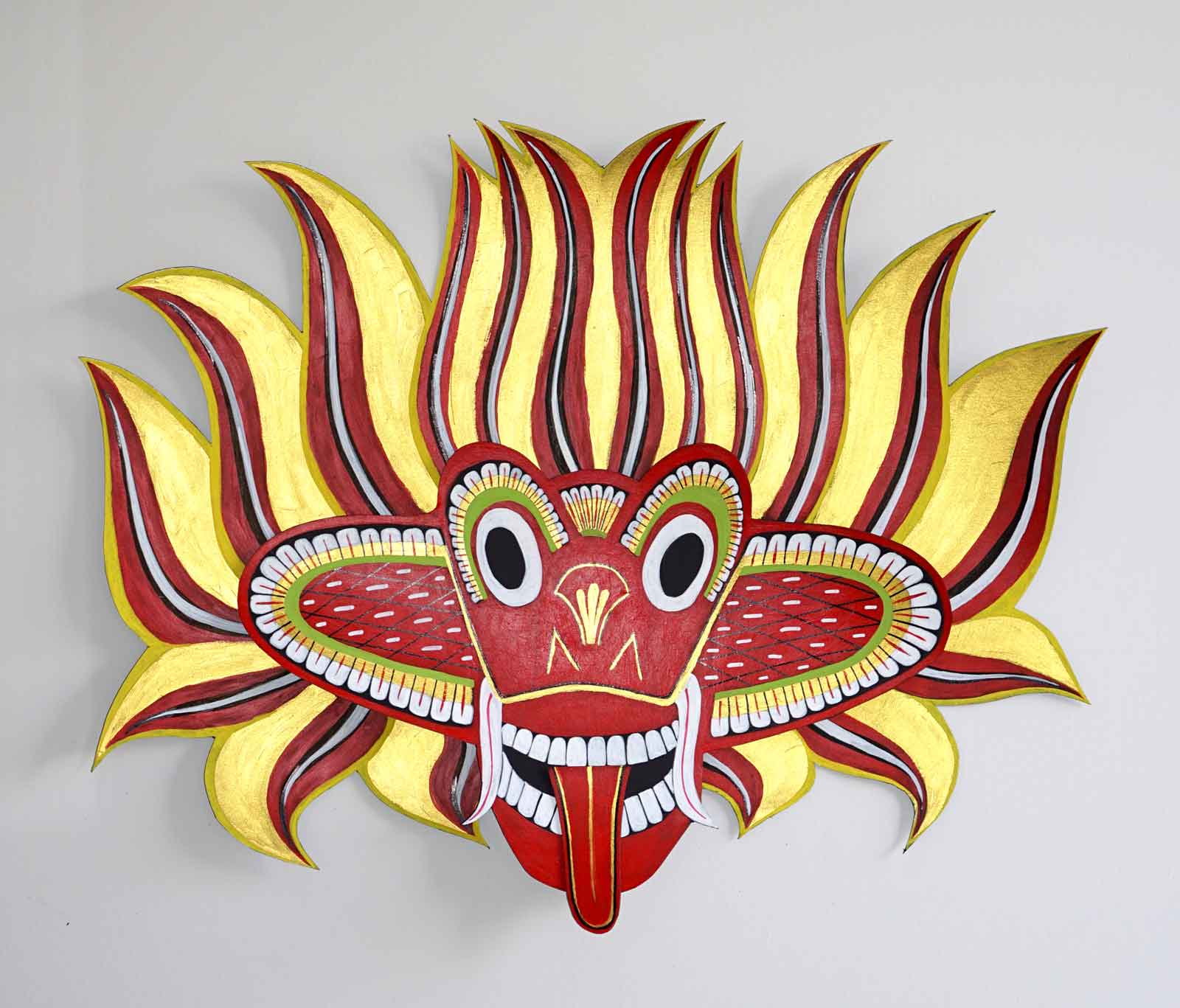
GRAPHIC PACKAGE - SAHALÉ
For the Musicvideo "Magharibi" from the DJ Sahalé, I created a graphic design package including flyers, posters, stickers, vinyl cover design and a screen print vinyl protection.

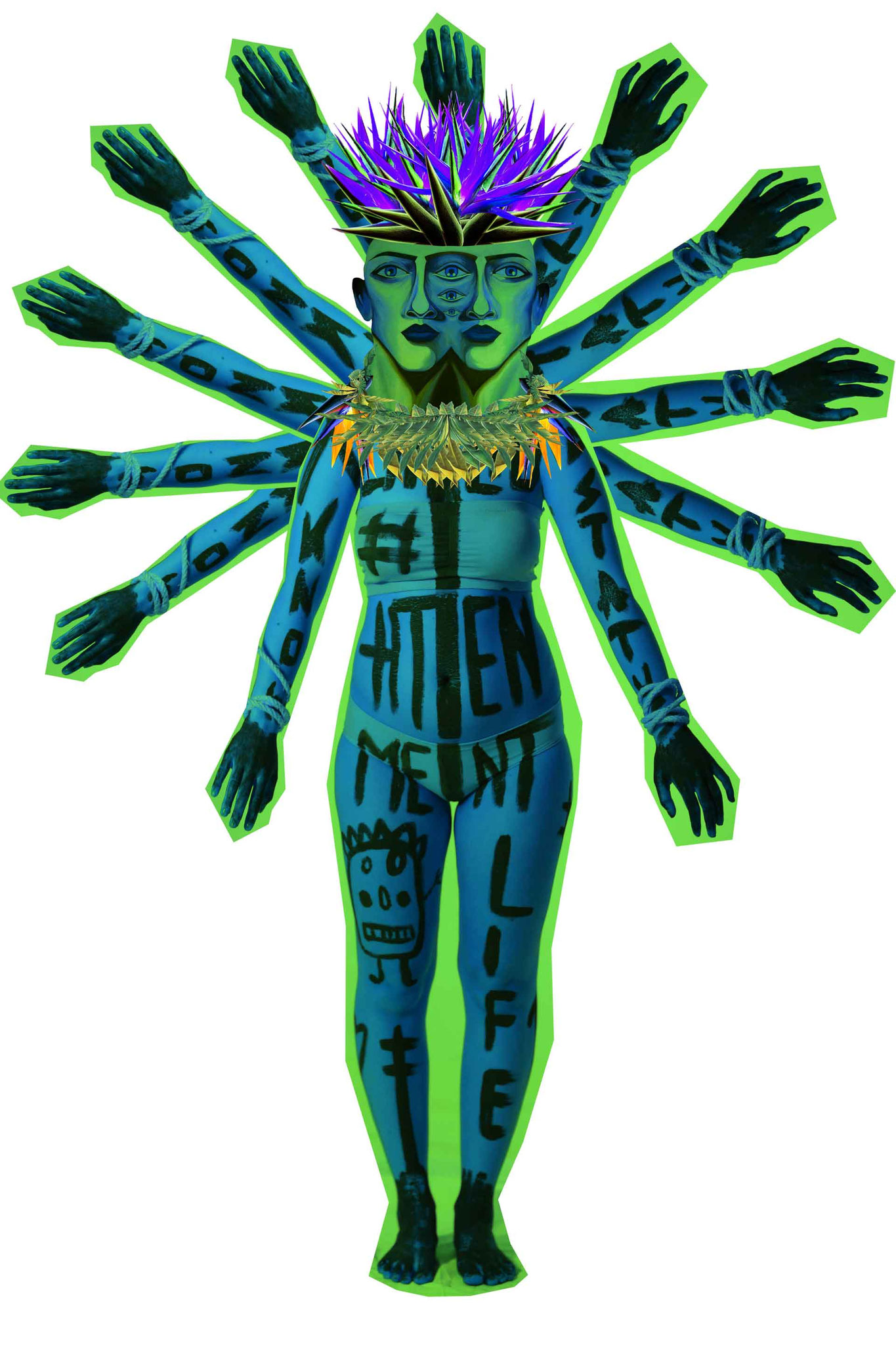


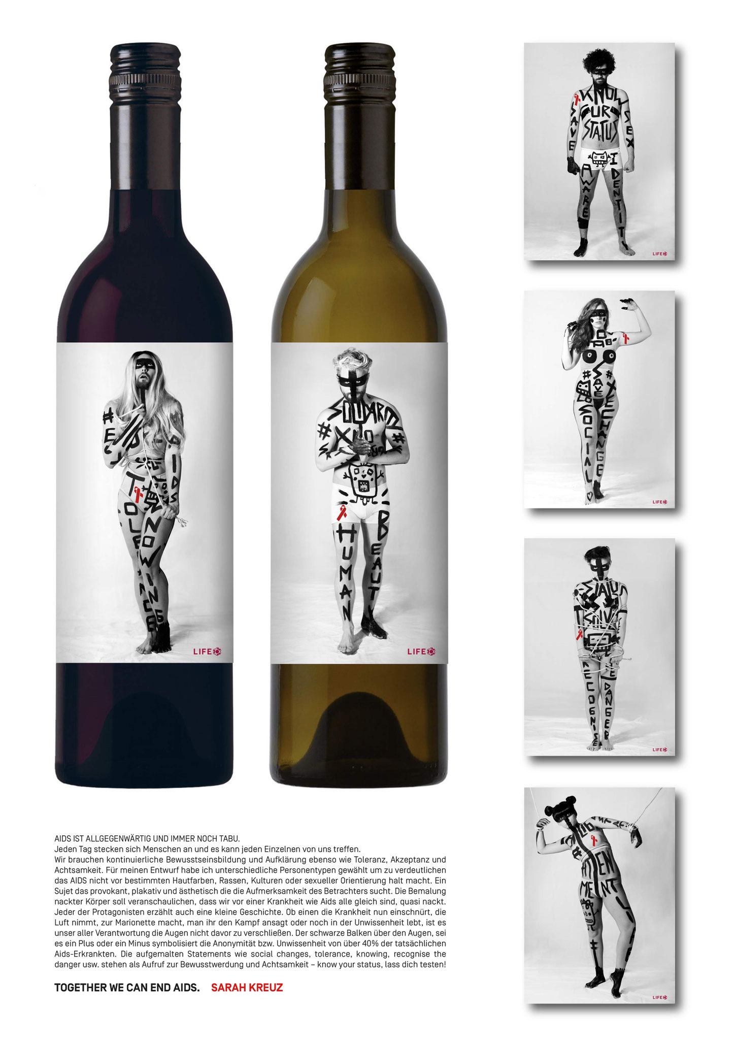
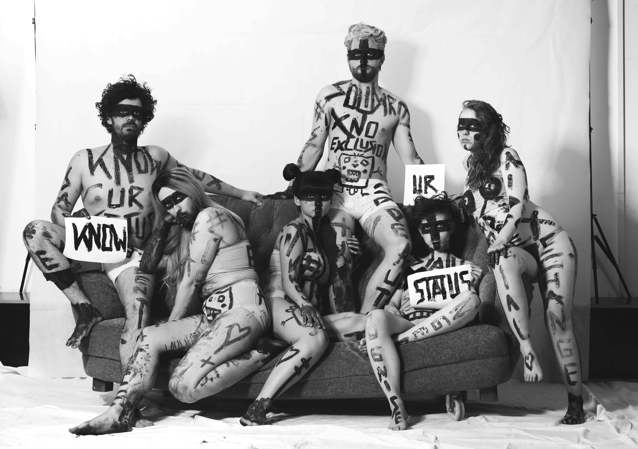
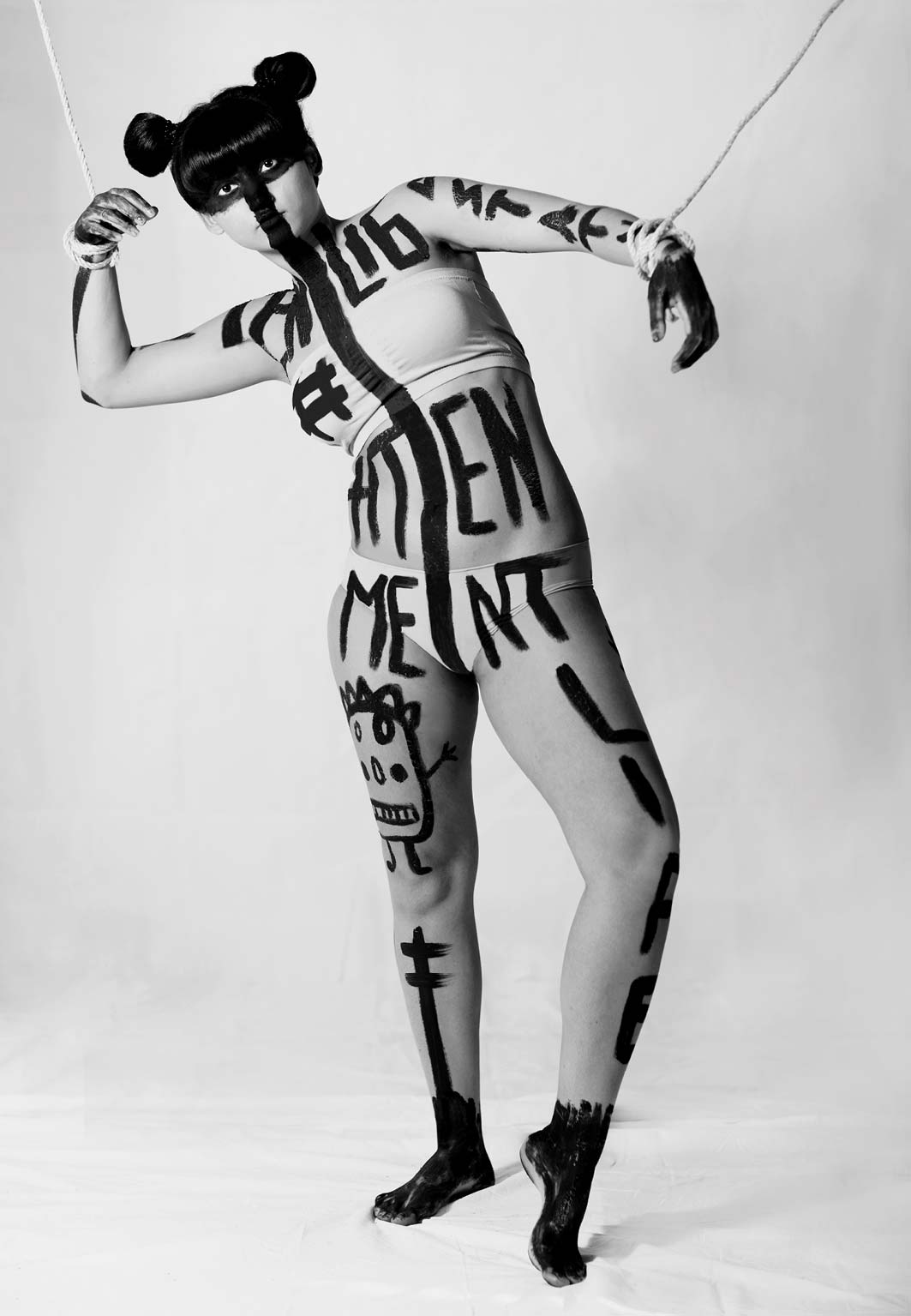
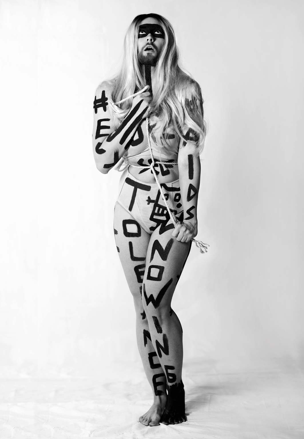
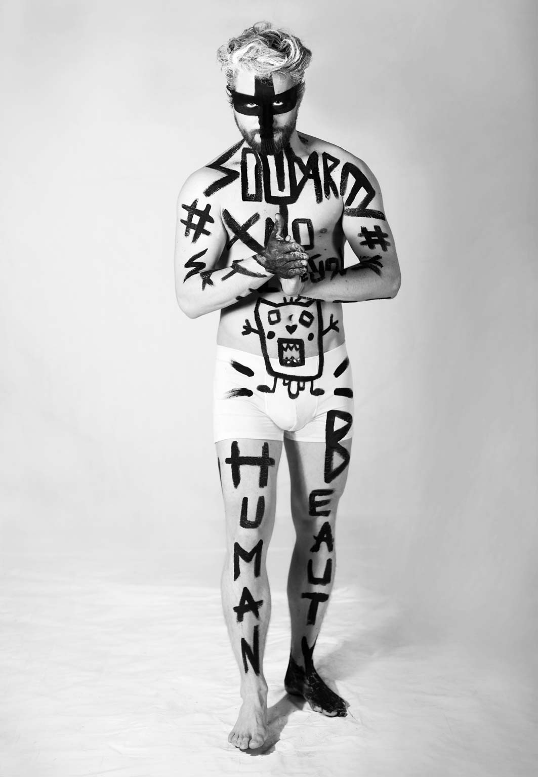
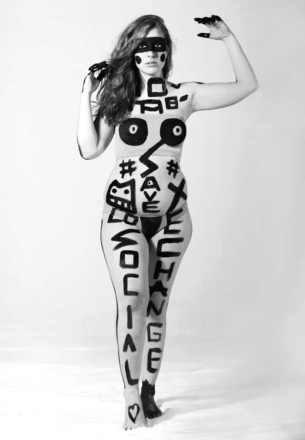
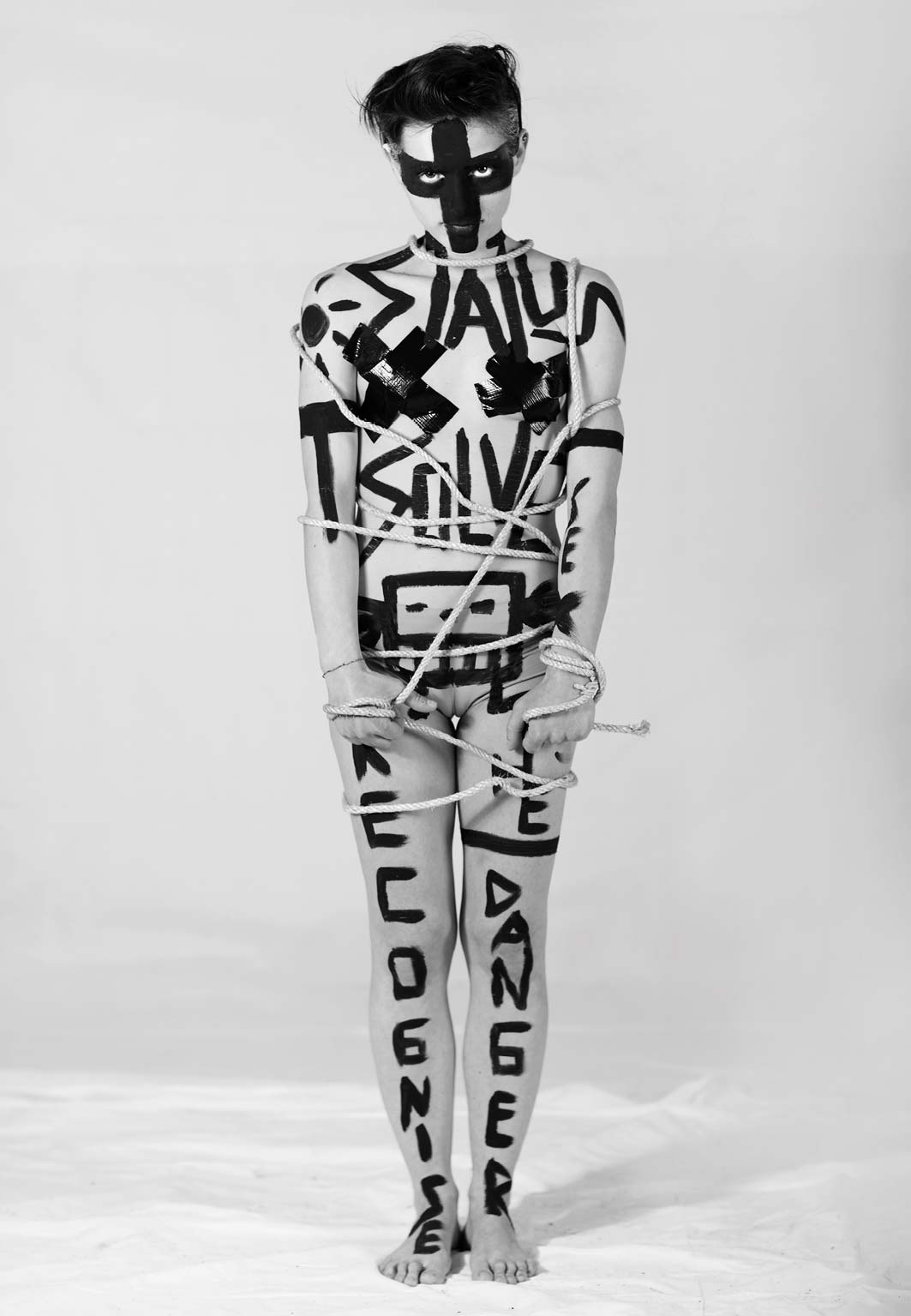
WINE LABELS - LIFE BALL 2017
Every day people get infected and it could be anyone. We need continuous raising of awareness as well as tolerance, acceptation and attentiveness. For my design I used different types of people to show that AIDS doesn't stop before skin color or races, culture or sexual orientation. I wanted to create a sujet which is striking and provocatively as well as esthetic. The painted, naked bodies should show that we are all equal, all naked in front of a sickness like AIDS. Every person tells also a story. It is our responsibility to NOT close our eyes in front of AIDS. The black bar over their eyes, a plus or a minus stands for the unknown of over 40% diseased. The painted statements like social changes, tolerance or know your status, stands for a call to broaden awareness and attentiveness - know your status - lass dich testen! Together we can end AIDS.


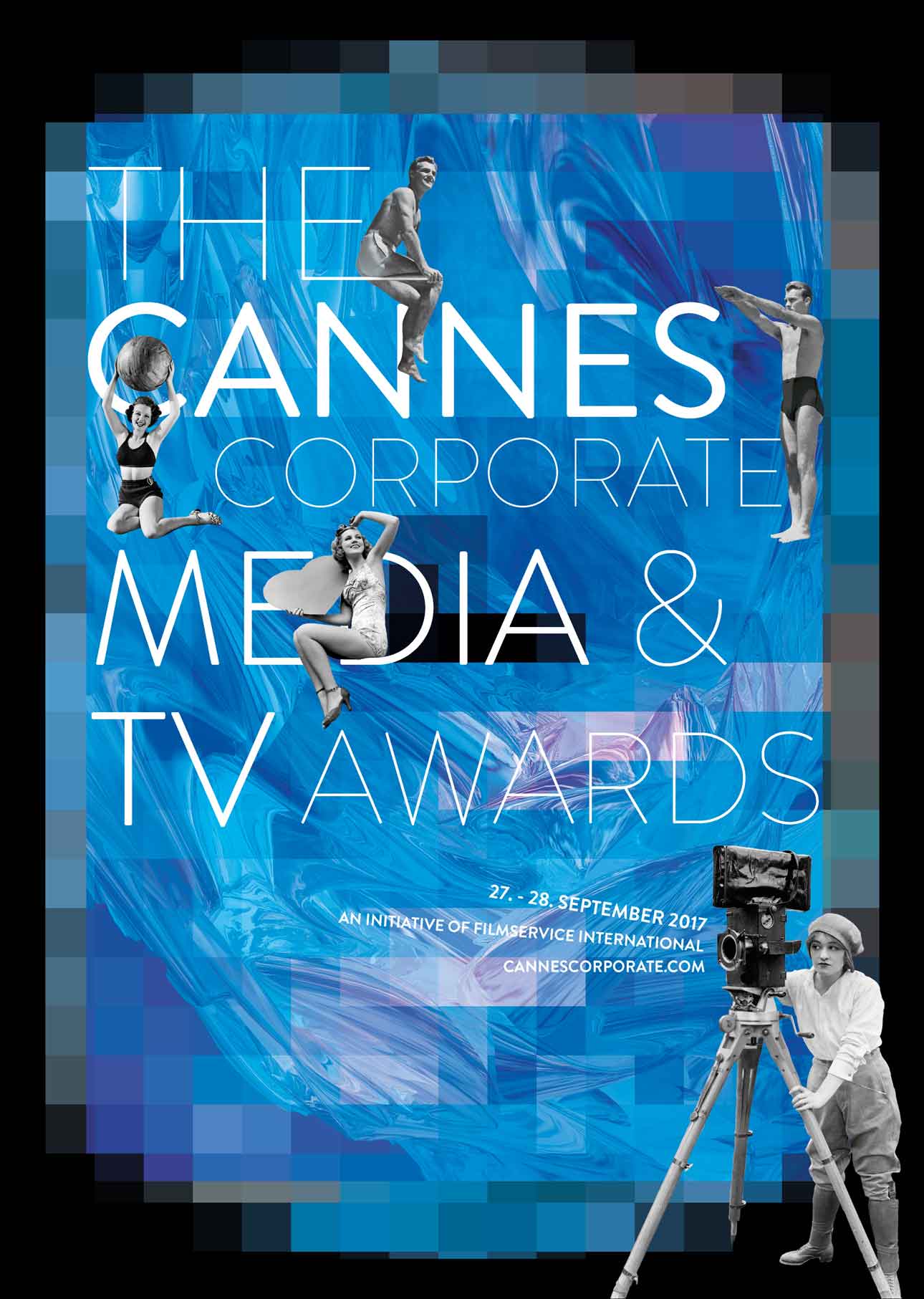
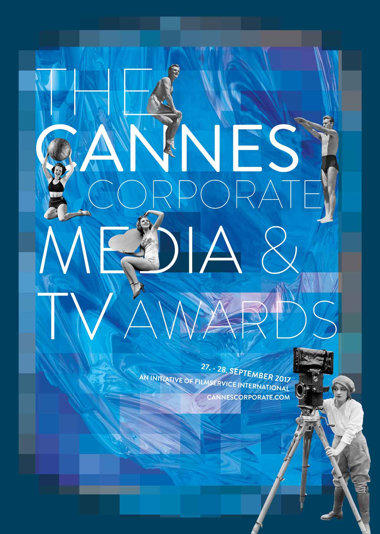
CERTIFICATE DESIGN - CANNES CORPORATE 2017
In 2017, I had the great opportunity to design the diplomas for the Cannes Corporate Media & TV Awards. The frame represents the view through the camera. The image is resolved by the large pixels. The 3D element in the background should represent the ocean, the constant movement. From the heart of the media world to the immersive sea of Cannes.


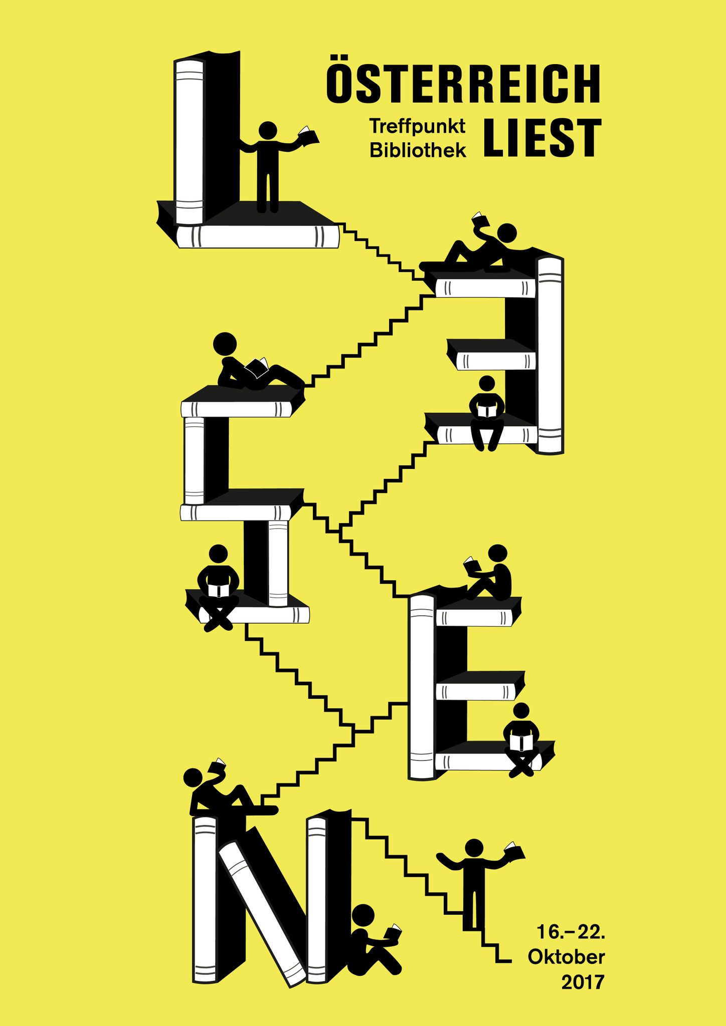
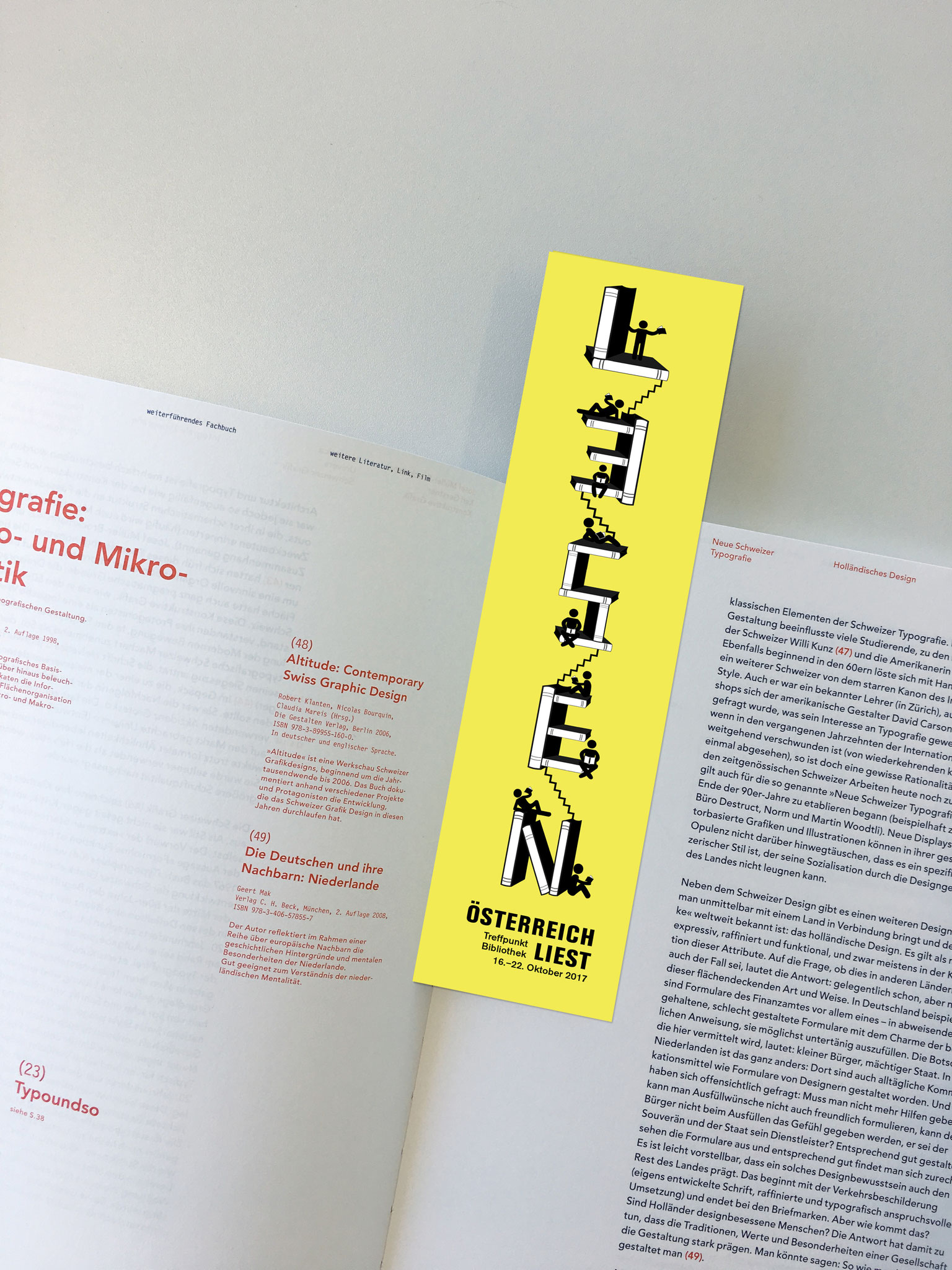
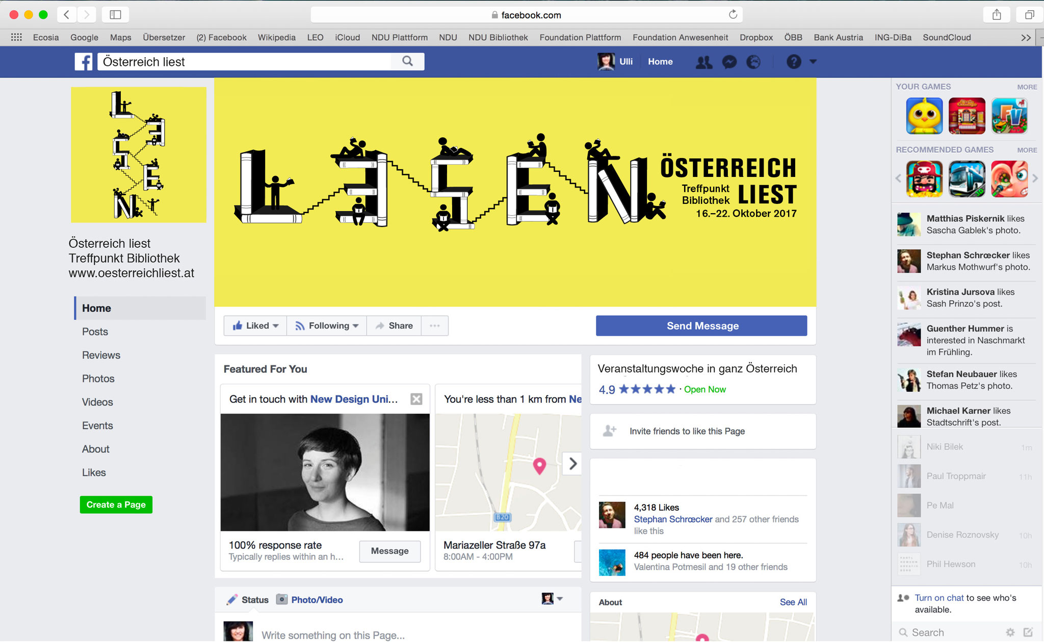
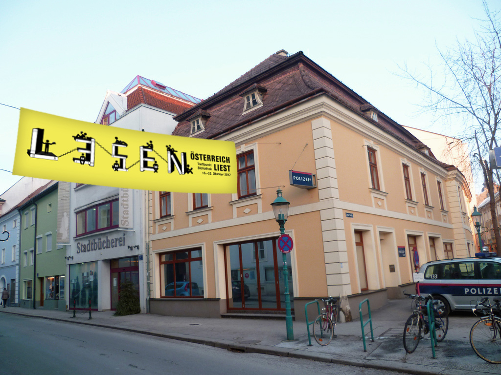
KEY VISUAL- ÖSTERREICH LIEST 2017
I had the chance to design the key visual for the festival "Austria Reads" - "Österreich liest" which takes place every year in Austria. For the design, I thought about libraries and seeing this place as an meeting point for intellectual exchange. I designed books and put them together so that they look like a letter. I thought of an integral part as part of an library. Reading a book also means getting emotional and relax or feel happy or so much tension that you even can't stop reading ... The various pictograms I designed should exactly represent this feeling. The steps between each letter or integral part symbolizes the connection of each library in Austria as well as the rise of knowledge.


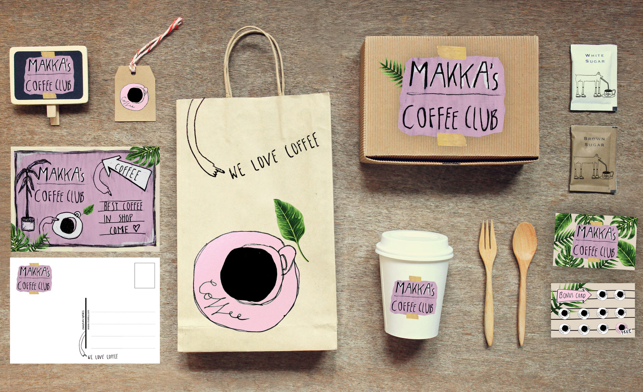
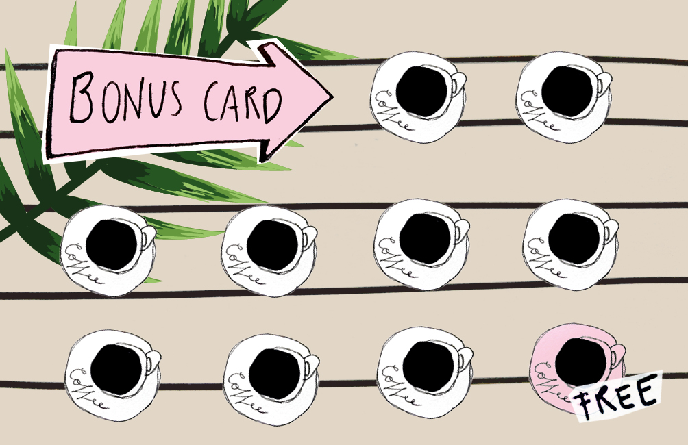
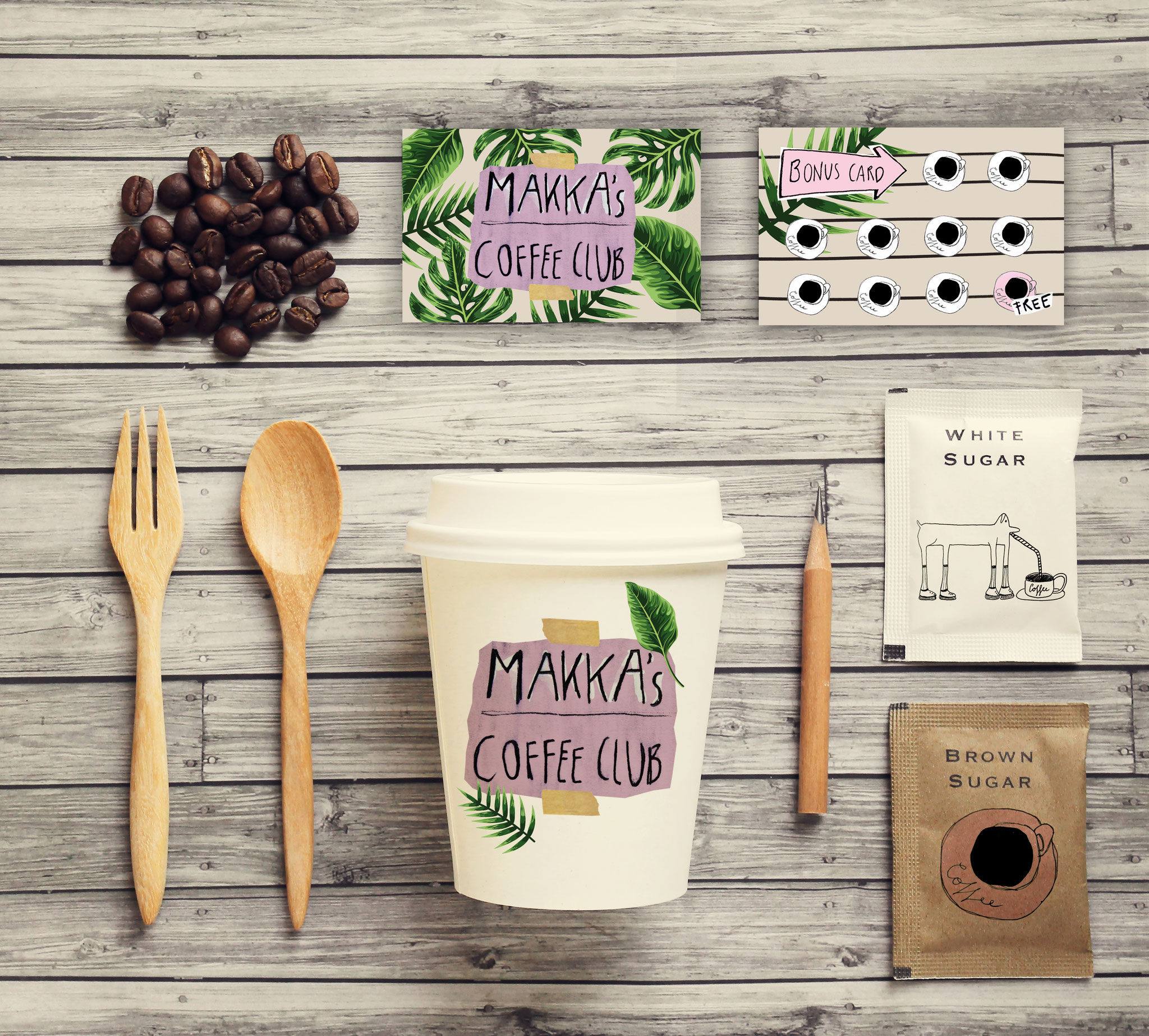
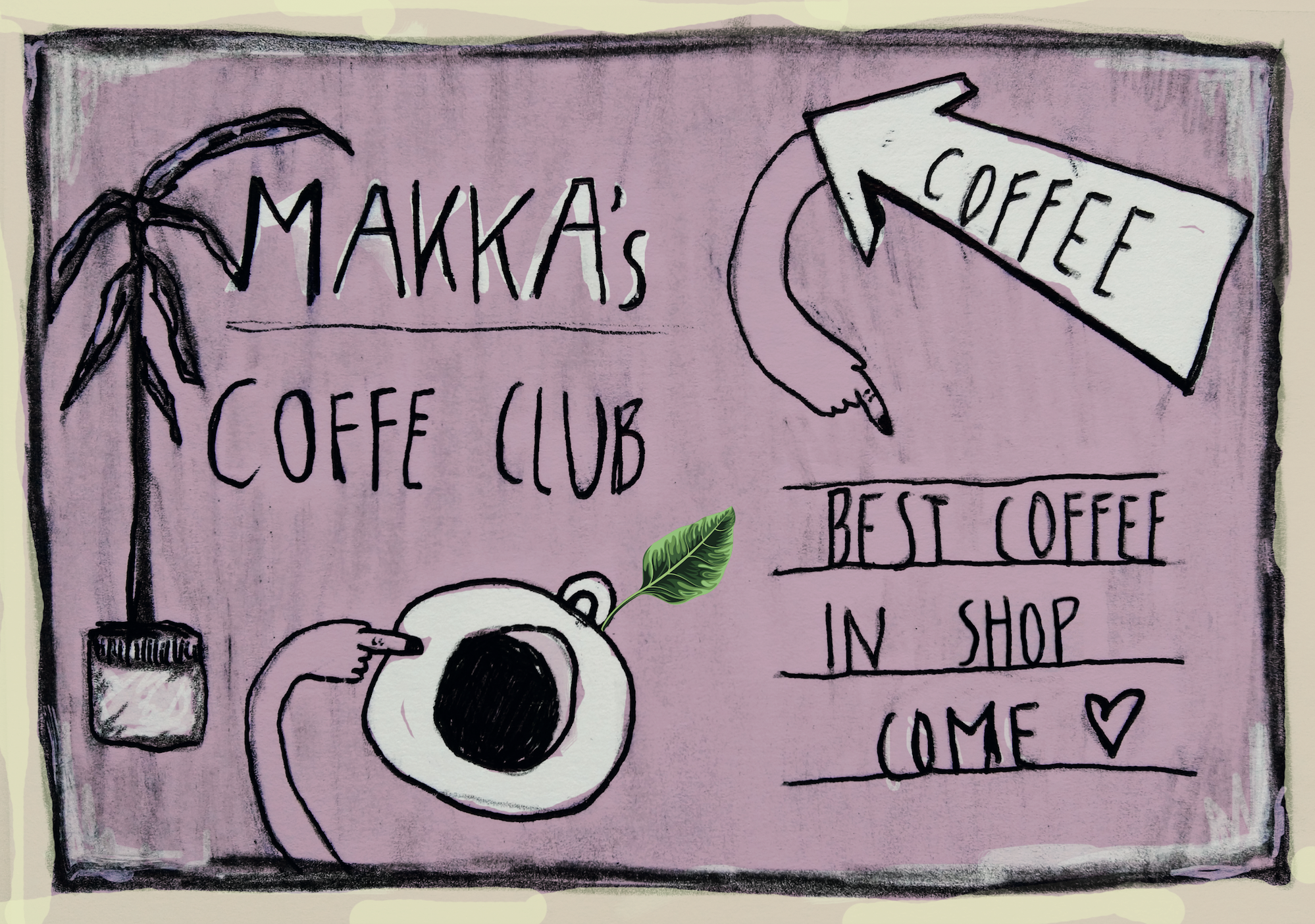
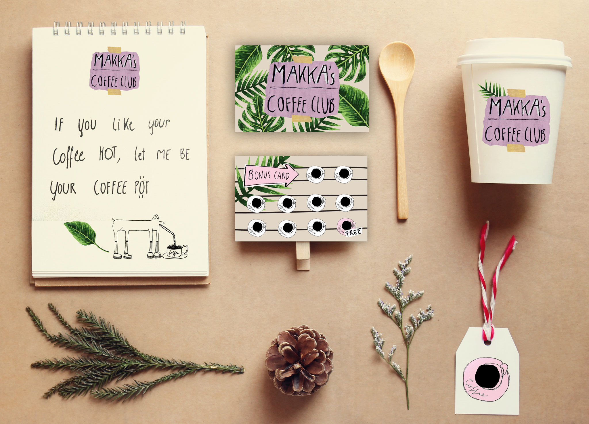
GRAPHIC DESIGN PACKAGE
This Graphic Design Package I created for the urban coffee shop "makka".
It includes logo, postcards, bonus cards and stickers.


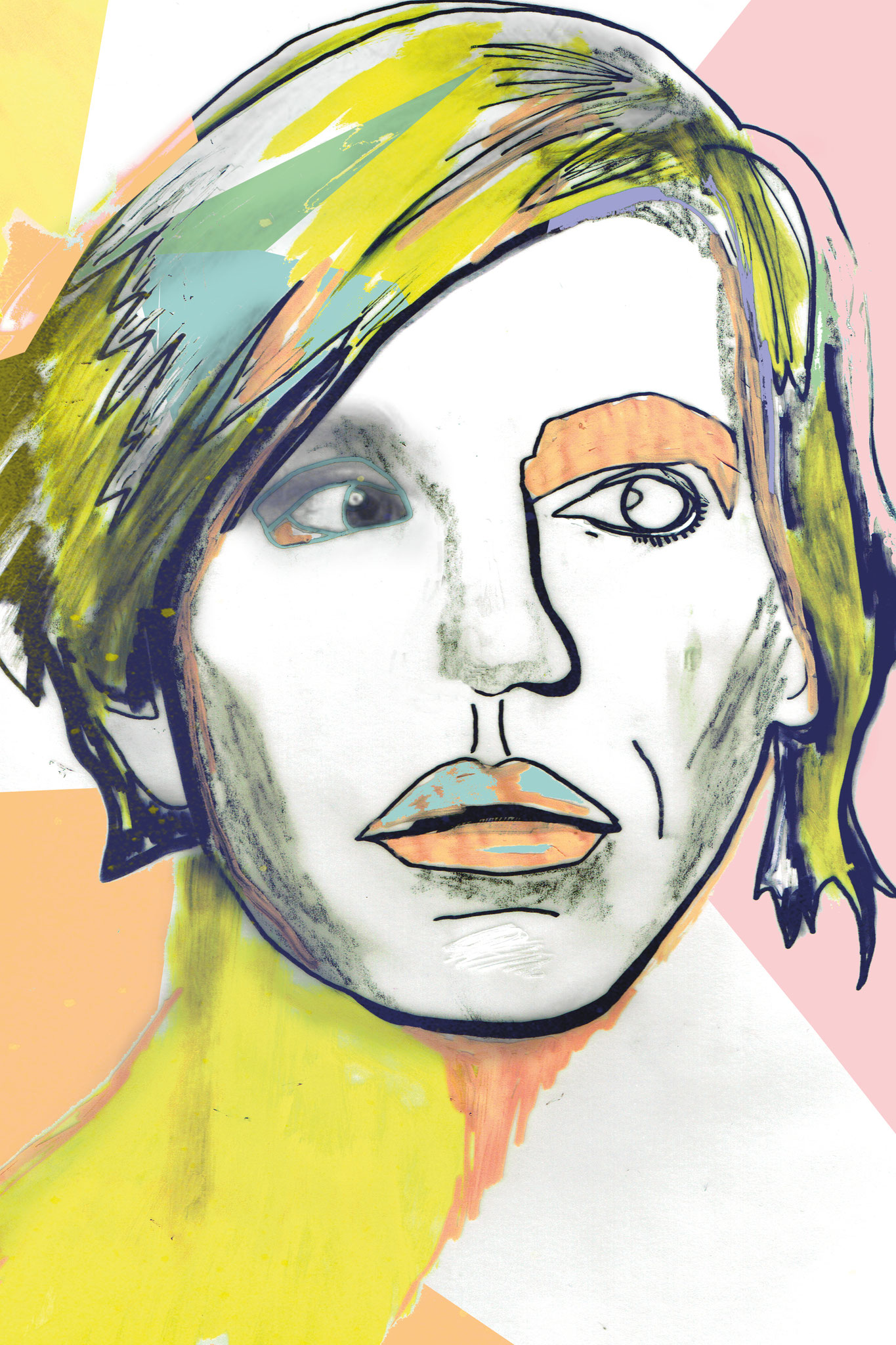
ILLUSTRATION
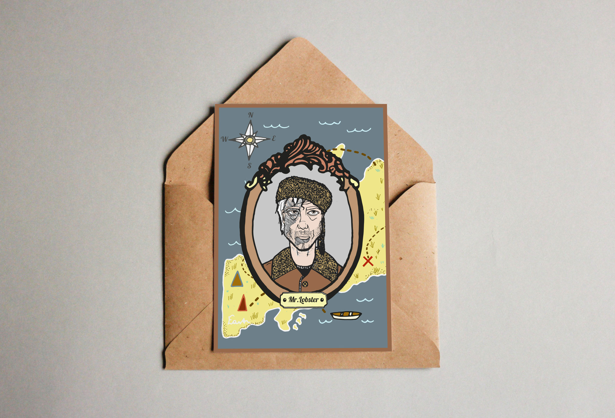
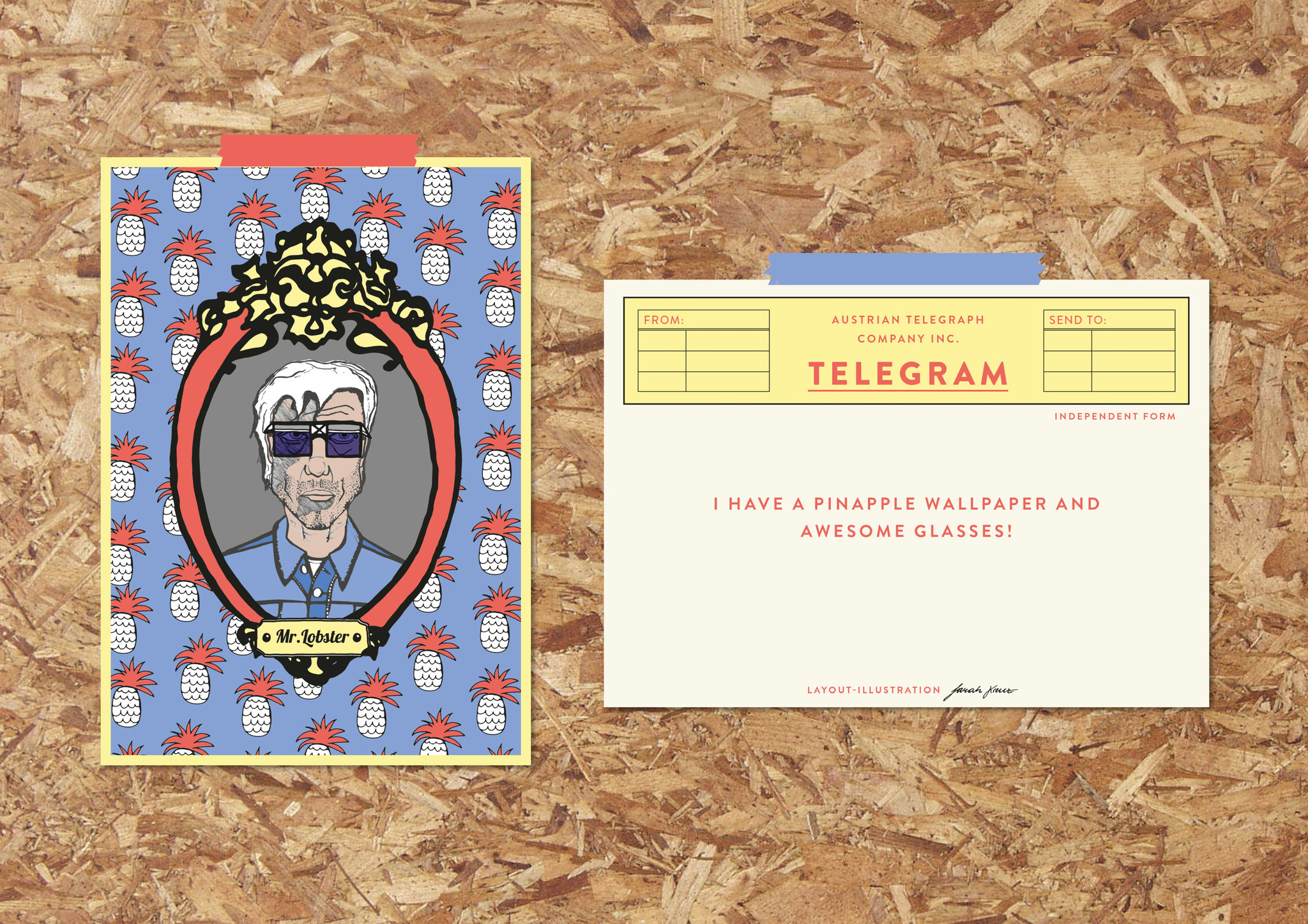
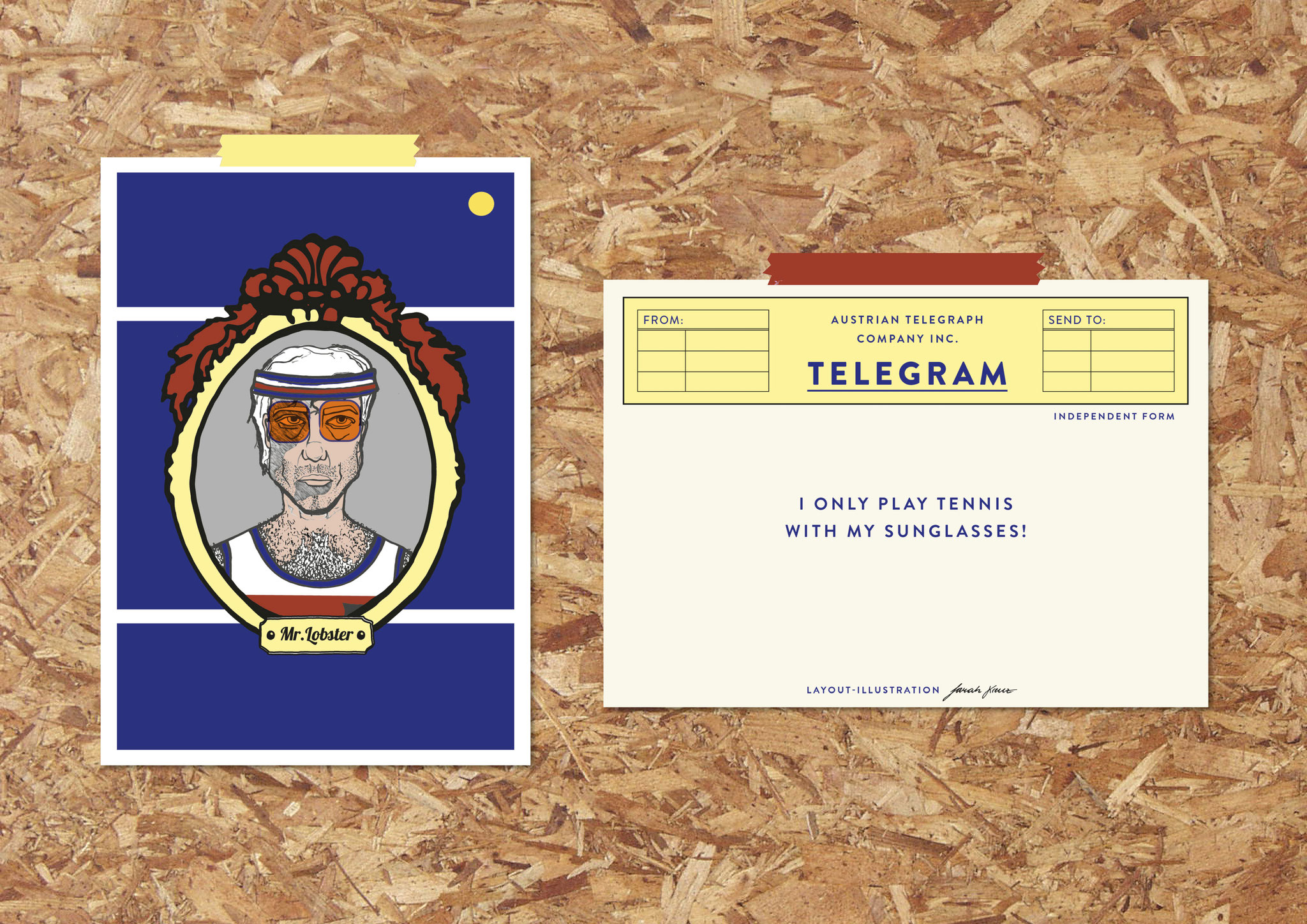
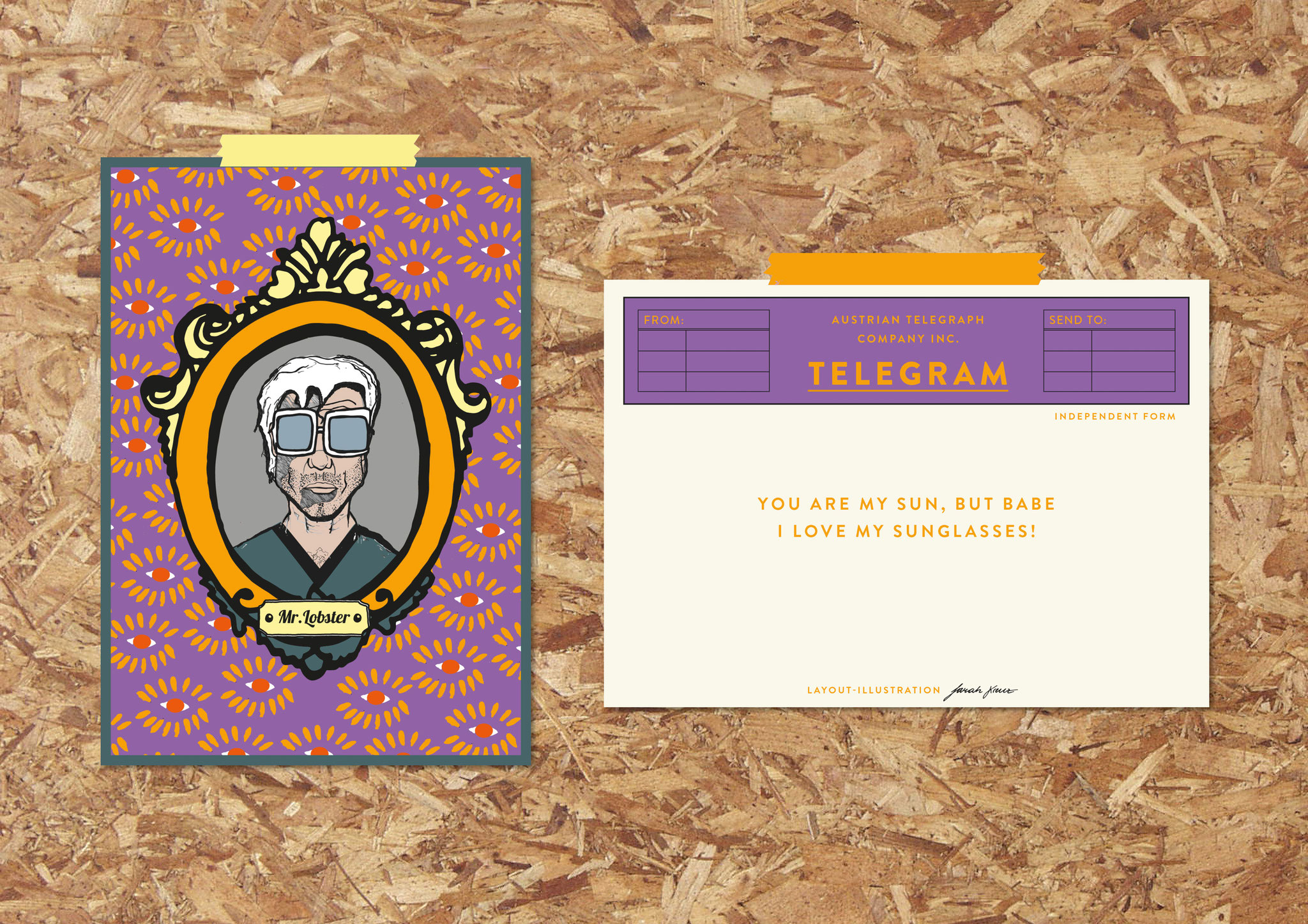
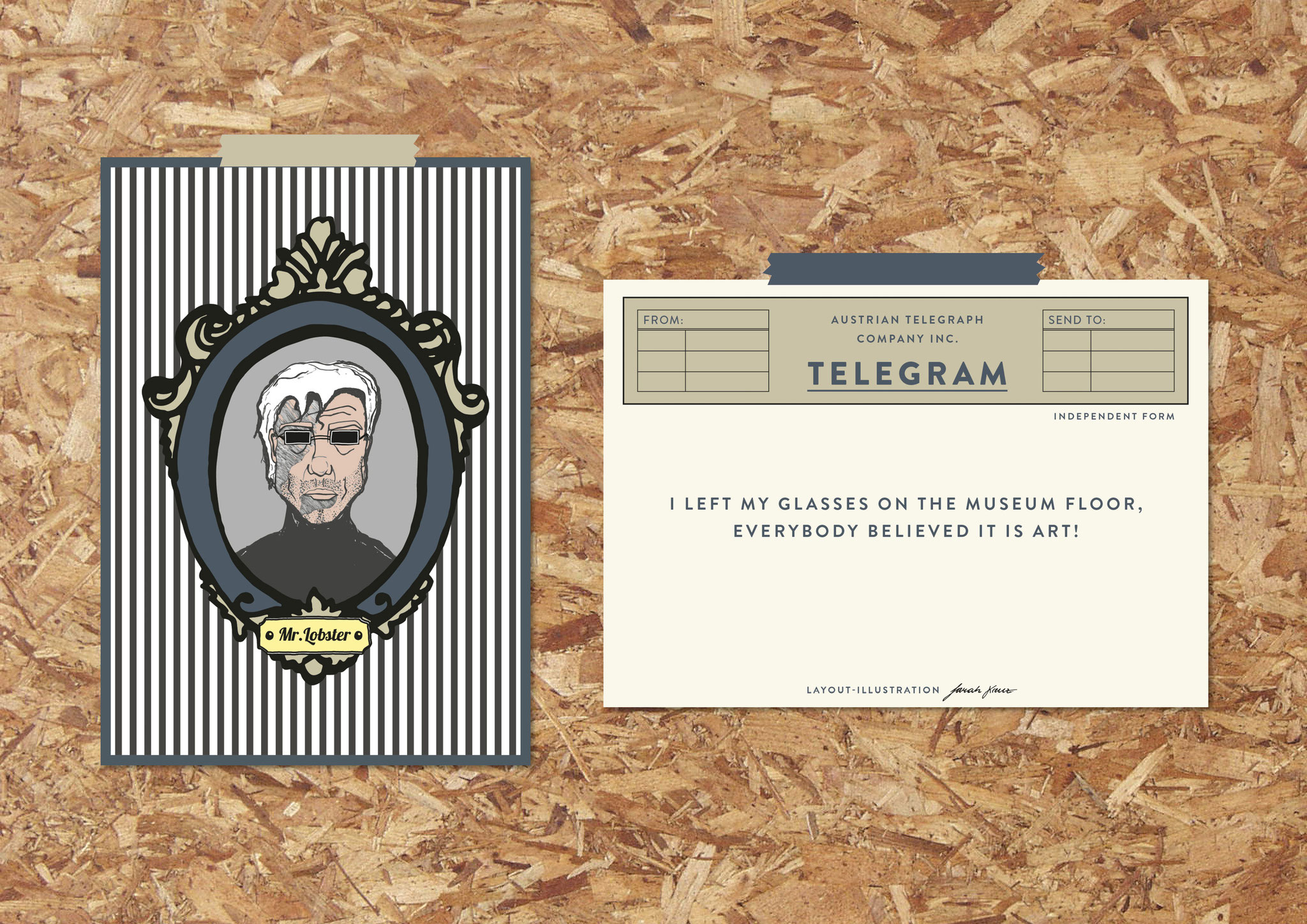
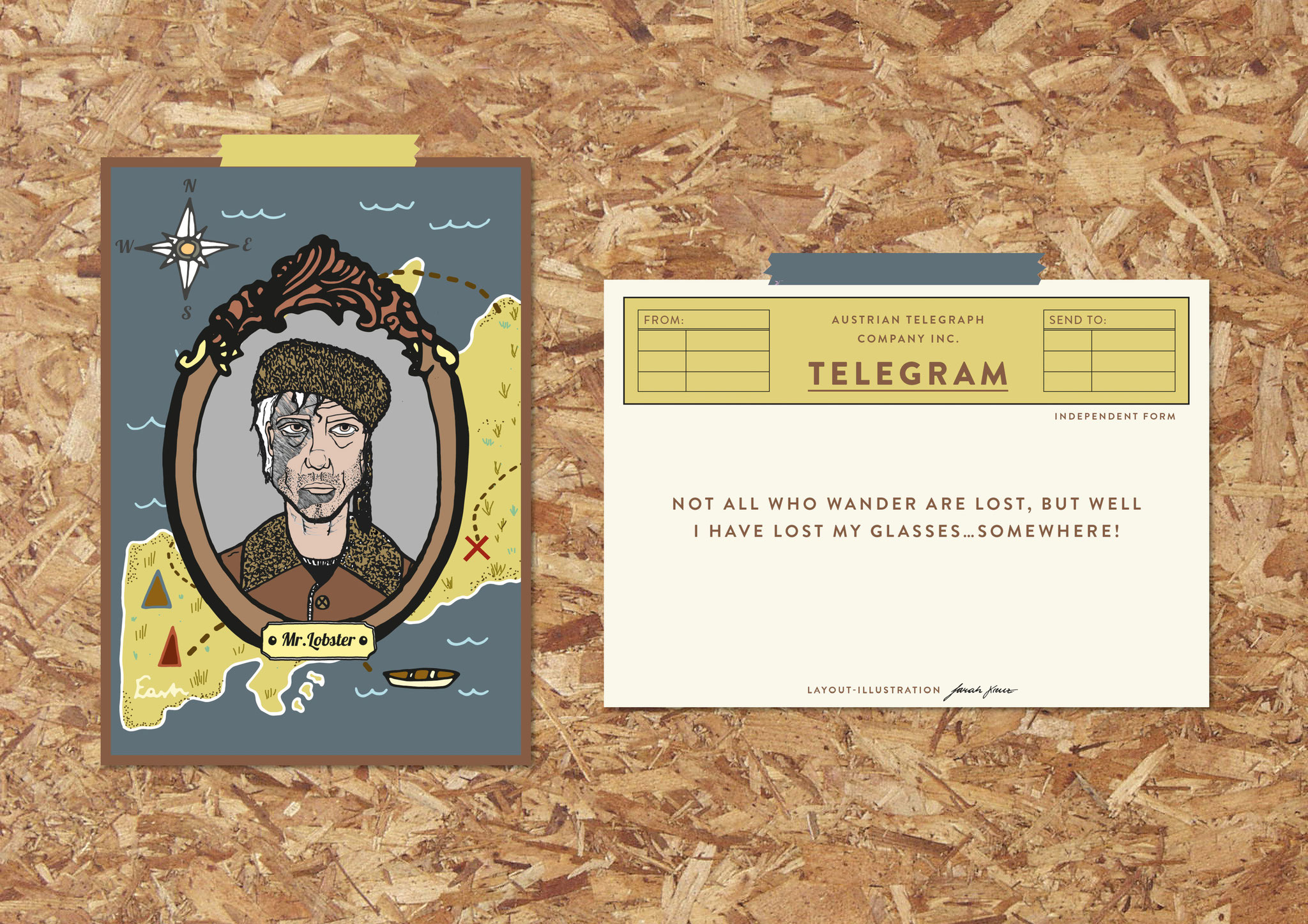
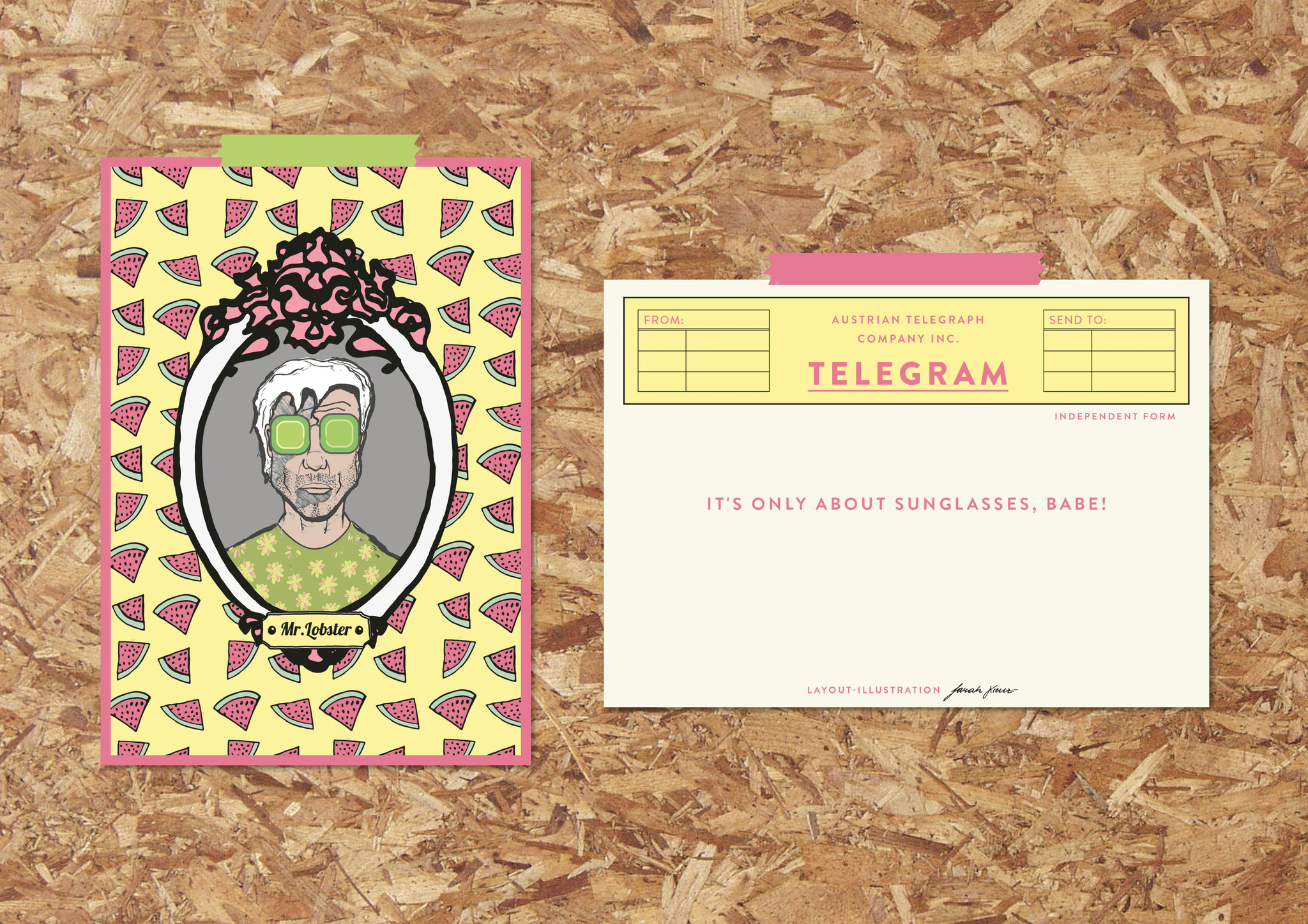
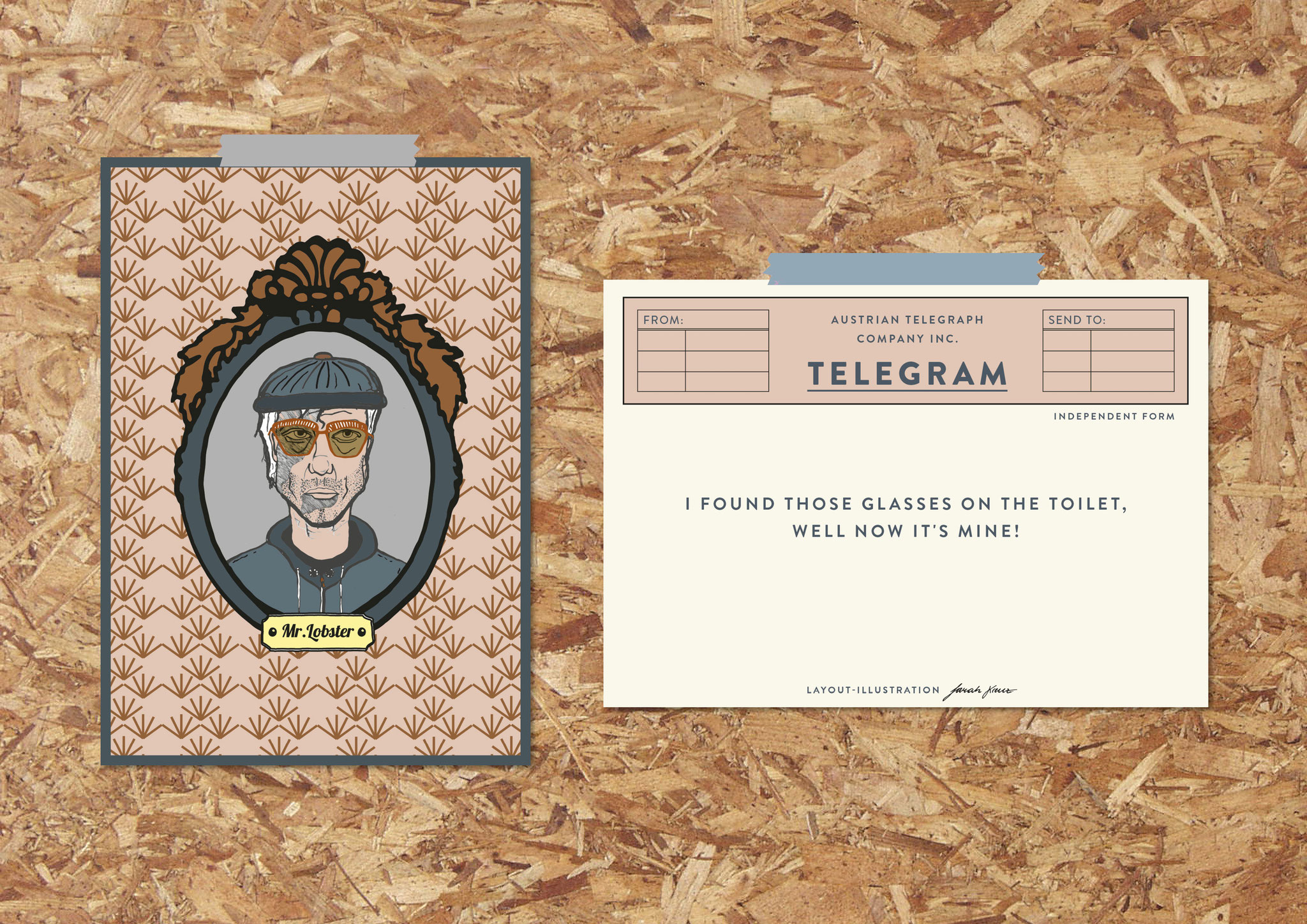
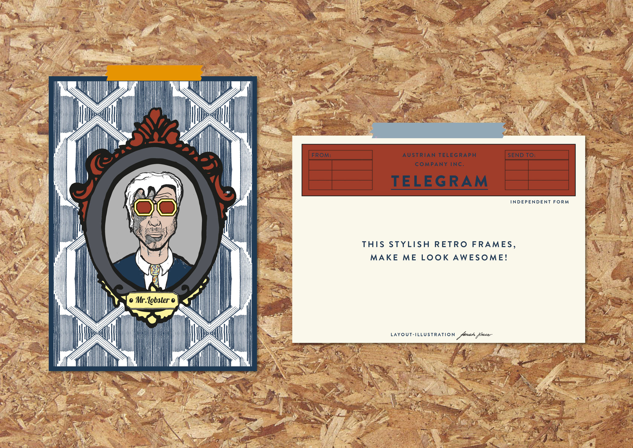
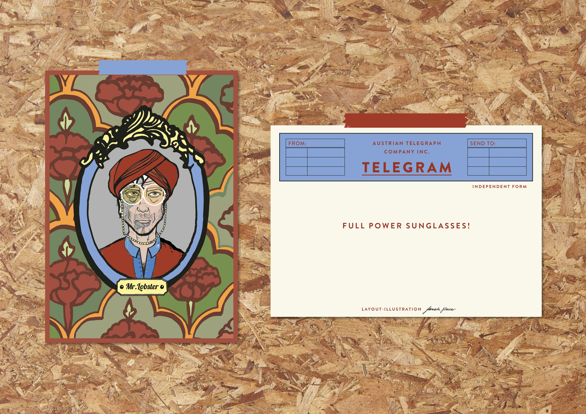
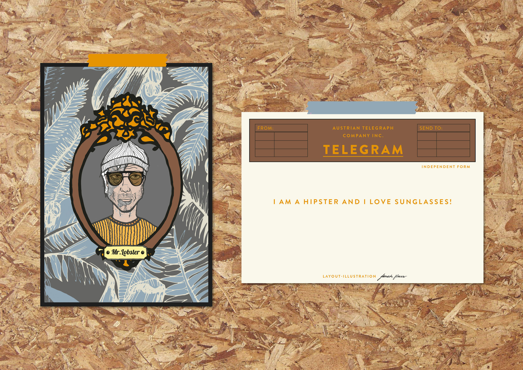
MR. LOBSTER - ILLUSTRATION
This illustration is a story about sunglasses changing. Mr. Lobster postcards are available with different outfits and different stories about his stylish sunglasses. On the reverse side there you can find funny or odd sentences or statements.


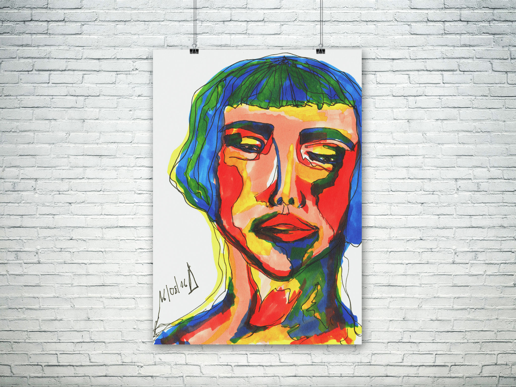
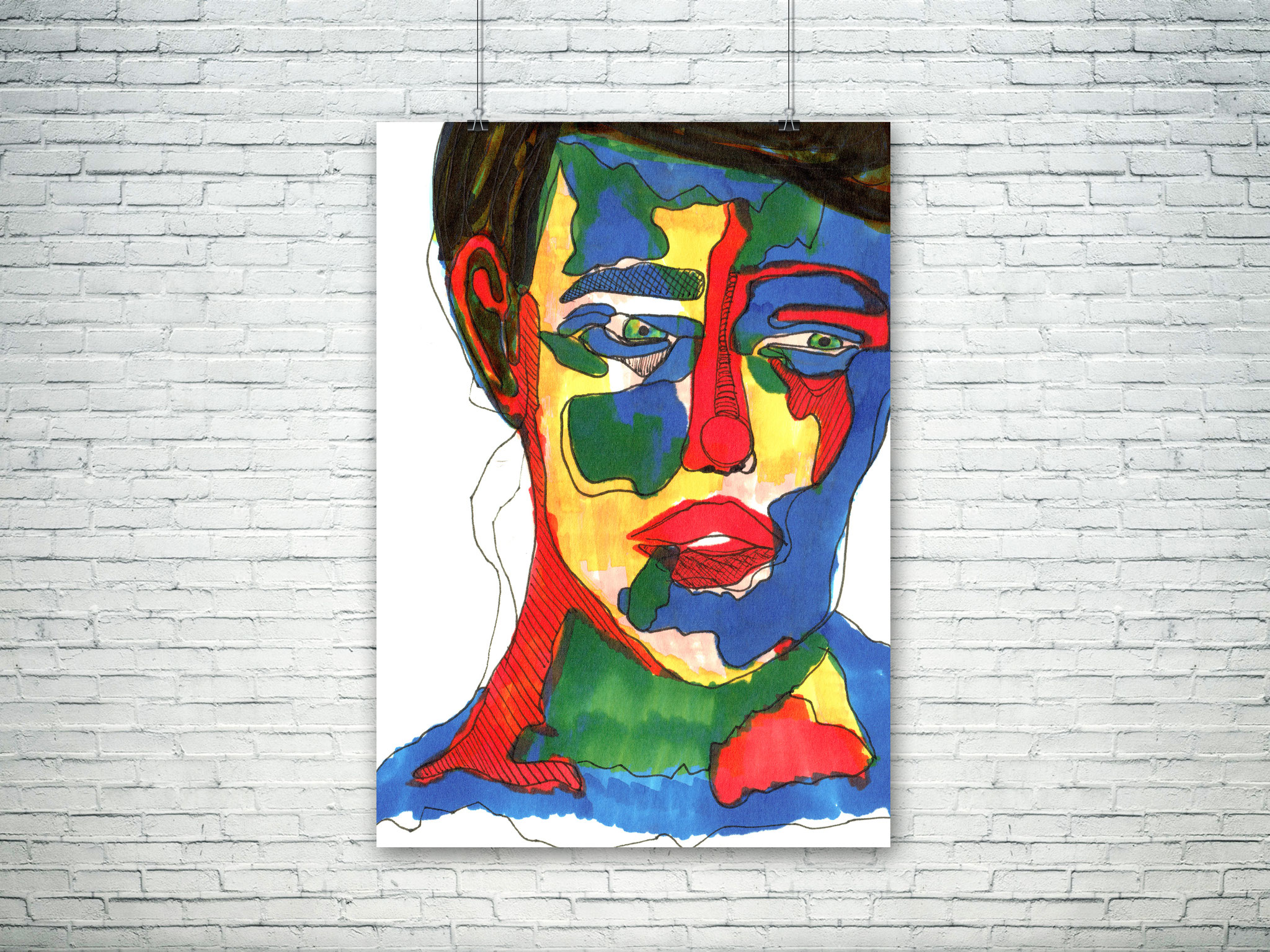
THE ODD COUPLE- ILLUSTRATION


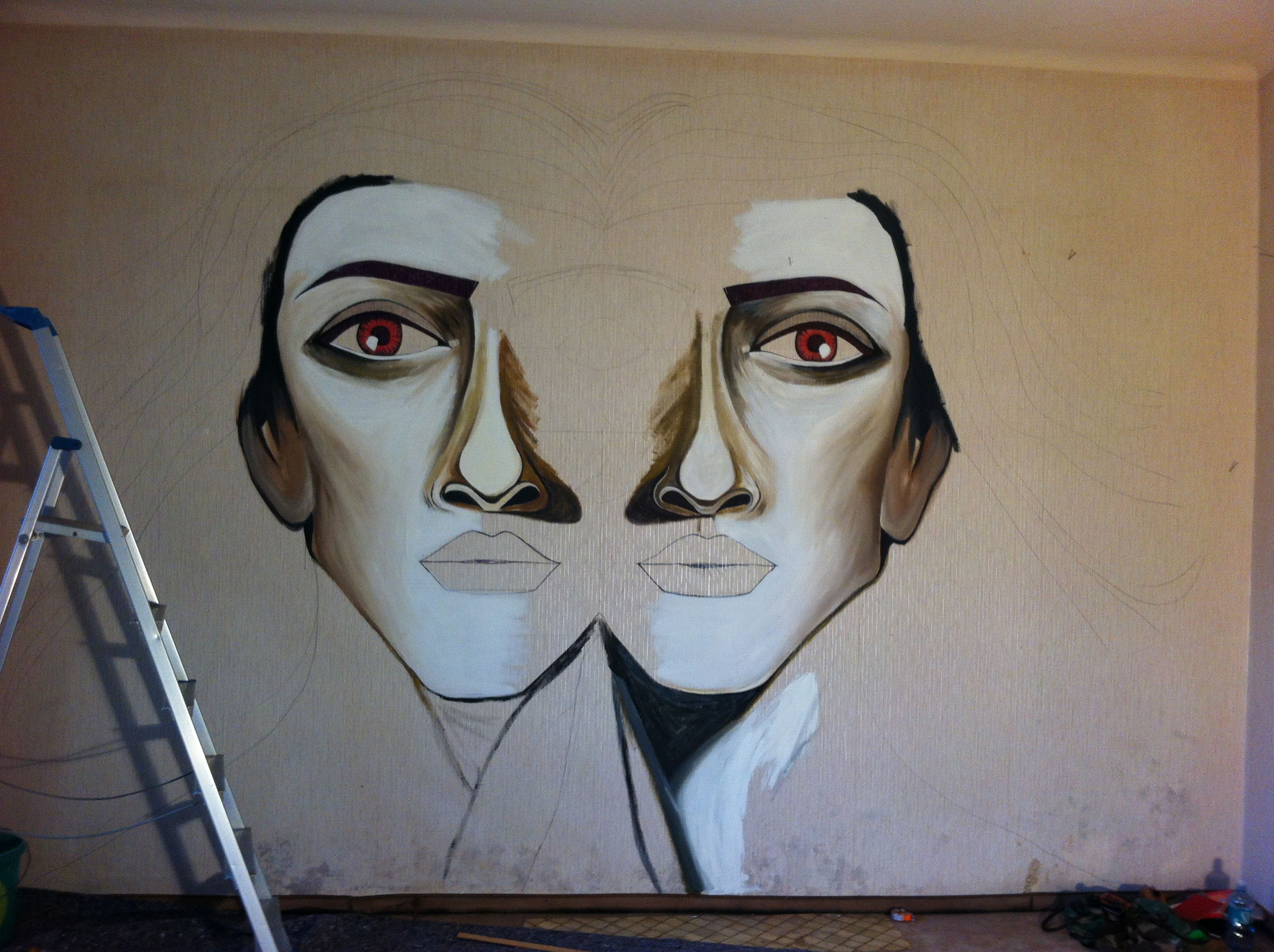
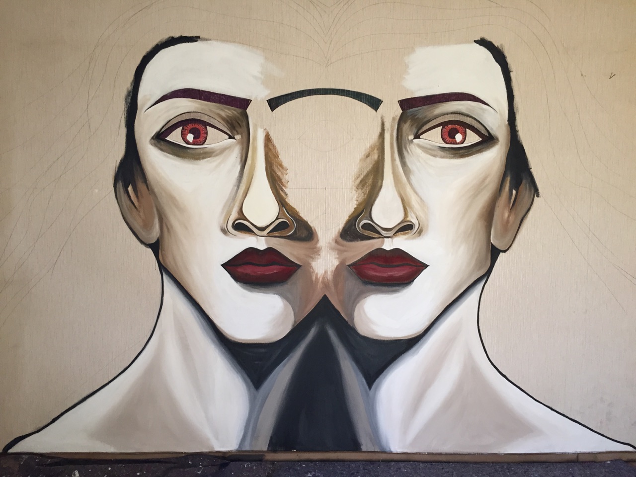
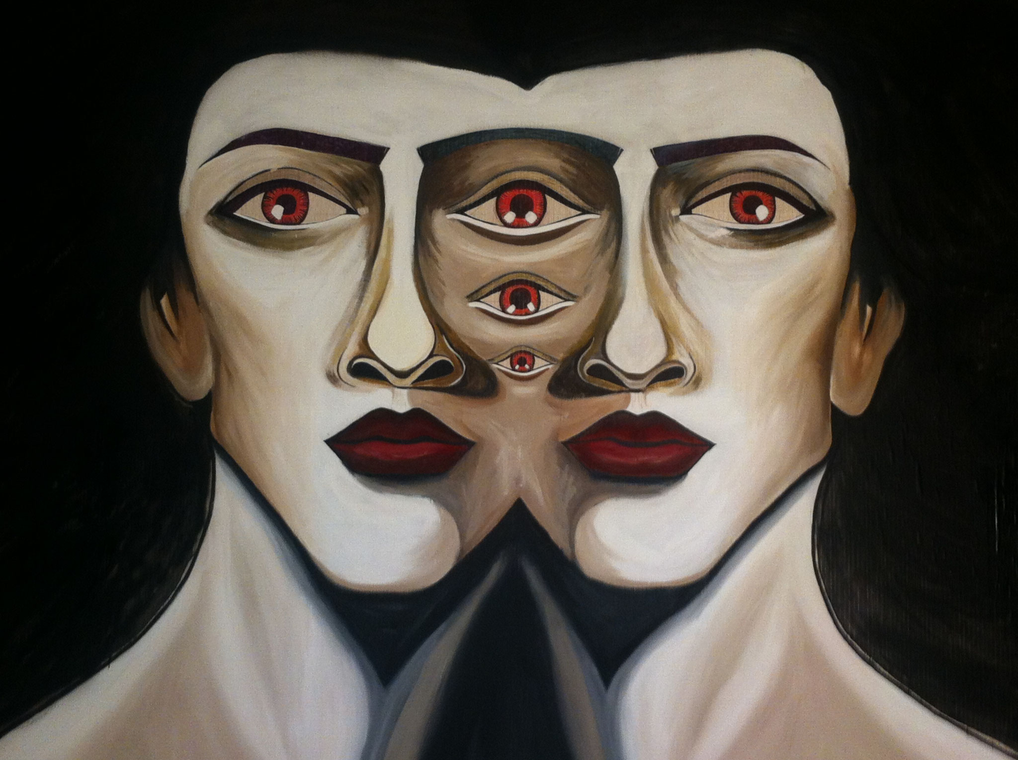
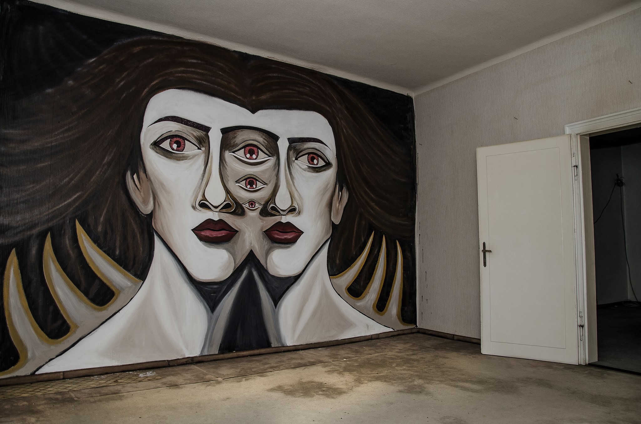
3rd EYE - WALLPAINTING
This is a 3m high wallpainting i did in a friends house. Luckily we won the fm4 private session and the austrian band "steaming satellites" where playing in front.


POSTERS
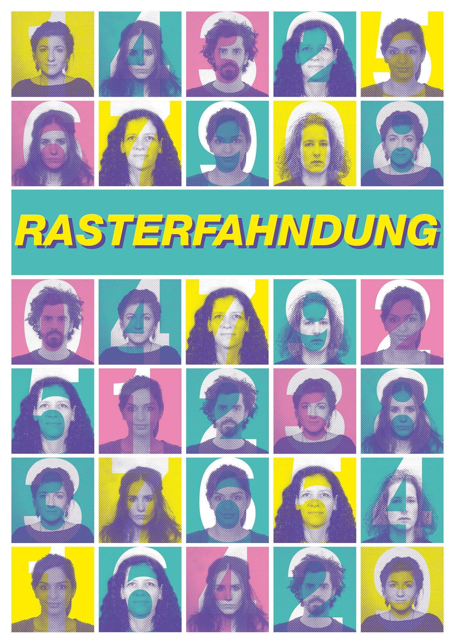
SCREENPRINT - RASTERFAHNDUNG "DRAGNET"
Dragnet - Rasterfahndung is a process of mass data processing which adjusts information from foreign stocks data with other data holdings to find certain people. This method was founded in the 1970s and the word "Rasterfahndung" was elected "word of the year" in the 1980s. It was kind of the outrider of what we call it today, monitoring. I made a 80s-style screen print, with typical colors which show passport pictures of different people with numbers, because in a computer system we are and always will be just a number.
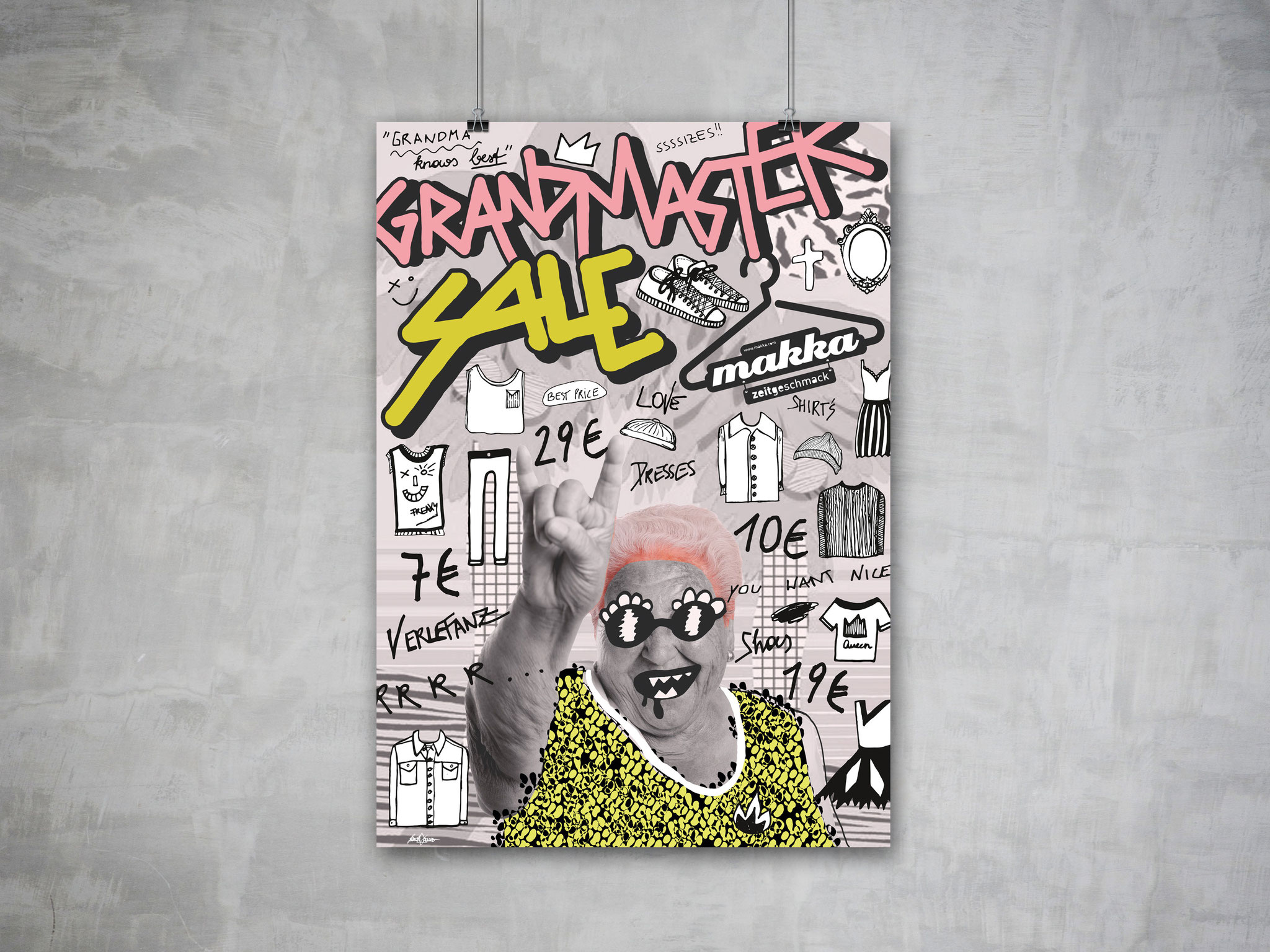
POSTER - FASHION STORE - GRANDMASTER SALE
Grandmaster Sale is A1 Poster which I designed for a street style shop "MAKKA" in Upper Austria. I painted all the small illustrations and typography to catch the costumers eye.
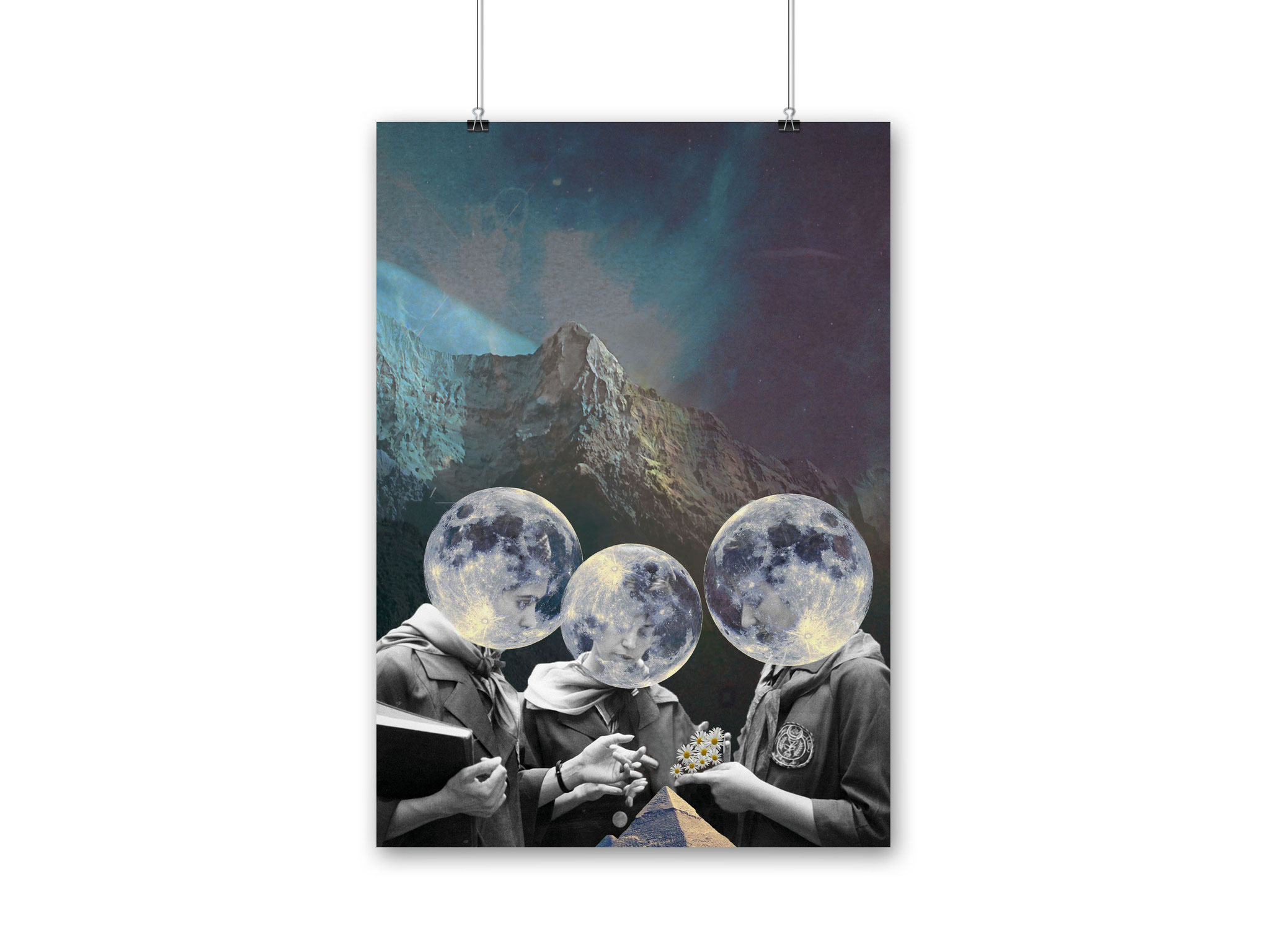
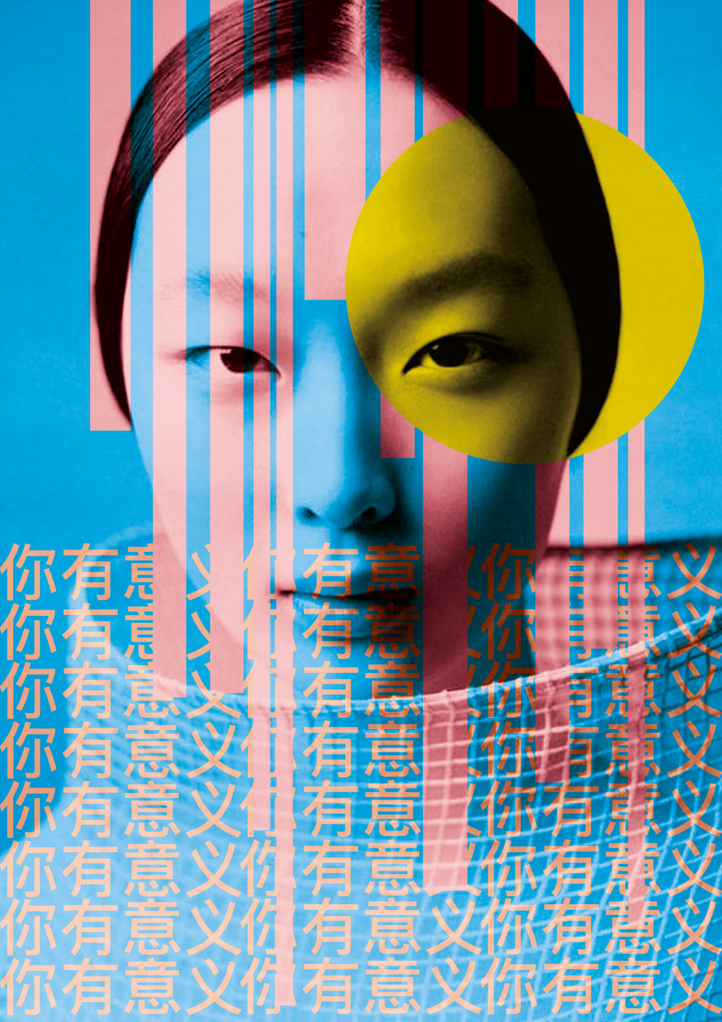
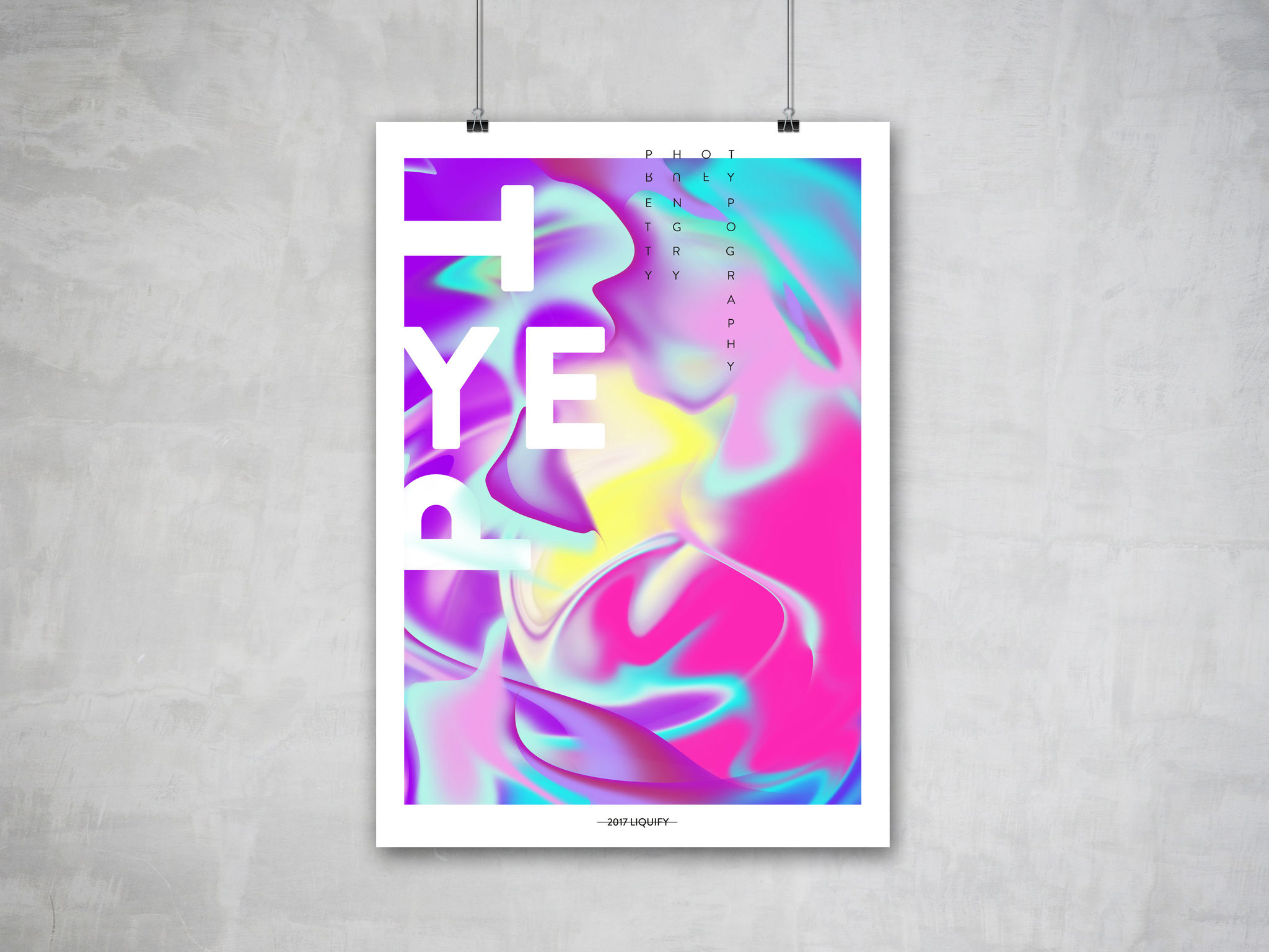
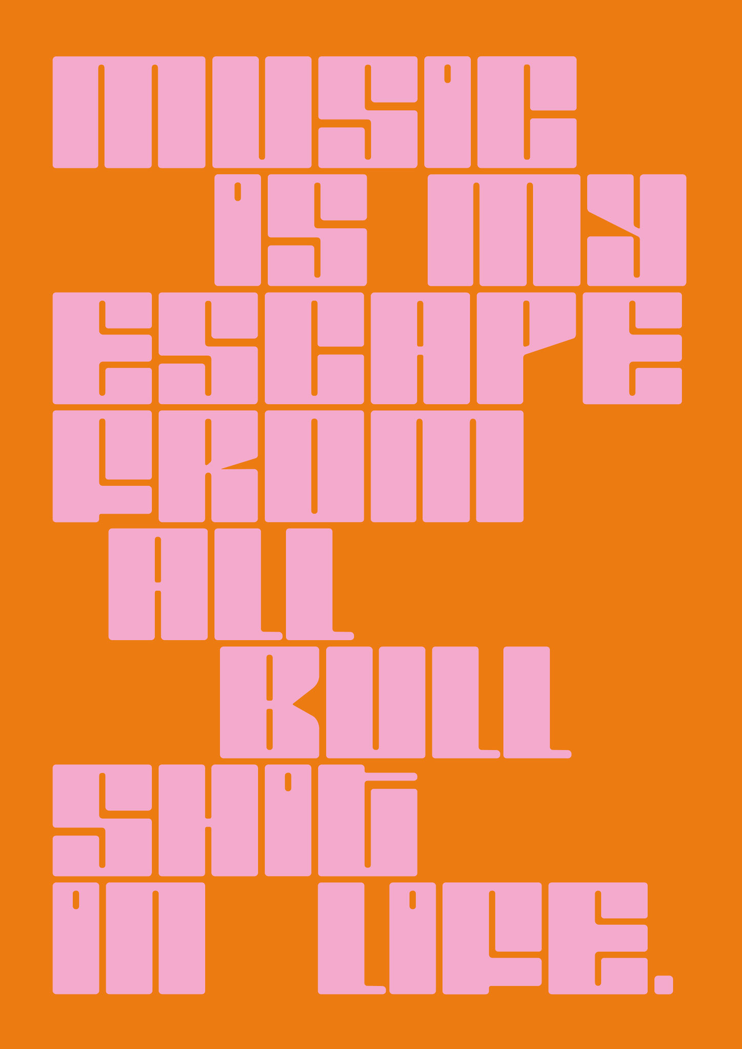
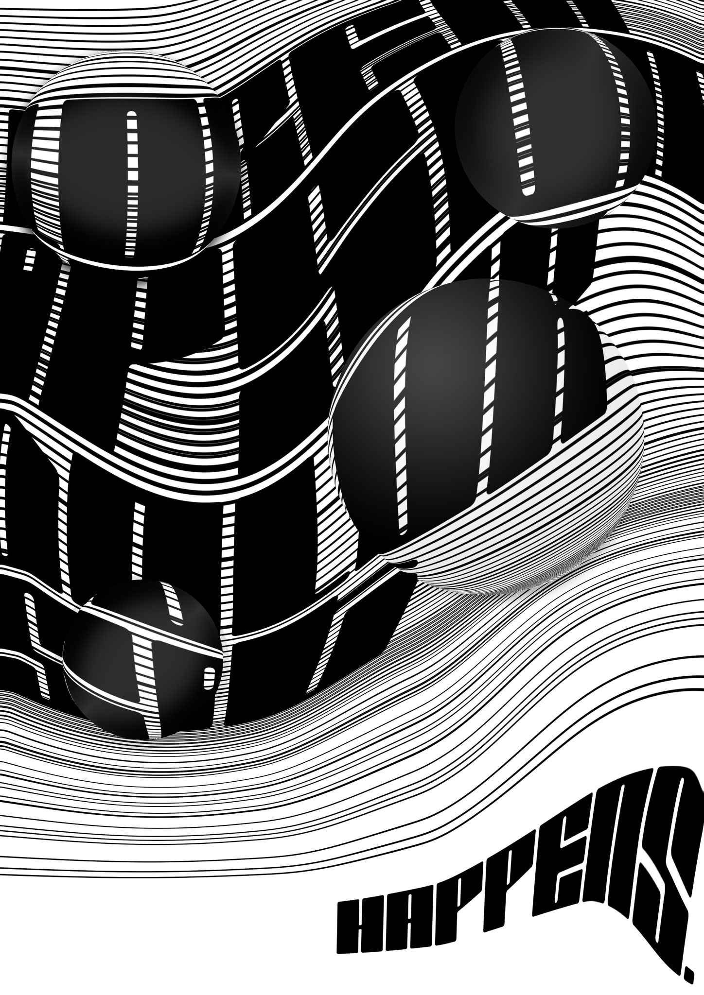
POSTERS
This series is a various collection of posters that I have created over the years.


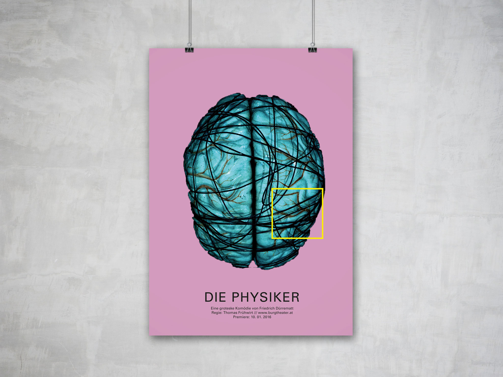
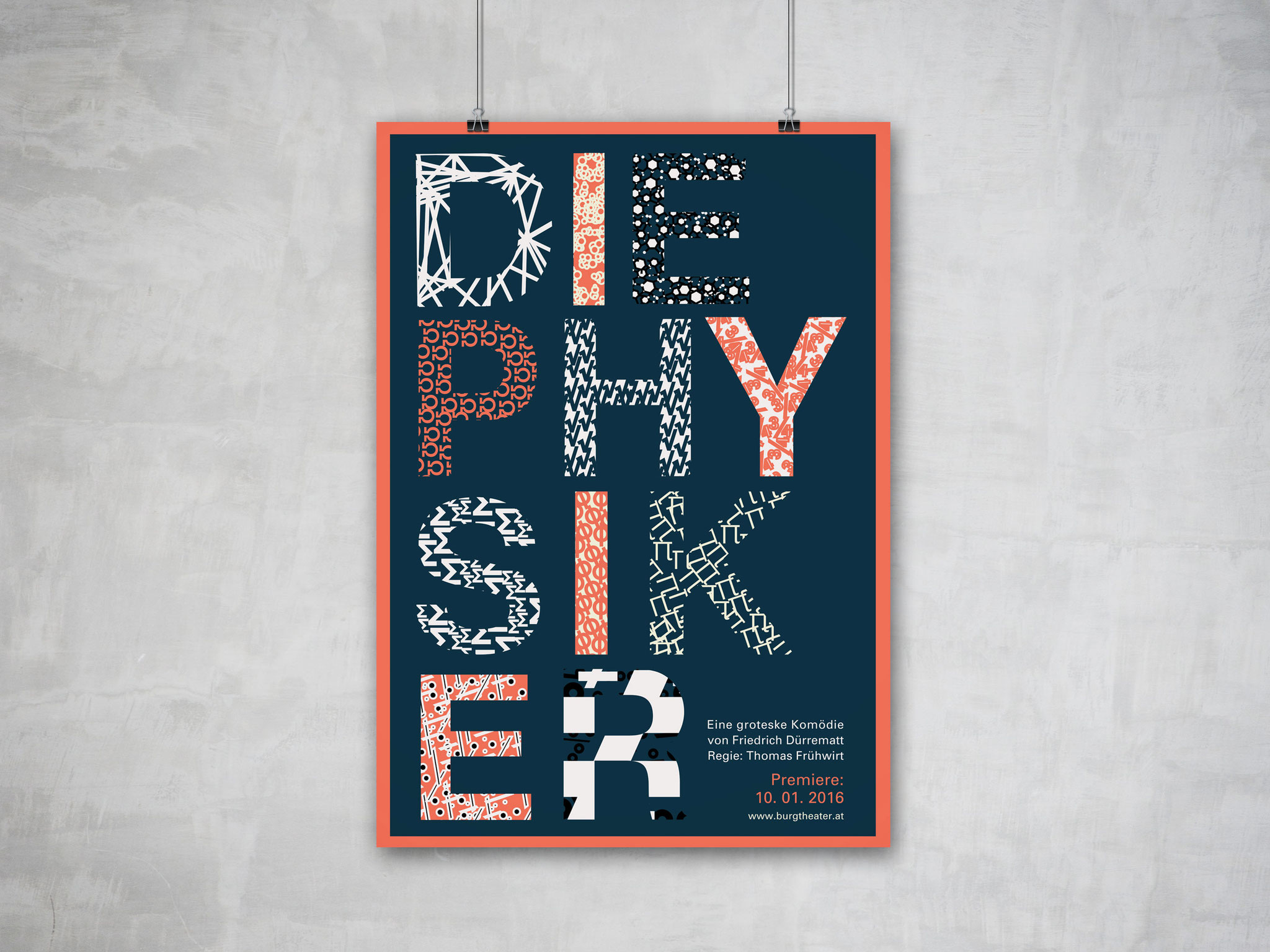
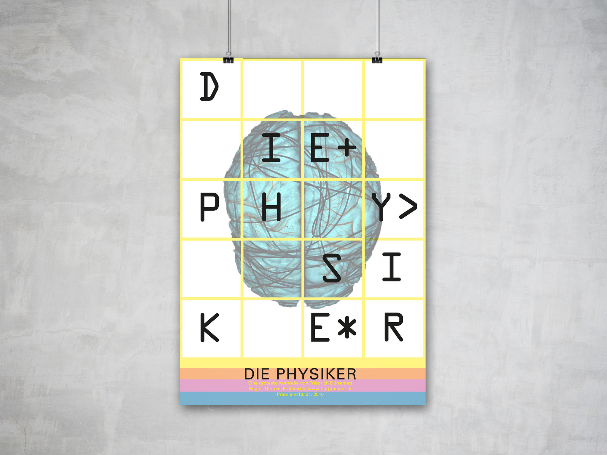
THEATERPOSTER -THE PHYSICISTS
For the theater - "the physicists" I designed three different, unique posters.


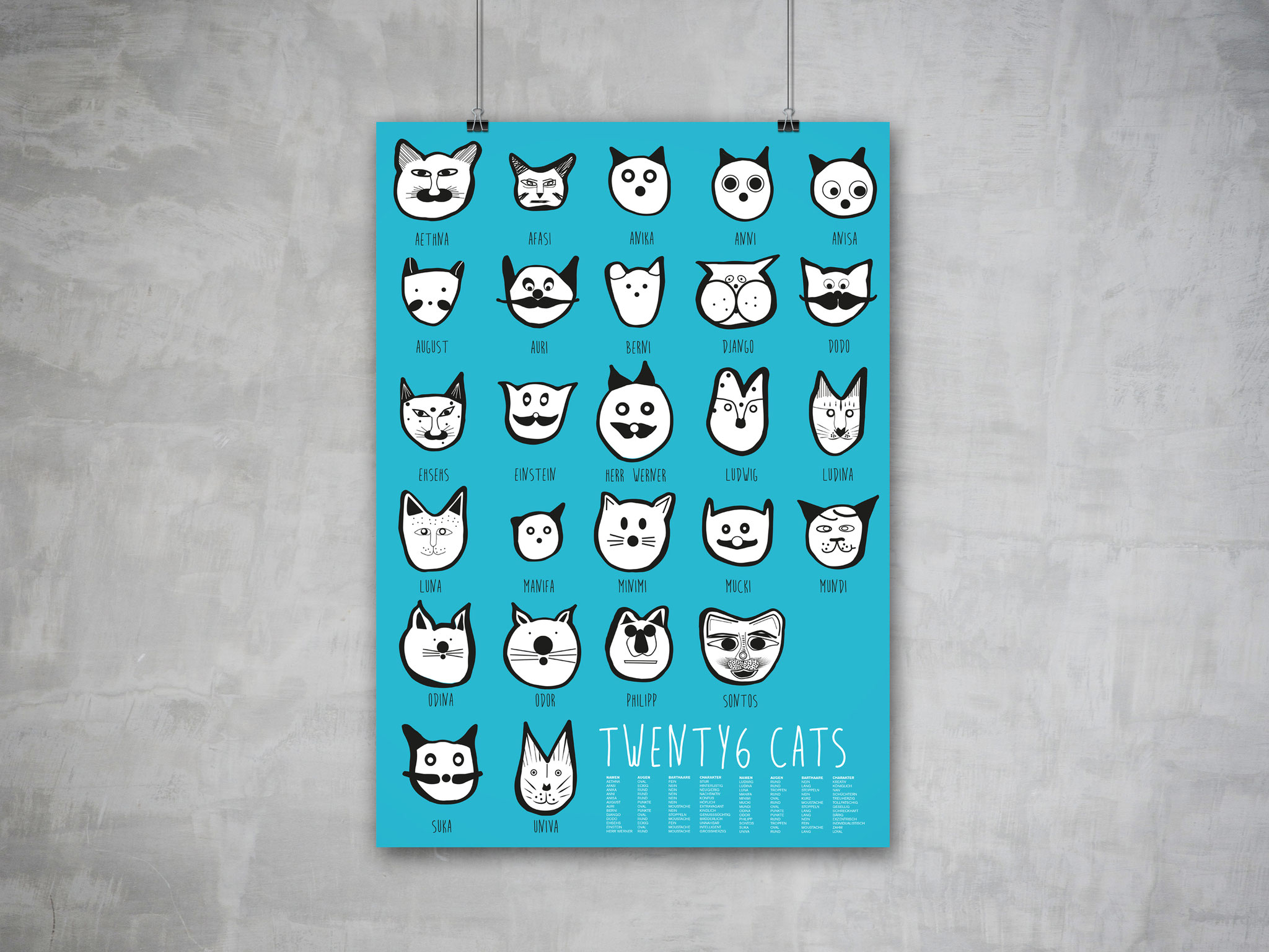
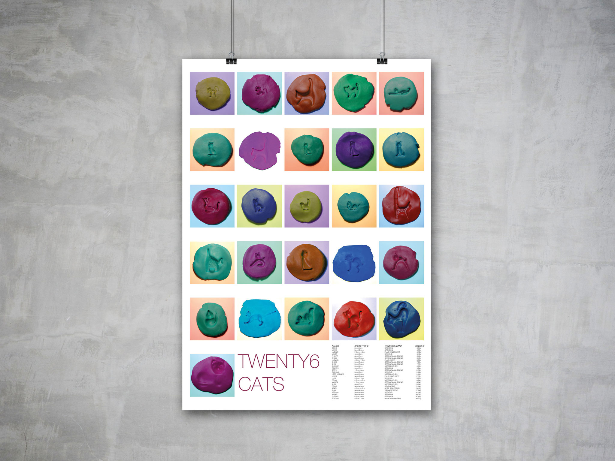
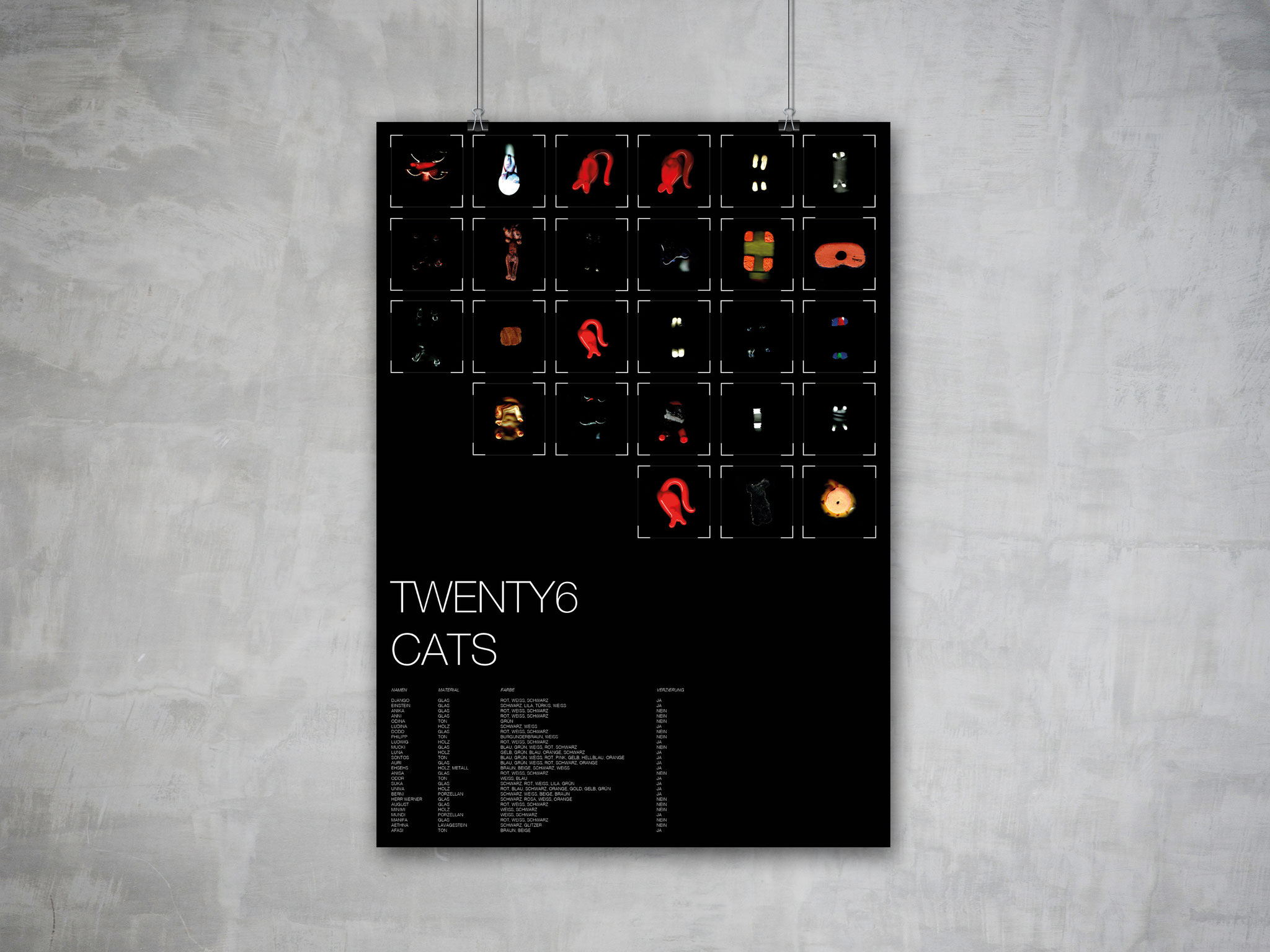
INFORMATIONDESIGN - TWENTY6 CATS
Twenty6 cats, is a project about finding information, looking for differences and showing them in an unusual way. I collected small cats from all over the world, scanned them, drew their faces and put their form into plasticine. As a result, three different unique posters evolved.


TYPOGRAPHY
HANDLETTERING
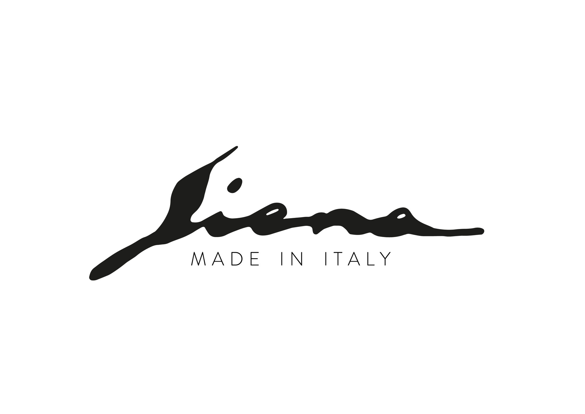
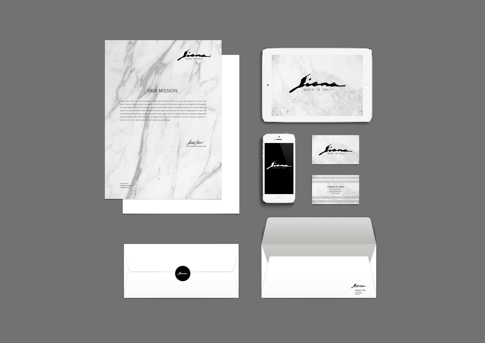
I designed a logo for my favorite city in Italy, Siena. Siena is breathtaking, very historical and tells a lot of stories. It was important for me to find a harmony between the old and the modern style. So i drew with feather and ink and finally came up with an elegant logo for an elegant city.


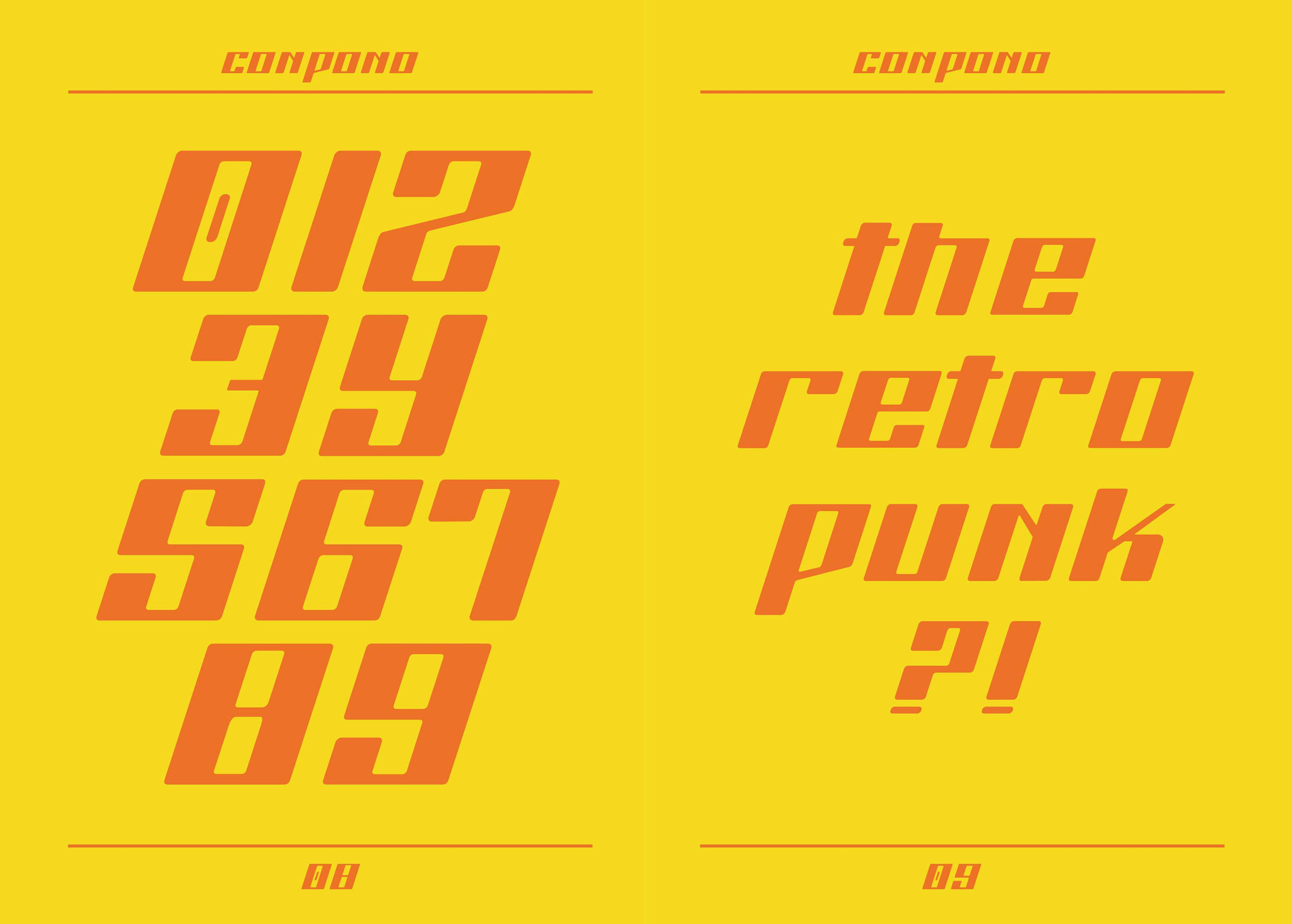
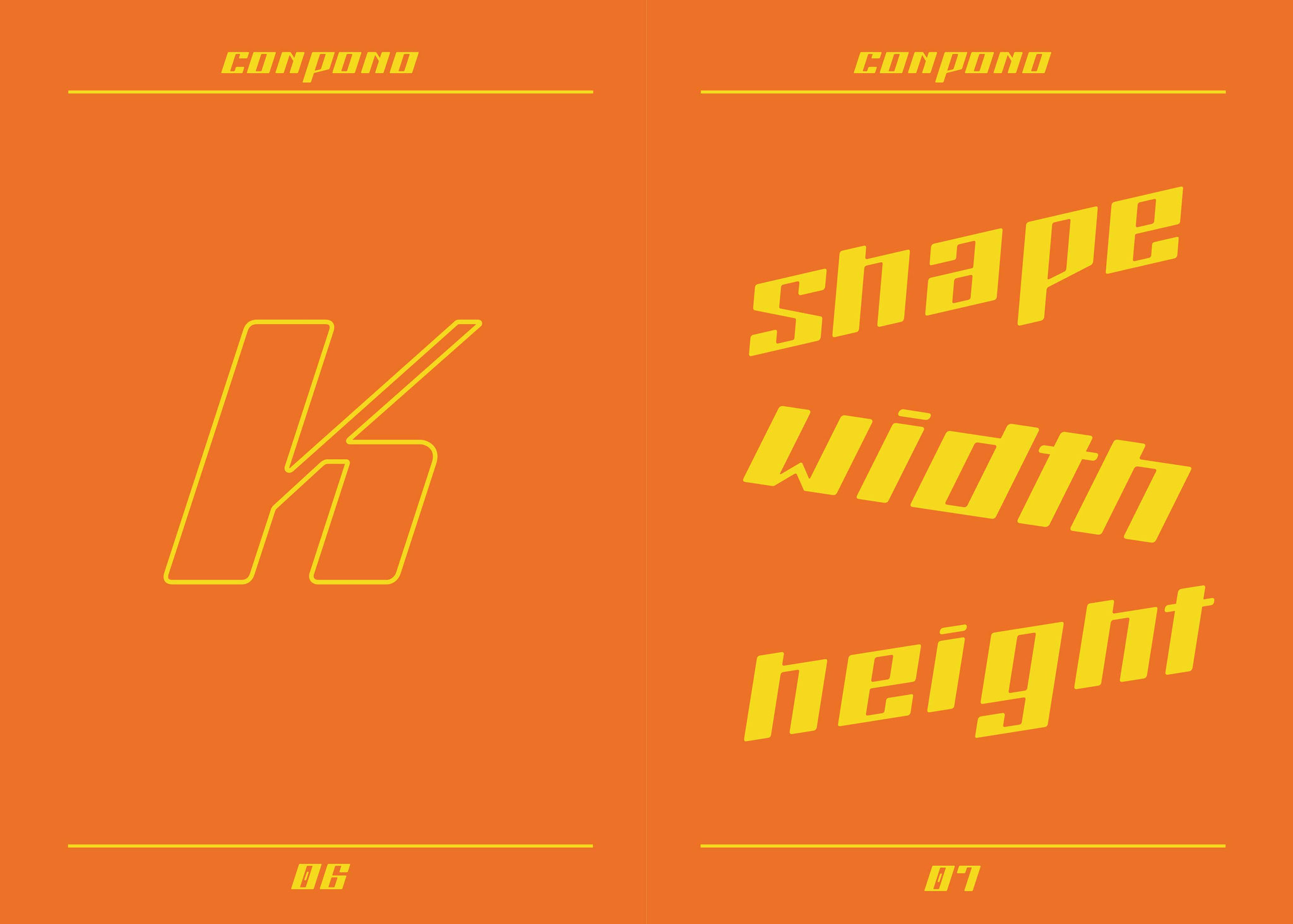
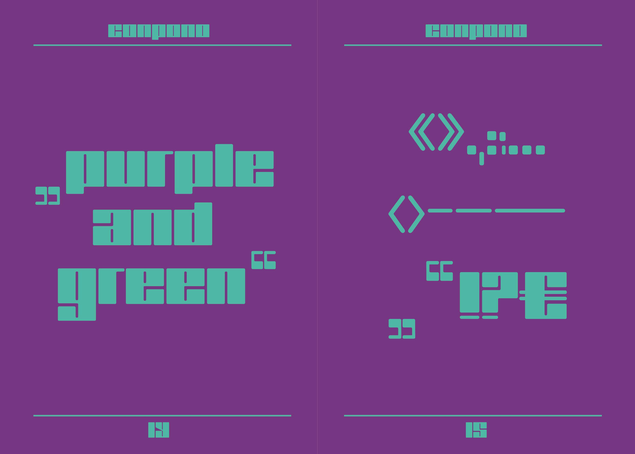
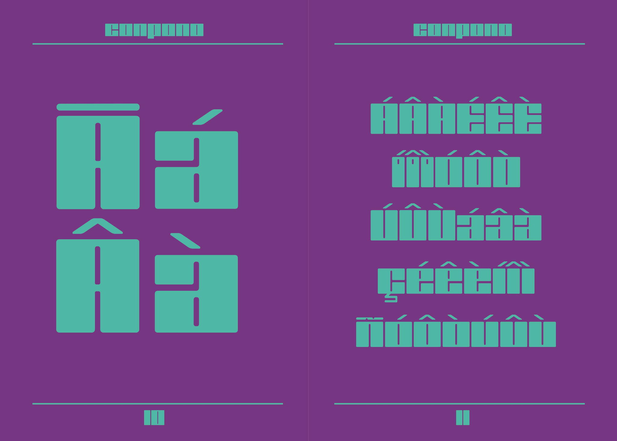
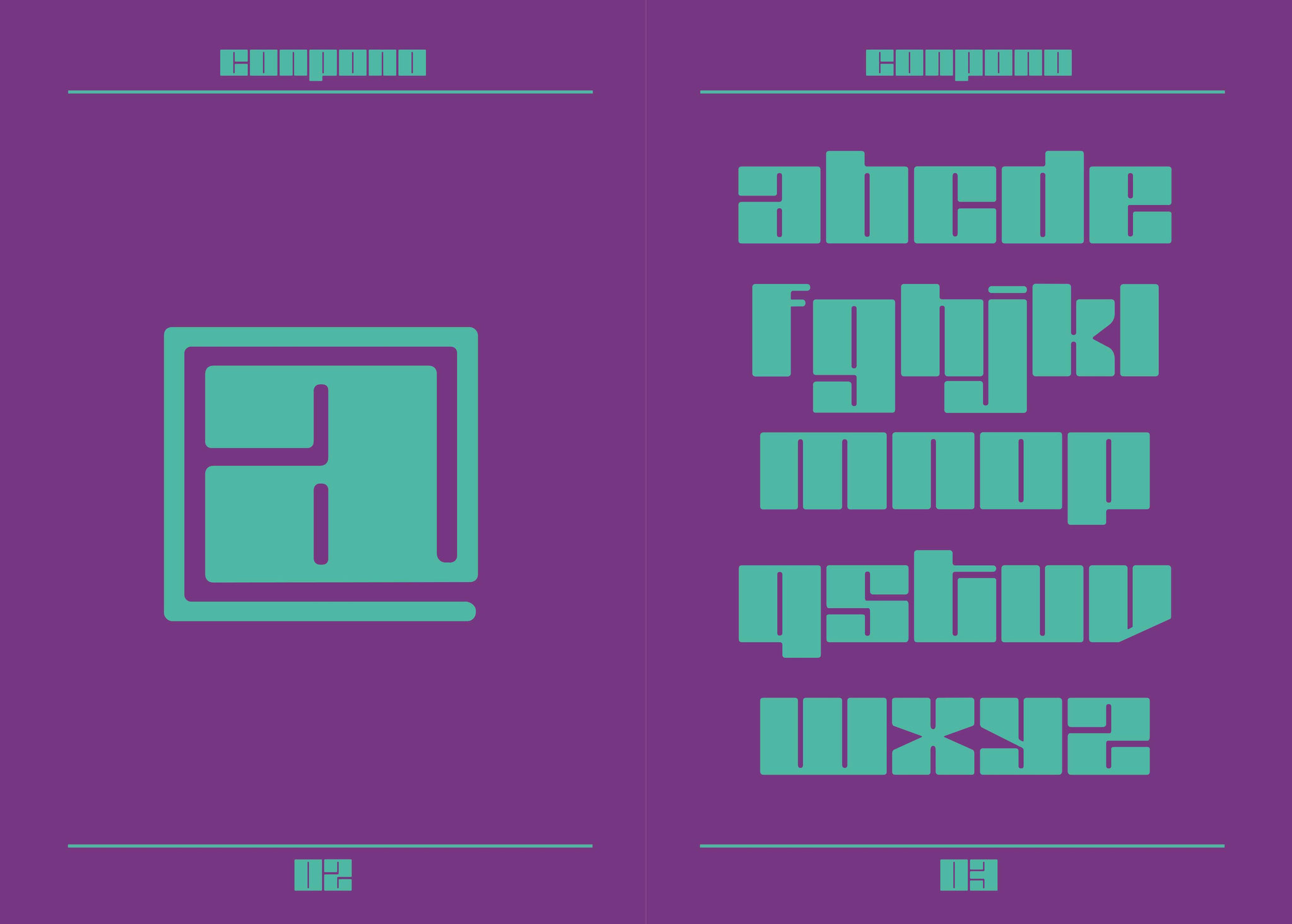
TYPEDESIGN - CONPONO HEAVY & INCLINED
Conpono Type was inspired by Geometrical Elements.The Typeface shows a strong contrast between thick and light lines. The vertical lines of each letter has always the same stroke width, it gives the type strongness and on the other hand thin lines and small curves are catching the viewers eye. The Typeface was designed for Headlines, Posters, Packaging, Logos and any kind of retro design.
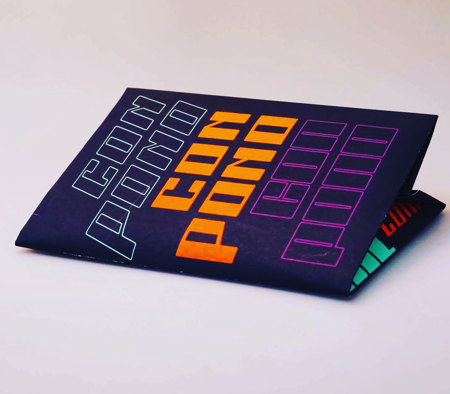
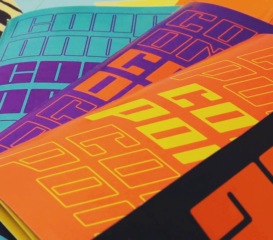
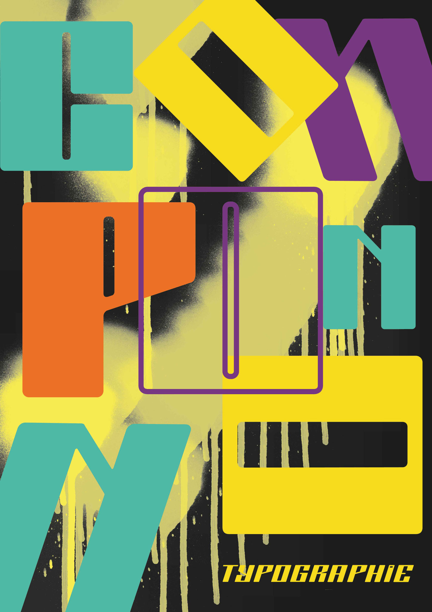
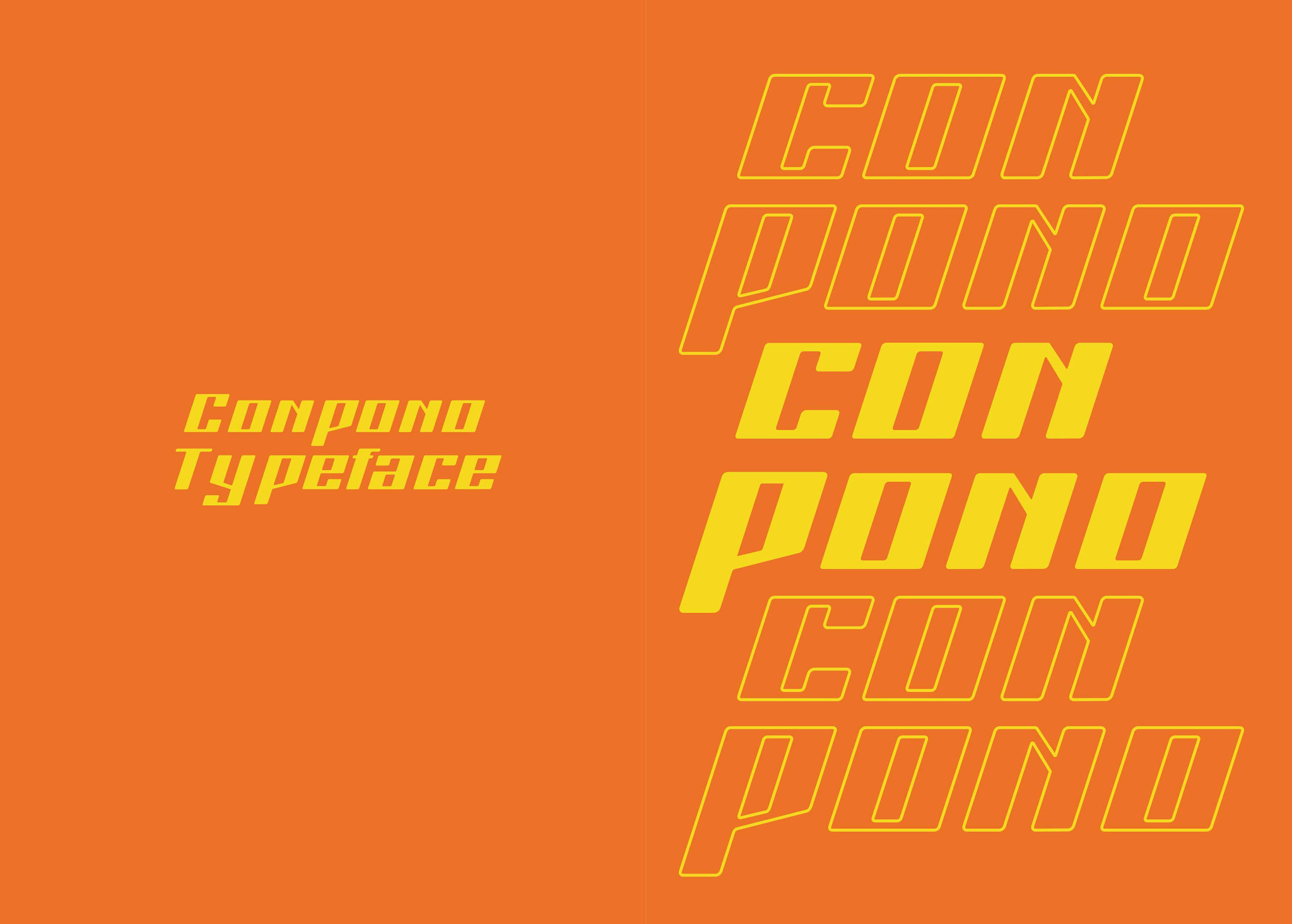
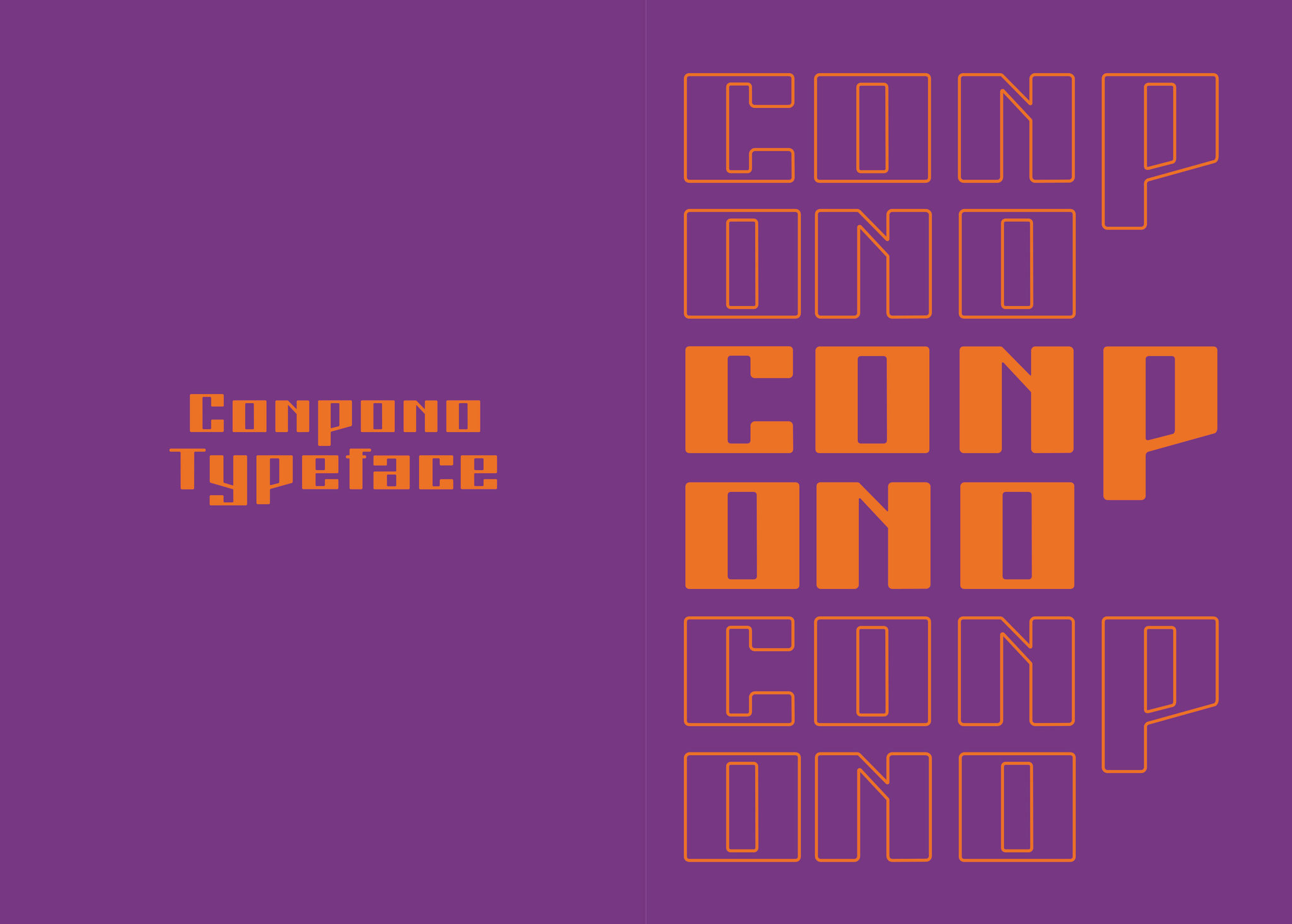
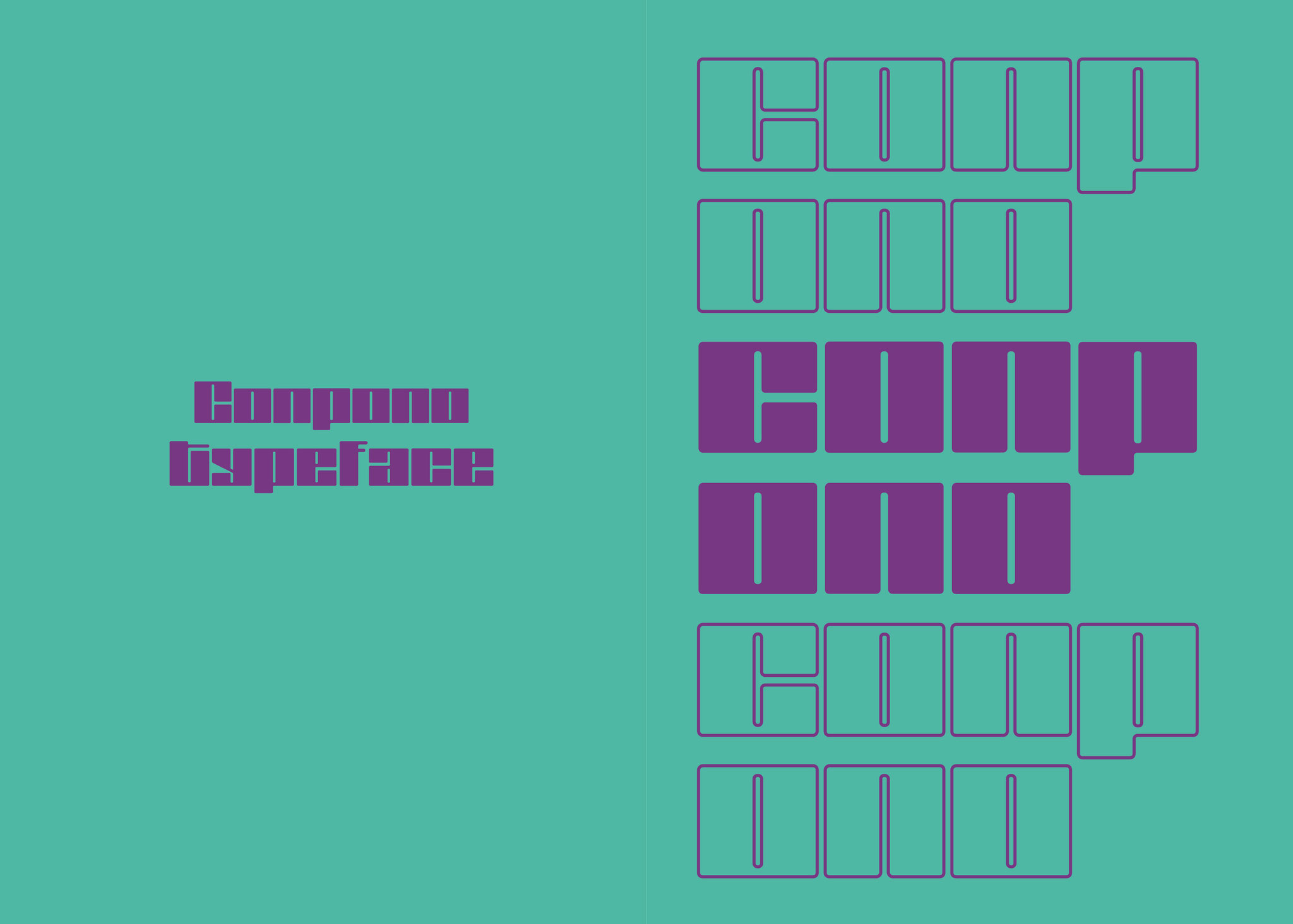
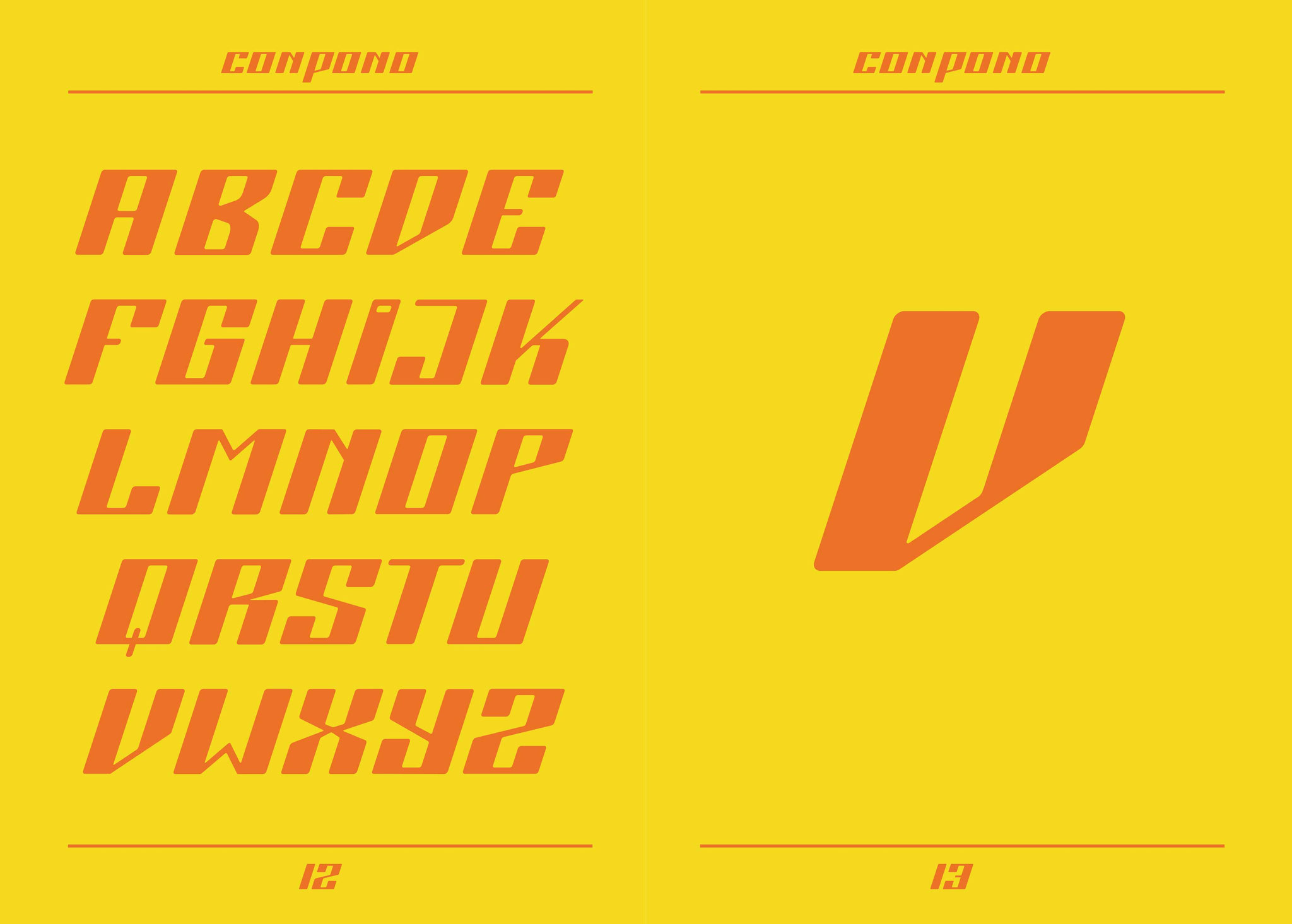
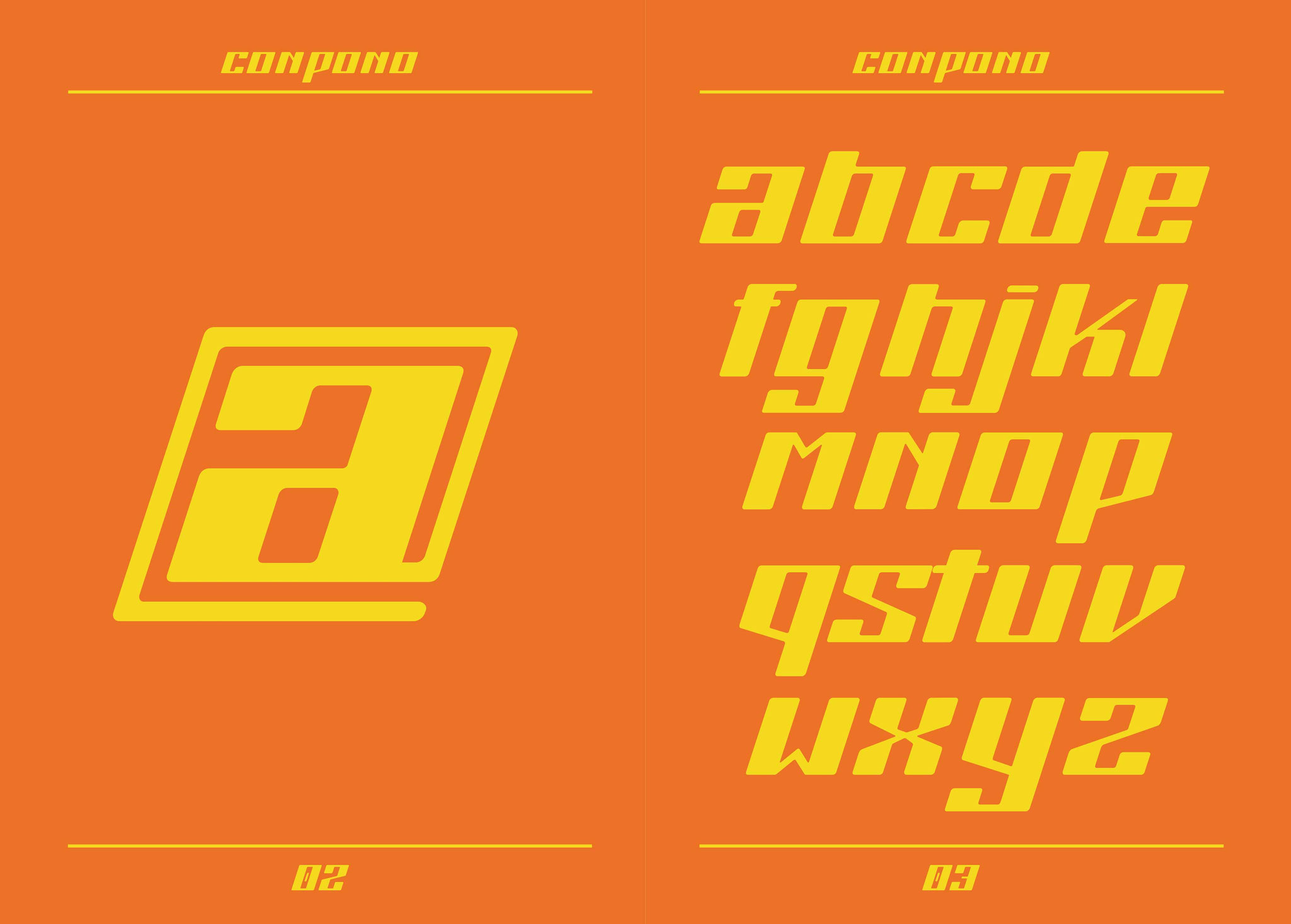
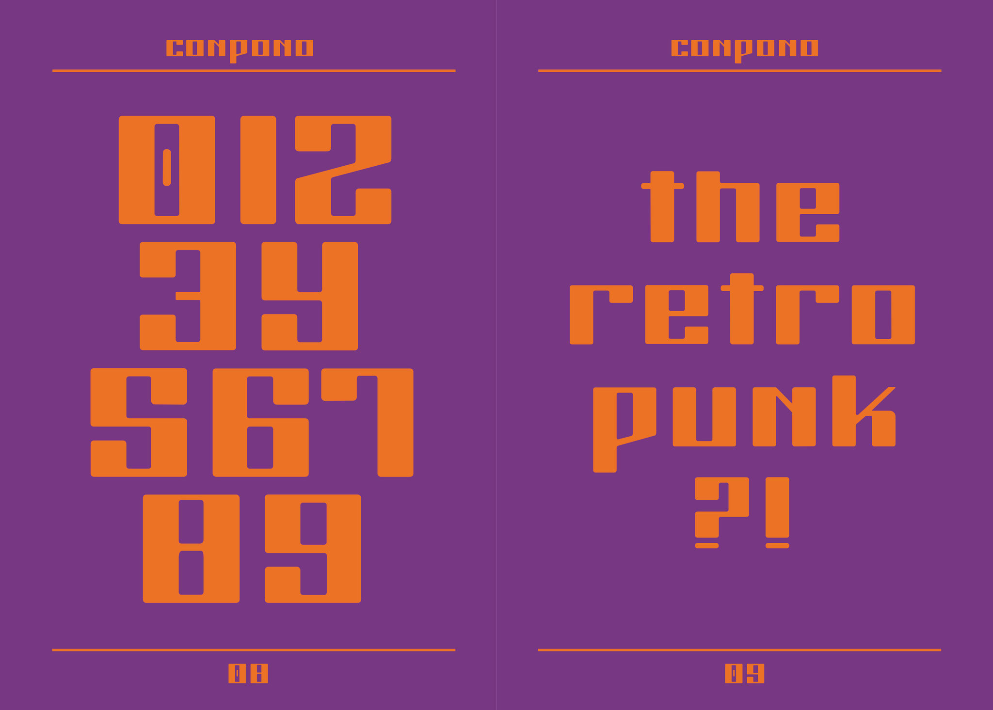


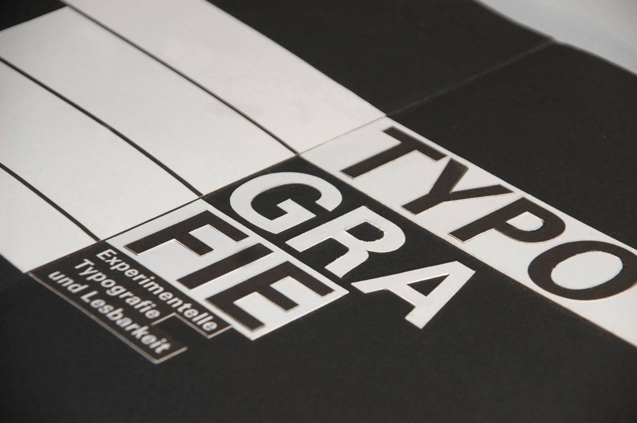
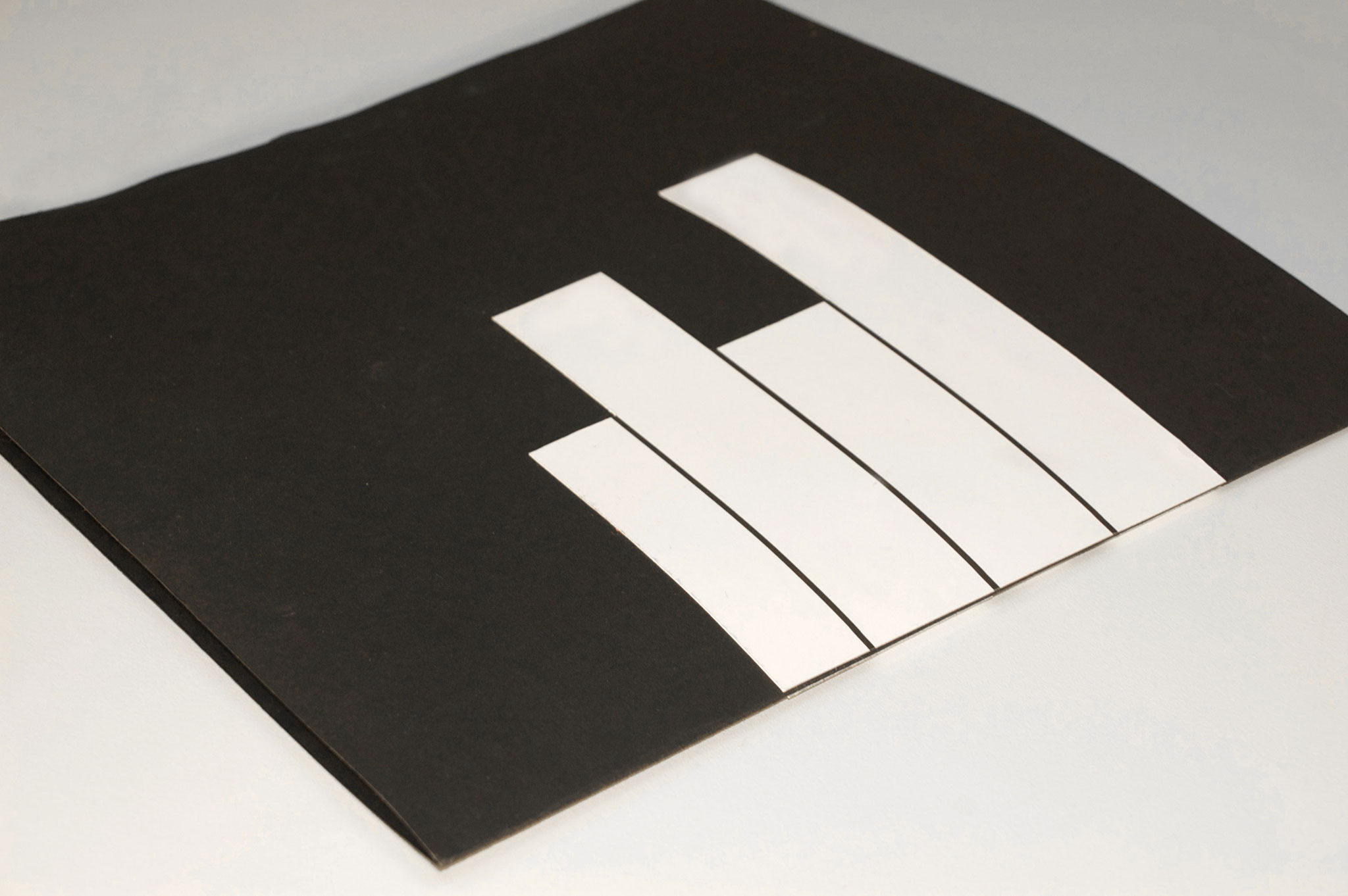
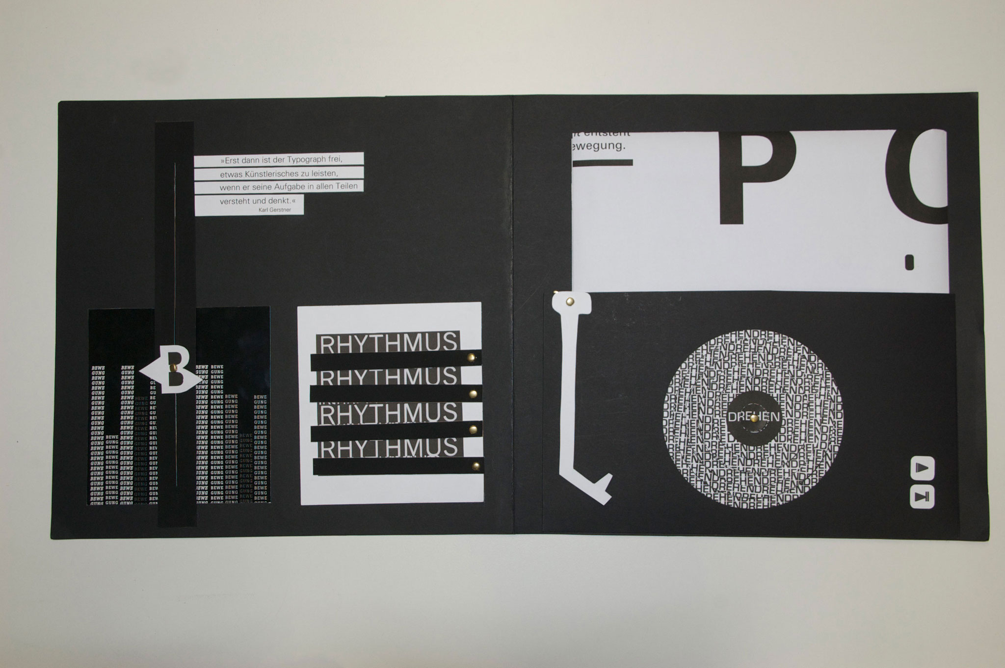
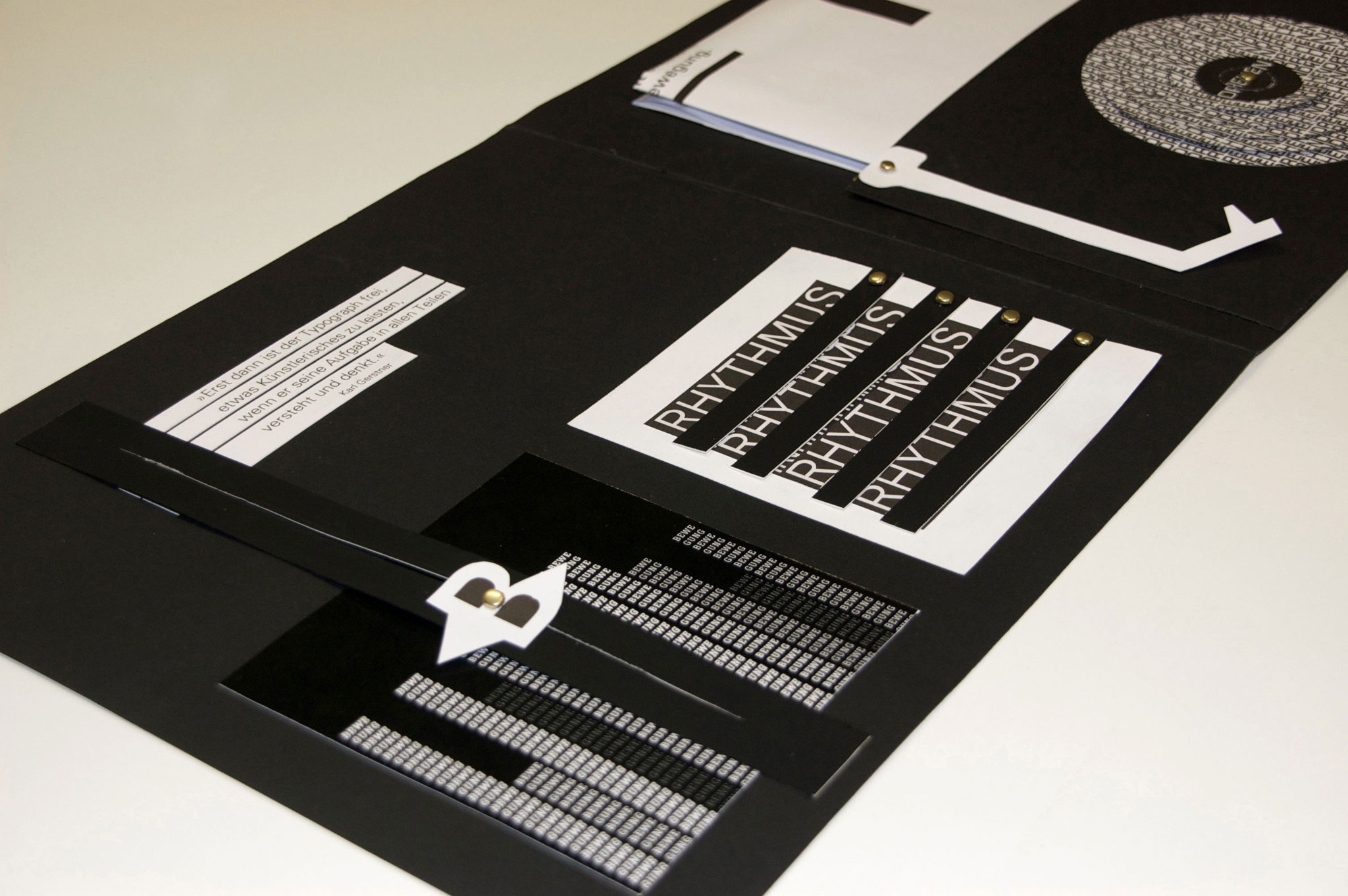
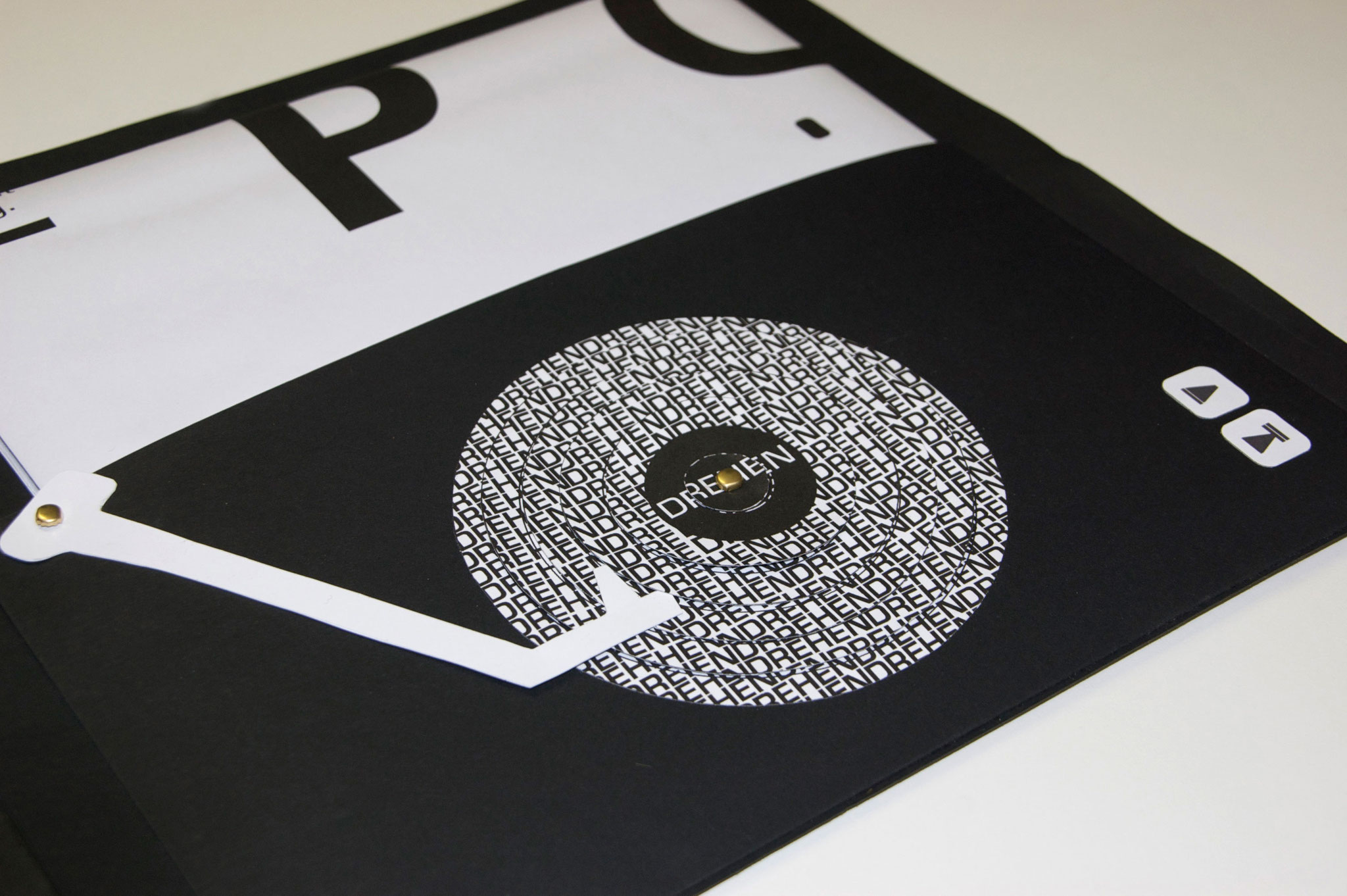
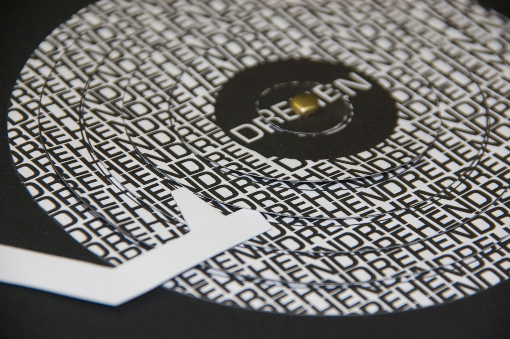
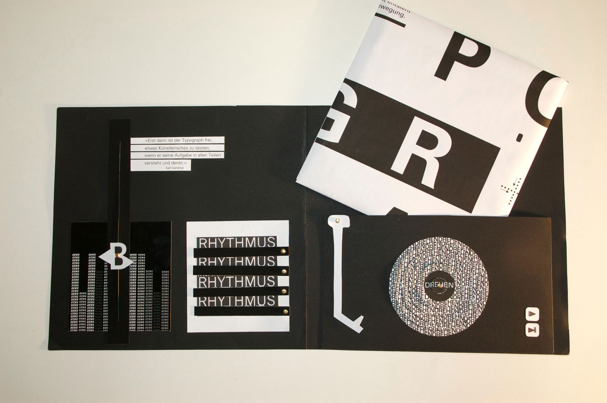
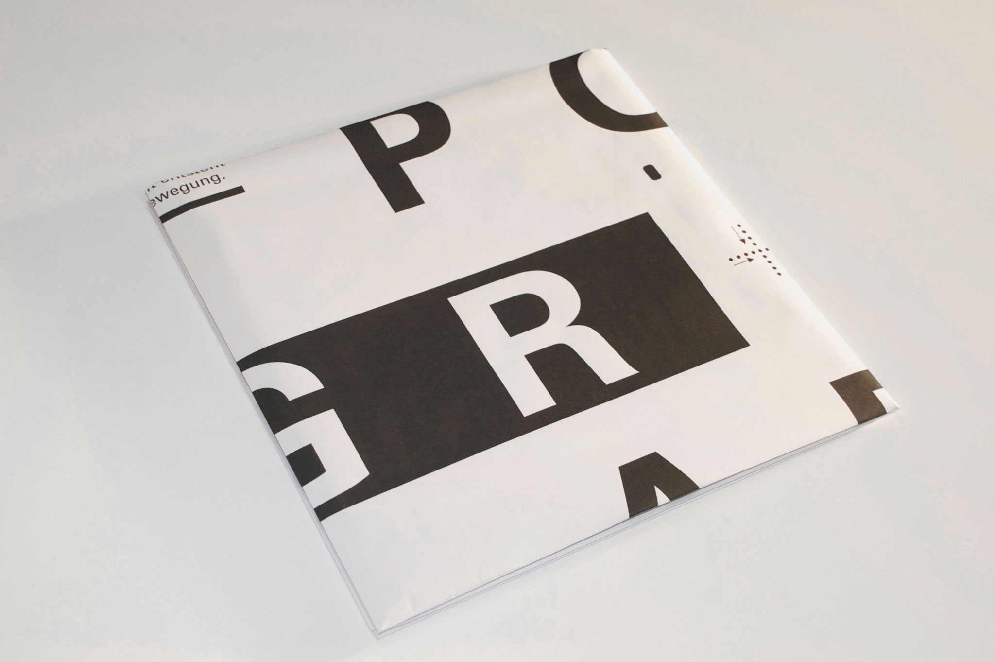
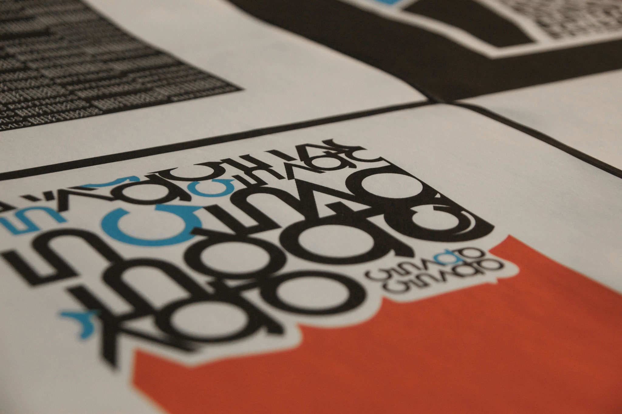
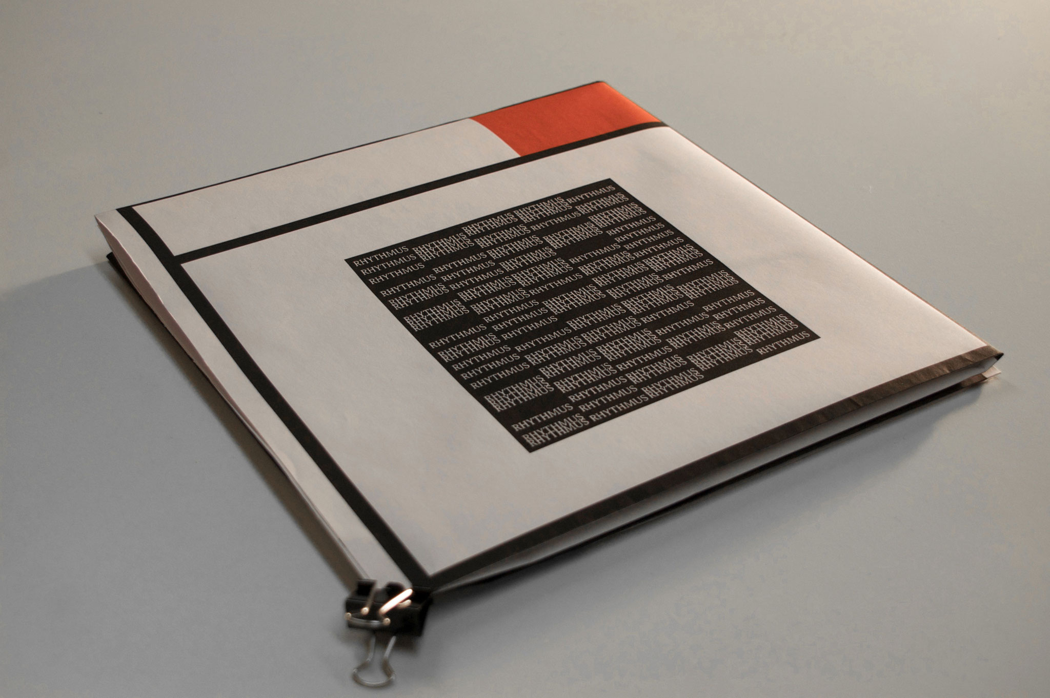
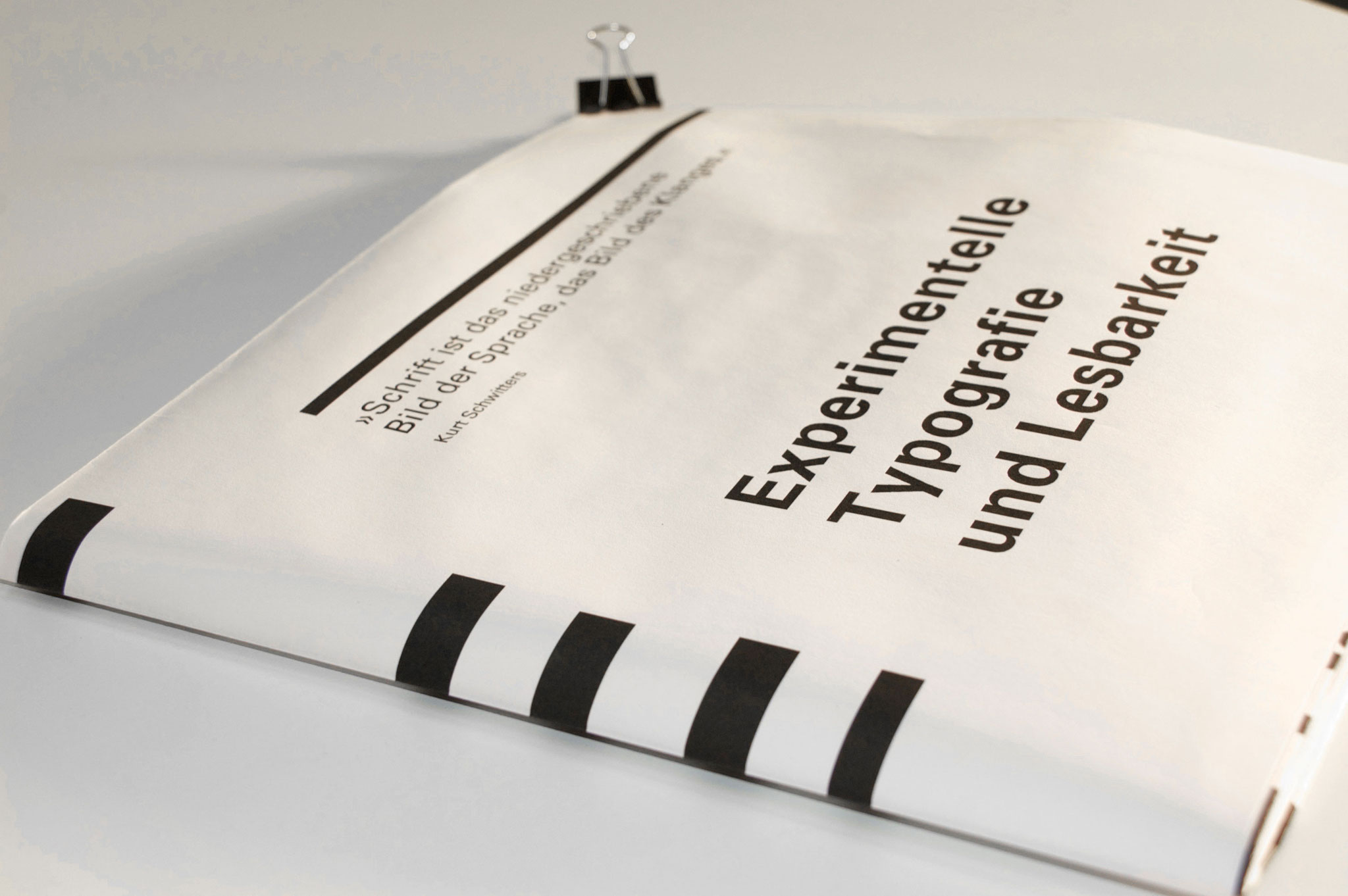
TYPEDESIGN - CONPONO HEAVY & INCLINED
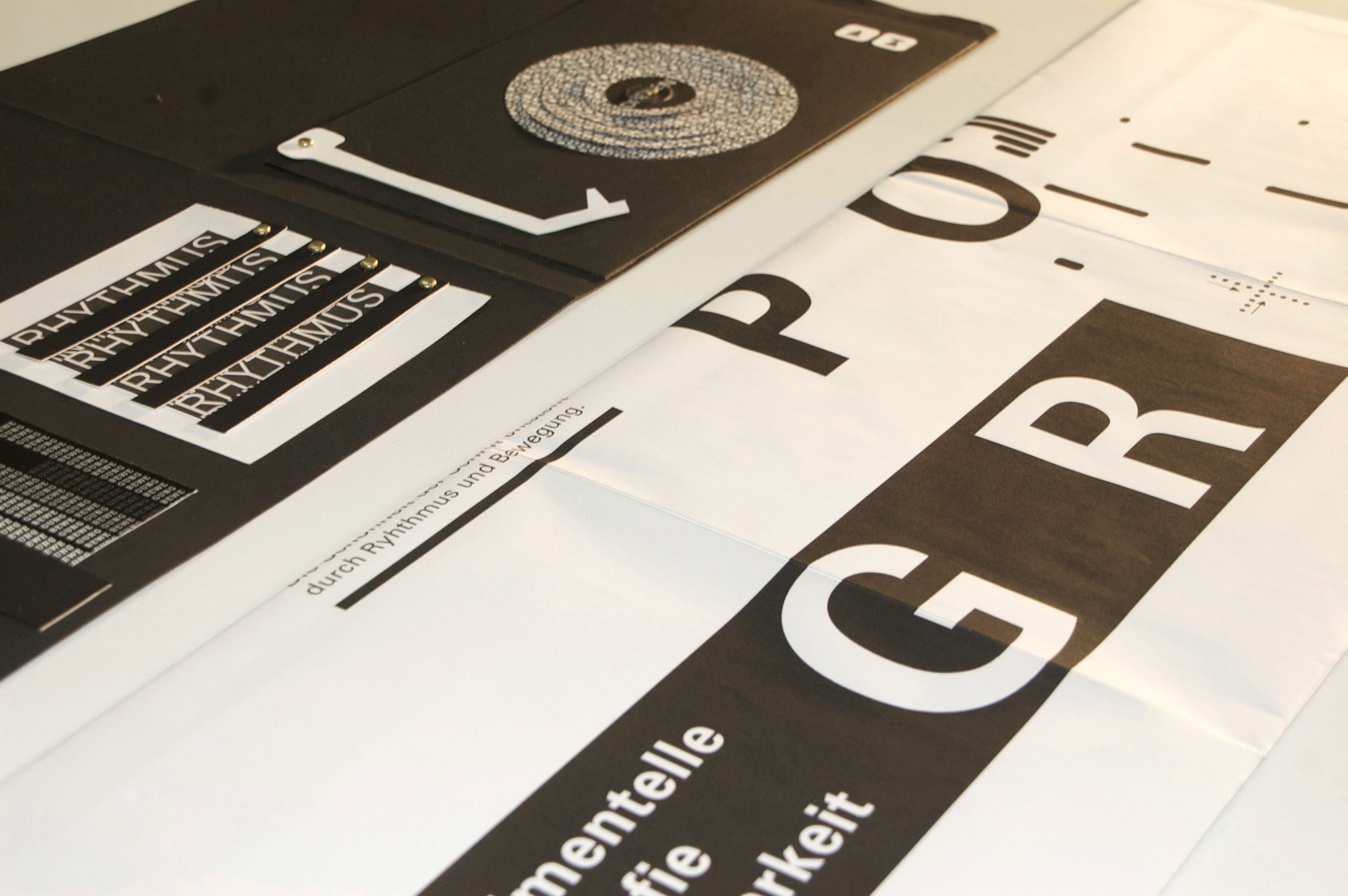
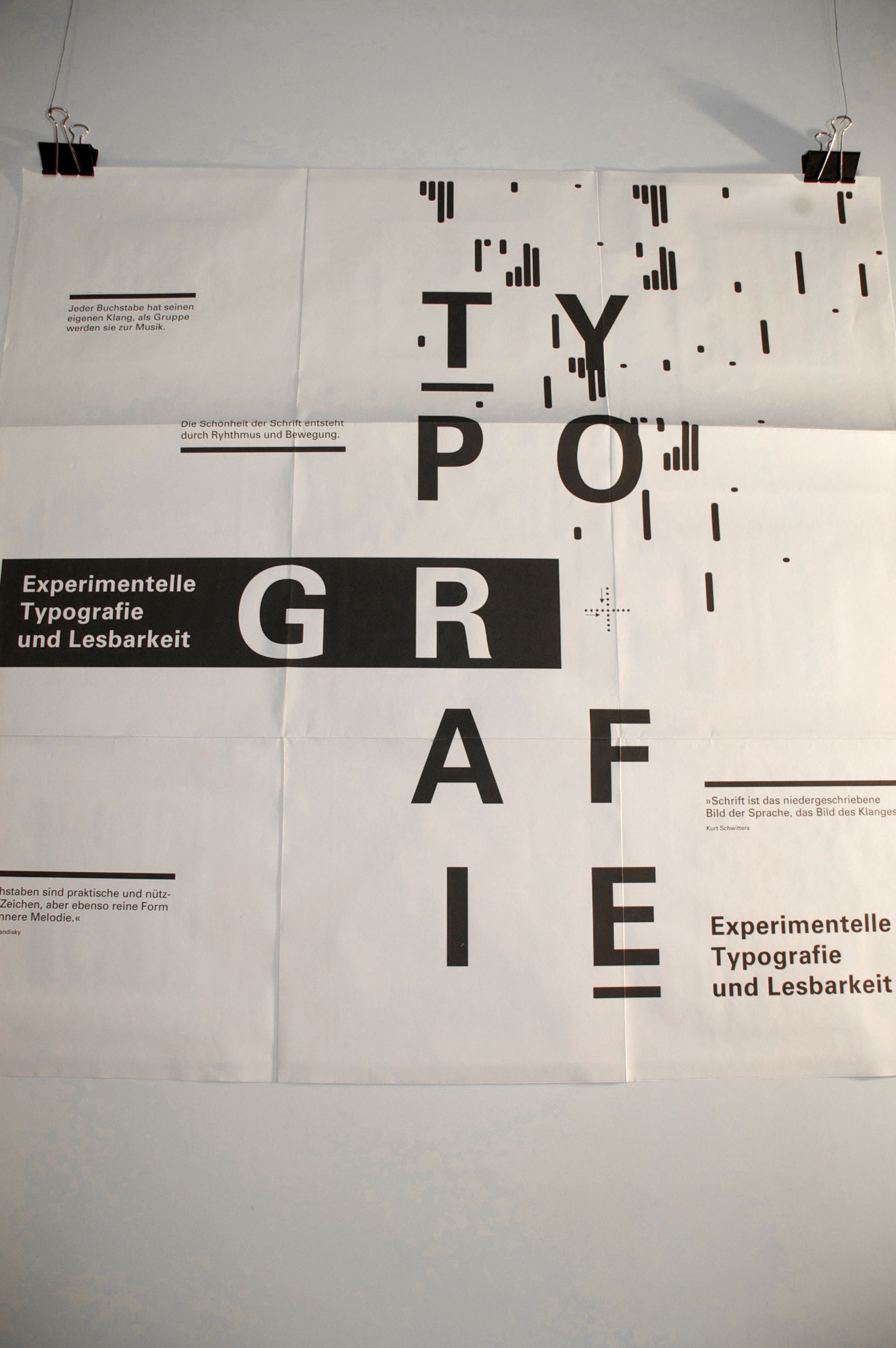
This project is about experimental typography. I designed an analog folder as big as a vinyl record. Typography is like music – it must be rhythmic in order to create a nice contrast, that the typography catches your eyes. Inside the folder is a double-sided Poster.


Packaging design
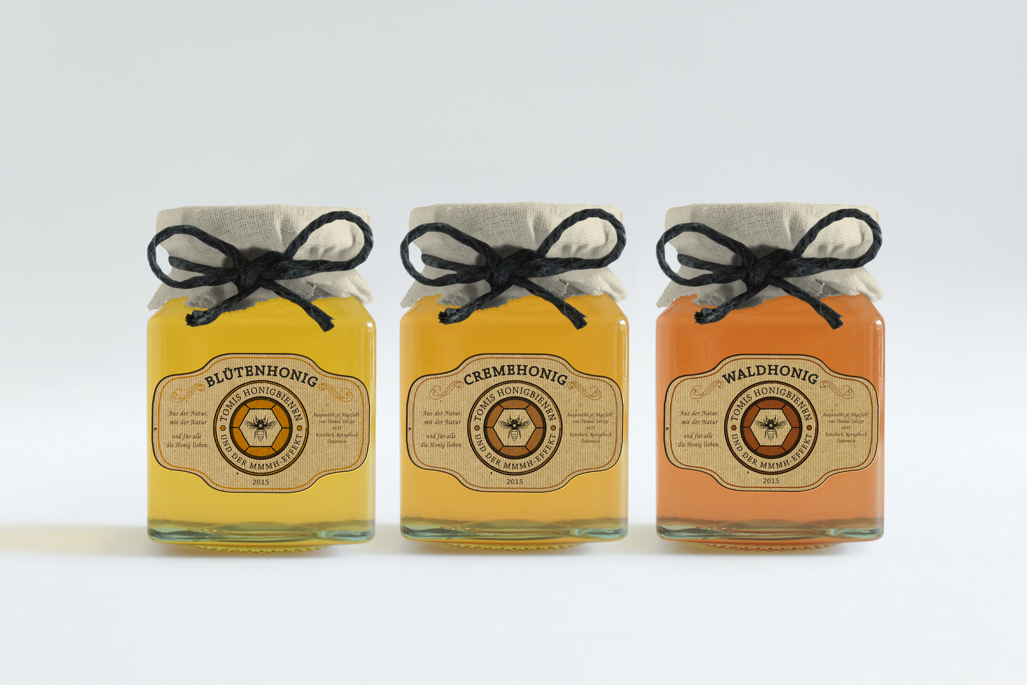
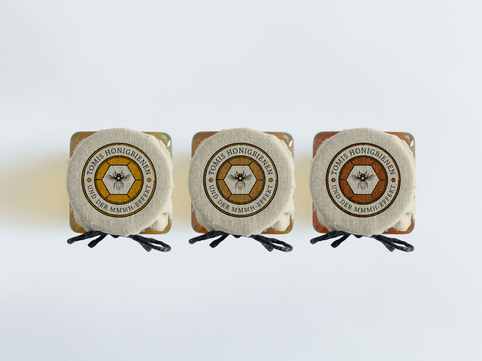
PACKAGING DESIGN - TOMIS HONIGBIENEN
For a beekeeper in Upper Austria I have designed a series of three honey etiquettes with a certain vintage as well as nobly look to catch the viewers eye. With colors from yellow to brown the etiquettes adapt perfectly with the different types of honey, for example from blossom to forest.